HOME | DD
 fractionalself — TooManyOptions

Published: 2006-09-17 19:40:26 +0000 UTC; Views: 213; Favourites: 0; Downloads: 0
Redirect to original
Description
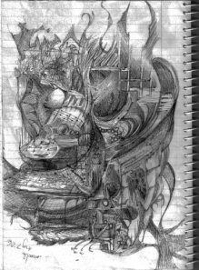
I think this might be massive, so although full-view might make it legible, it might also be a pain in the butt.I'm going crazy with this assignment.
Related content


Comments: 18

Wow! I love all the views... very creative and inspiring-
👍: 0 ⏩: 0

Very interesting. I like the two middle ones the best, I think, especially the periwinkle hair. The one in the upper right seems to me to be a bit too dark, somewhat throwing off the balance and visual flow.
👍: 0 ⏩: 0


well---I understand your dilema. For what it's worth. I say #1 in the first row.............#1 & 4 in the second row. 1&2 in the third row.
I confess I don't know what your assignment is---but I like the ones I picked. It's It's such uch an individual thing---don't make yourself crazy over it.  (Smile)")
👍: 0 ⏩: 0

IMHO Last one in a second row is the best color wise... All the rest seems muddy
👍: 0 ⏩: 1

Cool. Thanks for the heads up.
👍: 0 ⏩: 0

i like the first and second design. nice graphics.
tet
👍: 0 ⏩: 0

Hi Nicole -- I am behind you -- you will get through it -- nice work
👍: 0 ⏩: 0

upper-right, lower-right. without a doubt. im starting to understand your style a little better. i guess it goes beyond 'phoitoshopped' looking.
👍: 0 ⏩: 2
👍: 0 ⏩: 0
broken record
broken record X3
👍: 0 ⏩: 0
upper-right, lower-right. without a doubt. im starting to understand your style a little better. i guess it goes beyond 'phoitoshopped' looking.
👍: 0 ⏩: 0

looks hardcore i would choose them all like pokemon!
so is your stuff out in art exhibts yet, looks like the kinda things i go there for to inspire me
👍: 0 ⏩: 0
looks hardcore i would choose them all like pokemon!
so is your stuff out in art exhibts yet, looks like the kinda things i go there for to inspire me
👍: 0 ⏩: 0

")