HOME | DD
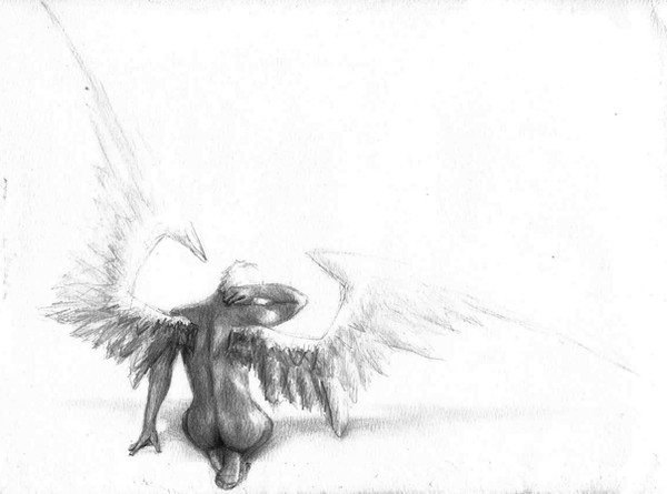
 frail — TRANSCENDANT
Published: 2004-08-06 11:50:17 +0000 UTC; Views: 10286; Favourites: 255; Downloads: 2409
Redirect to original
Description
series3 of 3
I. FALLEN
II. TERMINAL
III. TRANSCENDANT
Related content


Comments: 97

 (Smile)")


i love the simplicity of this, the hue you used, i guess it also looks much better this way than if it were to be shaded, and colored, because of its effect
👍: 0 ⏩: 0

I've looked at this over and over since I've added you to my modest watch, and I've decided I might like to incorporate it as a tattoo. I would very humbly like to know if this would be alright by you, and if so, if you have any further suggestions on where it could go, or what else you might add. Personally, I like it how it is, but it's your design, so perhaps you have something to say on the matter.
A simple yes on the permission would suffice, however
👍: 0 ⏩: 1

it's my preference that if you're serious about it that you buy a print and take that to the tattoo artist. it hurts me if you don't
transcendant is something i would lean toward "shoulder blade" on
my only real requirements are that you a) send me pictures and b) tell people who i am
👍: 0 ⏩: 1
Oh, certainly. Certainly to each request. How awful would it be to get it tattooed without due credit. And thank you for your permission and swift response. I'll keep you posted.
👍: 0 ⏩: 1
thanks for making my heart happier
👍: 0 ⏩: 0

Just wanted to let you know that I my daughter shipped me a print of this for Christmas from my wishlist -- and I couldn't be more pleased.
👍: 0 ⏩: 0

I love this but his wings look like they stick way out from his body...He's beautiful, nonetheless...
👍: 0 ⏩: 0

Awesome...very good on proportions. putting it in my favs
👍: 0 ⏩: 0


I sometimes see him fly by, the fairy man
with wings so lucid, so frail
yet still he is bound
He is so far, so very very far
And yet I feel him within inches of my heart
As though I was him, one day
As though I am him, every day
As though I will be him, one day,
I fear
I speak of logic, he sings of faith
Both we writhe in doubt
But his doubts, and his faith
And even what some could dub madness
And what I could think of as sad illusion
are in my mind
so infinitely, and heartbreakingly beautiful
👍: 0 ⏩: 1


Its a really awsome peice
I just dont like the copywright information going through the middle of him...
oh well
keep whats yours... yours...
👍: 0 ⏩: 0

would make an awesome tattoo, love the colour.
would be a good computer desktop too!
👍: 0 ⏩: 0

I know its discouraged critique, but i just wanted to say that this is really good, maybe you could draw a girl version? with like long flowing hair...hehe COME ON MSN!!!

👍: 0 ⏩: 0


i may be a late commenter, but I just found this, and i LOVE it !!

👍: 0 ⏩: 0


desk top background worthy.......it will have to wait as I made your feature deviant my main
👍: 0 ⏩: 1
"Everything Was Perfect," you mean?
Odd. How's that working out for you?
👍: 0 ⏩: 1
")
I am getting amrried to a blonde..I blaim him
👍: 0 ⏩: 0

Love the colors and the style! Very pleasing to the eye and the green is very relaxing.
👍: 0 ⏩: 0

i love the simplicity of these drawings. the series is great but this one in particular is my personal favourite because of the message. it's hopeful. which is always a pleasant change...
👍: 0 ⏩: 0

I love the use of space.And the bold lines used for his body. Yet the elegent little butterflies at his fist. I hope that wasnt too in-dept. Since you discourage that.
👍: 0 ⏩: 0

(unless the lines mean light instead of strings, but strings make more sense because of the first two. hmmm...)
👍: 0 ⏩: 0
The strings! I didn't notice them at first, but then I looked at the first two, and the strings are ...bah! what's the word? detached? The picture made me already indescribably happy before I noticed the strings, but it's even better now. It's so lovely. Congratulations.
👍: 0 ⏩: 0

very simple and in the same time very complex...
I like the clean feeling that this work gives me...Something clean and peacefull....And full of meaning...I really like it...
👍: 0 ⏩: 0

i just had a thought about this one.
"butterflies".
yes; that was my thought.
your... liking... for them; the little icon that you wanted made for you with a butterfly (mine's still in my gallery...), your butterfly/boxes icon you put on your pictures, having that butterfly on some of your 'webcam' shots... i don't know what it is with you and butterflies but that just clicked that maybe there really is a connection happening.
and i don't know if i ever commented on this drawing of yours. but i like it, i really quite do. there's just something about the way you draw, and especially what you draw, and it's amazing and beautiful.

👍: 0 ⏩: 0

Beautiful details here, and you've chosen the perfect color and postitioning. The barely vidable text adds to it as well to complete a balanced and well thought out piece. Well done

👍: 0 ⏩: 0


absolutely perfect. i love the use of the negative space.... ")
👍: 0 ⏩: 0

The wings really do tone down the lines which really bring out that sense of controlled power...
Excellent piece, excellent series. Wonderful art to come home to!
Thankyou for being who you are!
No, I'm not drunk... just tired.
👍: 0 ⏩: 0


well-i understand why this was a fav... of the series its definitely my favourite... i suppose its the simplicity that draws me to it... the composition is sparce but absolutely wonderfully thought-out... sometimes, (dare i say usually), bare blank space is boring--but i think in this case it *makes* the piece. --of course it help that theres the subtle green creamy hues and not simple stark white... its very soothing, and the fact that it carries through to the figure is exquisite. the figure is so well formed, the detailed shading and heavy contours that draw the eye toward it as well as their juxtaposition with the light pencil work of the wings really makes the form dynamic. 
 (Wink)")

👍: 0 ⏩: 0

I absolutely ove this one. The green is awesome (it's my fav color). The wings are just amazing.
👍: 0 ⏩: 0


Wow what a drawing.
that is stunning, i love the green colour you've used for the series, and this is by far my favourite of the three.... just gorgeous.
amazing anatomy drawing! great work

👍: 0 ⏩: 0

I simply loved it!! Its an amazing drawing, full and simple. Gotta fav this one

👍: 0 ⏩: 0

im curious about the effect of the title in the bottom left .. what tool or process you used to get it ... its very fitting for this image ... and id like to see what i could do with that tecnique
👍: 0 ⏩: 0


This is so awesome, I love it, I don't know any words that can express how much I like this. I love fantasy/mythical stuff, faeries, fairies, pixies, etc..... very cool makes me think of Peter Pan (live action) which I just watched this morning.... anyway, sory to blab, really cool!!!!!!
👍: 0 ⏩: 0

Love the sketchyness, the anatomy & structure. I love how faint the butterfly wings are - overall beautiful picture.
👍: 0 ⏩: 0

Yep... Prety good... And that light green around him... Hail to you little one. What did you draw it with?
👍: 0 ⏩: 1
| Next =>