HOME | DD
 framesofreality — s05 . EFTB
Published: 2005-08-10 14:50:25 +0000 UTC; Views: 3439; Favourites: 24; Downloads: 1526
Redirect to original
Description
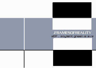
aka entertainment for the blindAVS pack by charles berczi
contains 22 AVS presets
all info in the intro comment
enjoy!
(and no it is not a picture)
Related content


Comments: 20

👍: 1 ⏩: 2

👍: 0 ⏩: 0

👍: 1 ⏩: 0
👍: 1 ⏩: 1
👍: 0 ⏩: 0

👍: 1 ⏩: 0


liked almost all of them very much
and the rest are cool as hell too
👍: 0 ⏩: 0


Jó partylfyer-t lehetne csinálni ezzel a grafikával... nekem tetszik!
👍: 0 ⏩: 0

Hmmm, bit of a departure here from your usual style and I like most of them, the visual roughness that has been criticised by other comments I actually quite like and seemingly random colours thrown together is a speciality of mine so you'll get no complaints from me  (Wink)")
There are a couple of presets which just don't work for me in this pack deep 'inside the eyes of the furniture' being one of them and 'qviex' the other (I think this one does need a little more work in the colour department).
The difficultly is for me that some of these seem influenced too much by teh 'clean-visbot' for your style, sometimes this simplicity clashes with your 'dirty-bits' style in a way that the visual friction doesn't quite work (as appossed to the mixes you did with yath, which were excellent).
To stop this from getting too negative this is still a great pack, 'interslash' and 'biomass' are fucking excellent, the later works with everything from Philip Glass to Big Pun and its good to see you exploring a bit more with your visual style.
Peace
zen-x
👍: 0 ⏩: 0

First off: I agree that kerygma was a better pack.
I guess my ratings would be rather binary because I either loved or hated these presets, not many 'in the middle' ratings in this pack, so I'll leave my full review out.
Things I like:
Nice idea for the scope in vob. Good preset in itself too.
Great intro.
I like climbing heat v1.1 over v1.2. Best looking preset in the pack IMO
Things I liked less:
Try to keep 'I'm lazy' and 'what gives' kind of statements outside of your comments.
Unusual preset names are cool, but titles such as 'asfgs' make me feel bad about a preset before it even loads. The difference: atisticness vs. lazyness; It only takes a few seconds to change a name.
In general:
niov - this visbot thing really affected you, didn't it?
4/5 stars
👍: 1 ⏩: 1

thanks for the long comment.
about the preset names - when i see a preset with the name "fluffy clouds" or "gentle flow" i know what i will see next and i know i've seen it before. asfgs was just there because "embossed xorish flow" was even lamer and i know that i suck with preset names. i'm not that lazy as my comments would suggest, but i dont want to give a detailed comment on "why did i did this or that". it's just there, the preset should speak for itself.
i know this is a difficult pack, i wanted it to be so i dont care if there wont be raining fav's
👍: 0 ⏩: 0


As you said in the intro, no one ever hit the jackpot twice in a row, but this sure came close! While it must have very hard for you to top kerygma, you have presented us with one hell of a pack.
-----
- intro: 
- noise detection 2005: Nice flow, but I think we both have to learn to turn off the OnBeat Random selection of the channel shift.
- jewelry: 
- climbing heat:
- bleache: Nice colors, my only real complaint is with the last DM. You're better than that.
- deep inside the eyes of the furniture: Heh, this is difficult preset. I love it, and I hate it... don't ask me why though.
- niov: Certainly unexpected, but that's not to say that I don't like it. In fact, it's one of my favorites.
- biomass: I hate you for this one, because I so much wanted to like it. However, at the end of the day, pak said it best: "its just a tad too choatic".
- asfgs:
- pantomin: I really like the scratchy effect and the colors are good as always, but I think I still prefer the original jewlery.
- qviex: The layering is very nice but the colors are poor for your standards.
- interslash: Another difficult preset to watch, it just doesn't appeal to me that much.
- akvaneoph: This is real nice, the only thing I don't like are the ugly edges, even though they were intended.
- tackternaom bb:
- visques:
- vob:
- newspaper blues: There are some nice effects in here, but overall it's a bit hard to swallow for me.
- showcase:
- voniq:
- comatose: I thought this looked a bit familiar. Great job with the remix.
- q-wark: Lovely colors, but, and while it may help to portray a 'living painting', I still prefer the mirror off.
- climbing heat v1.2: I like the texers because of the added response, but the MPs just seem to work better for this IMO.
-----
Overall I give it . Maybe I'm too generous, but this at the very least deservs a

👍: 0 ⏩: 0

Posted too quickly to see yaths comment, but i agree with a lot of what he said, except perhaps about the blocky edges which i think can look good if done (stylistically) right
👍: 0 ⏩: 0
intro - stylish as hell, smooth as silk. I love your recent intros. Bastard.
noise detection - nice flow but zomgbbq ugly colour scheme
jewelry - I'm resisting another zomgbbq on the colours, not really that keen on the general appearance
climbing heat - not quite as 'dirty' as i think it should be, but still ok
bleache - speaking of dirty... not really that keen, but it does use xor well
deep inside the eyes of the furniture - as soon as the preset loaded the word 'wrap' suddenly smacked into my brain
niov - very nice vectory appearance, movement is average tho (fps questionable)
biomass - this would be great if the colours were just a tiny bit more coherent, as it is its just a tad too choatic
asfgs - ok I guess, not mad on flows as im sure you know
pantomim - gritty, but perhaps a little too hard edged, almost liked it
qviex - layering is nice, but the preset suffers from colourmap syndrome
interslash - was this remixed somewhere? sounds familiar.. anyway, ugly colours, not keen
akvaneoph - man these preset names are ugly, anyway, quite nice and dirty but the colours arent coherent enough again.
tackternaom bb - great, a song with heavy beats really fits it, hard hits in a gritty overbright preset.
visques - great again, chaotic colours and movements but it all works together wonderfully
vob - meh, the old 'wobbly square' preset got old for me a long time ago
newspaper blues - better than pantomim, this one i like, scratchy greyscale with high contrast
showcase - looks really lovely.. but... just not dynamic enough. Its a real shame because with more response this would be a really pwn preset
voniq - Dark blue and yellow, comeon now, thats just... well.. its.. its really nice. hmm, yea this is a damn nice preset. Not sure about the mirror tho
comatose (cryostasis remixed) - very nice, very nice indeed, that fake refraction doohicky effect is interesting.
q-wark - boringish flow with boringish colours
climbing heat v1.2 - opposite colours and hardly any response, bleh
Overall: good but not great, often your style is a bit hit and miss, so unless its done perfectly i tend not to like it. Often the colours are just a little to chaotic and it gives the impression that they havent been given much thoght. I think on the whole i probably prefered s04, but this is still nice work. Maybe include some more remixed of other peoples work in future, since your style makes for some interesting changes.
👍: 0 ⏩: 0

i think the pack is a bit raw (as in unfinished, not a quality raw look). nothing coming close to the quality that under the lavender skies had. my favourites are the intro, deep inside the eyes of the furniture, noiv (except the color-changes!) and interschlash. what i really don't like in presets are those blocky edges, they make them look kind unfinished/unprofessional. i also think, that you need to work on your color-transitions. don't use channelshifts and try to match the colors of cycling colormaps better. even if each colormap looks good, it doesn't mean they go well with each other. still a quite good pack.
👍: 0 ⏩: 0

ha! the intro already blew my socks off. some of my other favs include: visques, voniq, jewlery, and asfgs. great work, although i wish there would be more than just beat reaction. well done
👍: 0 ⏩: 0

holy shit ")
👍: 1 ⏩: 0