HOME | DD
 frazbot — DeonOne.X

Published: 2008-01-18 20:21:26 +0000 UTC; Views: 5540; Favourites: 101; Downloads: 176
Redirect to original
Description
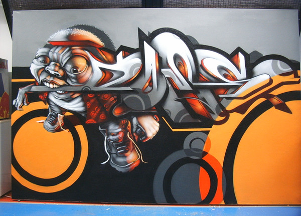
Another 3d piece, i tried to be more hard edged and technical with this one. Lemme know what you think!Related content


Comments: 34

strong colour scheme, an interesting form, theres no real perspective skew so the angles are all hard and forceful
its a nice simplistic piece.
👍: 0 ⏩: 0

wah i like the colors and i usually don't like pink. Nice...inspired by Hinman? u know his 3d canvases...? how do you make your pieces, in terms of materials?
👍: 0 ⏩: 1

I have no idea who Hinman is haha. Got a link? This one was 3DStudio Max... 8 I think? Normally I just use Photoshop, I was just experimenting with this one haha.
👍: 0 ⏩: 0

real fcking gr8, sorry but i dont't only like mix of this colors, rest is wndrfull, what program did u used???
👍: 0 ⏩: 1


that looks awesome.. nice color combination..
has gopd tech feeling to it yeah.. for some reason reminds me of the WipeOut game
👍: 0 ⏩: 1
its a sick game.. never understood why it didnt get that big..
")
👍: 0 ⏩: 0


love it, i think you should make an tutorial for it.
i bet many people are love to see your process.
keep it up, love your art!
best regards.
👍: 0 ⏩: 1

we would, from one artist to another... Everyone has they're own style & technique, its just grand to see more digitals coming about on the net period, keep on bangn man, awesome piece....
👍: 0 ⏩: 0

I like this very much, nice colors, good job bro ;D

👍: 0 ⏩: 0
Haha i agree, pretty time consuming though. Thanks for the fav, your 3d work is amaaaazing!
👍: 0 ⏩: 1
pixelchaot In reply to frazbot [2008-02-25 18:05:53 +0000 UTC]
oh yes time consuming  (Smile)")
(sorry my english is a little bit of [link] and a long time ago english class experience)
[link]
Optimism
👍: 0 ⏩: 1
Your english is pretty good haha. Yeah, the very end is definitely the fun part. Playing with lighting and rendering is so entertaining.
👍: 0 ⏩: 0
Thanks a lot
👍: 0 ⏩: 1

Thanks man and cheers for the watch back
peace ++
 (Wink)")
👍: 0 ⏩: 0


Dam i like it a lot! also the sharp and unsharp... damn bro!
What program do u use?
👍: 0 ⏩: 1
Thanks
👍: 0 ⏩: 0
MFBlank [2008-01-20 01:49:38 +0000 UTC]
kewl!
i like it........
but i prefer the 1st 3d piece
👍: 0 ⏩: 0


This one looks way better than the prev one. Great job!
👍: 0 ⏩: 1

Lovin' that N. The E could use a tad more definition and the D seems a little seperated from the rest of the piece but the "camera" angle you've set allows for it.
Also, the drop shadow onto the canvas surface seems a bit weird... too many spot lights? What if you used a reflective surface instead?
Sorry if I'm being too critical... I just find that too many people just write "dope" or "sick" without really offering valuable feedback.
👍: 0 ⏩: 1
hahaha yeah thanks, i really appreciate the feedback.
I do have way too many lights. well, at least too many casting shadows. There's 3 really soft edged spotlights on it, and they all have ray traced shadows hahaha. It seemed to me that i could only really pick out 2 of the different shadows after rendering it, so i left it alone. Maybe I'll change up the lighting and re-render it.
I kinda liked leaving the E a little vague, leave a little to the imagination haha. And the D is actually really far away from everything else haha. If you were to rotate the camera, the piece doesn't work at ALL haha. I'm still learning to get the shapes i want, but fit them together nicely
Thanks for the crtitique!
")
👍: 0 ⏩: 0


yes it looks better than the last! a lot smoother and sharper. nice colors too! good job!!
👍: 0 ⏩: 0