HOME | DD
 FredrikEriksson1 — Tutorial Death Supernatural
Published: 2014-07-10 17:19:14 +0000 UTC; Views: 4474; Favourites: 79; Downloads: 0
Redirect to original
Description
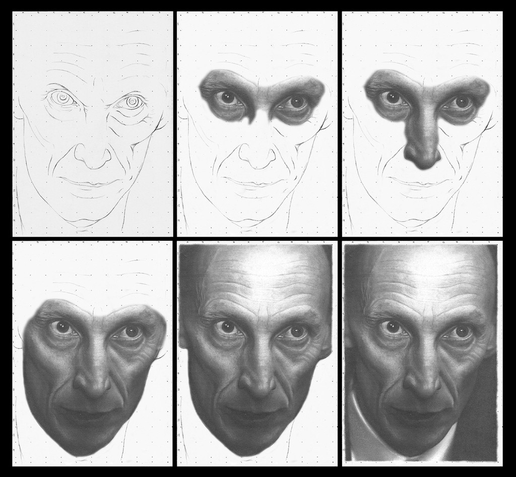
Tutorial Death Supernatural
Julian Richings
Four horsemen
fanart artist
Portrait
Graphite pencil drawing
fredrik eriksson
Tutorial
This tutorial is not going to be about the different steps. That is allready covered in My other tutorials. This one is going to be about advice. And as allways. Everything works differently for everyone. So if you dont like the advice, ignore it.
choose picture after your own Style.
style has nothing to do with genre. Style is your technique. So ask yourself. Are your edges sketchy or smooth. Do you use high contrast, black to white (like Julian Richings Here). Or shades of grey (like My David Beckham). Dont force a picture from one style to another. I Will Link you to My Sean Connery drawing on My blog. On My blog I show alot more old stuff and pictures to bad for deviant. My Sean is one of them. He is a greyscale forced into highcontrast. With a poor result.
How to start shading. The Classic way is to add graphite in the area you want dark and the blend it towards the lighter areas. Another way to do it. You start by adding lightgrey to the entire area. You then add the darkest parts. And in the end you use an eraser to highlight. The last is the way I do it nowdays. I do it because it minimize the white areas. And to me less white often increase realism.
Know your weaknesses. Sounds like a bad cliche. But it is important. My weakness is noses. I dont like them. And I allways know that the nose is going to cause trouble. If you look at My Bilbo you Will notice that I accidently gave him a little straight nose. And on My Gandalf I blended away the edges on the nose in a poor attempt to hide it. Noses are My nemesis. What is yours???
How to get darkness in graphite. I often get the question. How do you get your pictures so dark with graphite? If we first talk about materials. 9b graphite is very dark. If you Put it on a poor quality schoolpaper with a soft surface. And blend it with the blender you have used for ten years. It becomes very dark.
But I think it also comes down to How and were we Apply the dark. By making an entire picture dark except for a white reflex in the eye. Makes the white appear whiter than the paper and the darkness darker than it actually is. Dont forget that drawing is about fooling the minds eye into thinking that the drawing is real.
sharpen your pencil. A thing I constantly nag about on My students in school. Skarpen your pencils. It can make the difference between a good beard and a great one.
170g A4 (cheap schoolpaper quality)
The tools:
2B Mechanical pencil for grids and outlines
6B-9B Cretacolor Monolith Graphite Pencils
graphite stick
A package of erasers sharpened in all different shapes
and eraser pen
Blender and cotton sticks.
Related content


Comments: 12

Oh interesting that you greyscale then highlight by erasing. I've tried that but never been very successful - everything just came out looking kind of grubby. Your drawings are both fascinating (thanks for showing your steps) and impressive likenesses.
👍: 0 ⏩: 1

I use poor quality paper and erasing causes it to tear! The tear is not grey by the pencil! But the negative part with poor quality paper is that you can't control the grains! But that is also what makes the drawing look vintage and charming! 😉👍
👍: 0 ⏩: 0

I've always admired you photorealists: you're so skilled. You know the secrets how to make drawings that look like photographs at the first glance; it's simply amazing...
👍: 0 ⏩: 1
You just made my day!
Thank you very much for your kind words!
 (Smile)")
👍: 0 ⏩: 0

Cool! I can't figure out how to do realism yet, the step by step helps and I think it looks neat as well.
👍: 0 ⏩: 1
You made me happy!
thank you very much!
👍: 0 ⏩: 0

I always find it fascinating to see how people create their art. Most artists I've seen are so methodical and organized like yours- I marvel at that! When I draw, I tend to work the whole piece with no concentration on one area at a time. I know there are no right or wrongs to how one creates but I have to say that that technique is something that I've always admired! Thanks for the Tutorial and the tips!
")
👍: 0 ⏩: 1
Thank you very much for the support!
👍: 0 ⏩: 0

Thanks for the tutorial, i will give it a try, excellent drawing by the way
👍: 0 ⏩: 1
Thank you very much!
👍: 0 ⏩: 0

I still can't understand how you with mere pencils can make your things look as photorealistic as they do.
It's amazing.
👍: 0 ⏩: 1
Thank you very much for your kind words!
you made me happy!
👍: 0 ⏩: 0