HOME | DD
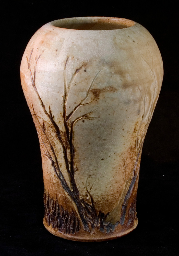
 Frost-indri — Tree vase2

Published: 2006-01-23 00:45:50 +0000 UTC; Views: 919; Favourites: 25; Downloads: 20
Redirect to original
Description
Reclaim and cone 6Another attempt at drawing trees on clay. I've decided that thick dark teal glazes aren't the way to go with the trees. Maybe thin, but not thick.
Related content


Comments: 29


Hi,
I have featured this piece of work in my article: [link]
Please check it out, and maybe love it? 
")
👍: 0 ⏩: 1

Thanks.  (Smile)")
👍: 0 ⏩: 1

Very nice, I think the thick glaze at the top makes it a lot more interesting...
👍: 0 ⏩: 1

This is an amazing! I like how the glaze is sort of sloppy, I think it adds to the piece a lot.
Beautiful work
👍: 0 ⏩: 1
Thanks.
 (Wink)")
👍: 0 ⏩: 1
Oh yes, I absolutely agree with that. I am having trouble breaking away from the comfort of just doing a smooth glaze on my projects, but I love the look of uneven and varied textures so much more.
You're very welcome!

👍: 0 ⏩: 0

The colors are fantastic, and the tree and the texures you added are really cool!
👍: 0 ⏩: 1


Thank you very much.
👍: 0 ⏩: 0


Got a couple more on the way. ^_^ Probably have them ready in about 2 weeks.
👍: 0 ⏩: 0

Thank you. And nice quote about China. :}
👍: 0 ⏩: 1

haha no prob and thank you.
👍: 0 ⏩: 0

I like it
👍: 0 ⏩: 1
Thats exactly what I thought too. I was going for a gradient, but... meh, it's glaze. *shrugs* I'll try again. ^_^
👍: 0 ⏩: 0