HOME | DD
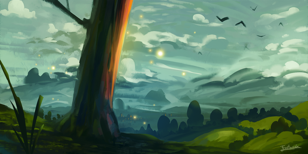
 Frostwindz — Draw This Again - Sakura Tree

#2014 #2015 #again #clouds #colorful #draw #gras #improvement #meme #progress #sakura #tree
Published: 2015-07-25 19:17:32 +0000 UTC; Views: 3657; Favourites: 78; Downloads: 18
Redirect to original
Description
I finally remembered to upload this xDYou can see original artworks here:
2014
2015
Related content


Comments: 19

the second one literally makes me feels sad looking at it
👍: 1 ⏩: 0

This is a very interesting development. With most "Draw This Again" submissions, there is a unanimous recognition of what the old artwork is and how it changed to the new artwork. With this piece, I don't think it is that clear. If you didn't put the years below the drawings, I would think that the 2014 drawing would be the new one and the 2015 drawing is the old one. I think this mostly has to do with the expectation that any new artwork that an artist produces will be automatically more detailed than the previous one. You rarely see artists go from high detail art to a more minimalistic approach.
I feel that the 2014 drawing has more "flashy" details (butterflies with bloom effect, stylized hanging lantern, kite that is blown away by the wind, cloud design) with an "energetic" color palette (brighter colors, high contrast). The 2015 drawing has more "subtle" details (the tiny blades of grass, shading of the tree trunk) with a flatter and more minimalistic art style. Both drawings are beautiful, I think the biggest improvement in your new drawing has to do with focus.
The 2014 drawing had so many things going on, it is difficult for the viewer to determine what is important in the painting (is it about a sunset, magical glowing butterflies, weird cloud formations, hard wind gushing through a field, someone who lost their kite, a mystic lantern that is not affected by the wind). The artwork raises more questions than it answers. The 2015 painting on the other hand has a more focused tone, it seems to convey solitude and peacefulness. There are no unnecessary details that obfuscate the core message.
It feels that the 2014 artwork is a showcase of skill, where you try to cram as many beautiful effects in the painting as possible. The 2015 artwork on the other hand is less flashy and seems to be lacking any visual effects. This makes the 2015 artwork appear less interesting to some viewers.
The 2015 artwork does have one great improvement over the 2014 artwork: a more focused tone.
👍: 0 ⏩: 0

The first (2014) represents happiness, excitement, and things going way too fast. It also has a youthful, adventurous vibe. While the second (2015), has more security, contempt. Maybe even sadness. It's much more still, tranquil, quiet, serene and peaceful.
(all imo)
 (Wink)")
👍: 0 ⏩: 0

Feels like you've gotten worse if anything, just giving you my honest opinion don't kill me! ")
👍: 0 ⏩: 0


Both seem like they were drawn by completely different people. The newest one has less details than the old one. Nice job on both though.
👍: 0 ⏩: 0


I like the left one. Had it on my wallpaper for weeks
👍: 0 ⏩: 0

Ah; it's brilliant to see not only an improvement in skill, but that drastic change in style, also! I love the interesting shapes and angles in your latest piece. Both are very stylish, though.
👍: 0 ⏩: 0

the differences between the two images actually say quite a lot! Beautiful, as always.
👍: 0 ⏩: 1

This is amazing. It's almost like a timeline.
2014 seems like a stressful year. The tree is bending under the weight of the storm and the kite is being swept along
The 2015 picture shows that the tree survived the year and grew stronger to withstand the winds. However.. everything is calm.
This is beautiful. One of the best "draw this again" memes.
👍: 0 ⏩: 2

and this is one of the best comments i've read on deviantart
👍: 0 ⏩: 0

Thank you! I'm really glad you like it ^^
👍: 0 ⏩: 1
It's gorgeous <3
Both styles are.
👍: 0 ⏩: 0

These are quite different from each other, and both look great. It seems that the tree grew. The first image is energetic, with all that wind, and all those bright colors! On the second, the wind is more calm, and the tree shaped to the left because of it. The colors are smoother, and greyish. Great style development
 (Smile)")
👍: 0 ⏩: 1
