HOME | DD
 FrothingLizard — A once-in-a-lifetime-offer
Published: 2011-10-25 20:26:18 +0000 UTC; Views: 3095; Favourites: 83; Downloads: 31
Redirect to original
Description
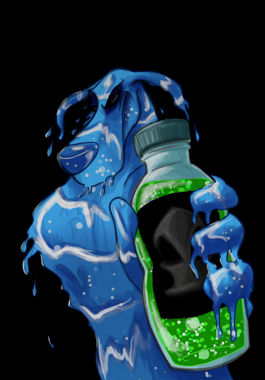
Please, DON'T fave without commenting, I really need some critique and a few thoughts.I plan on colouring this when I return - I really should get back to packing my bags... But I'd much prefer drawing

Edit; In colours.
Related content


Comments: 70

Fantastic redesign! very imposing and evil. There's a real feeling of malevolence here.
👍: 0 ⏩: 1

Thanks - 're-designing' has been so much fun, I'm thinking about trying with some of the other canons to.
👍: 0 ⏩: 1
has been making redesigns like this for a while. You might like his work.
👍: 0 ⏩: 0

To echo the sentiments of others, reeeally like the style used here, particularly the sharp angles used around the head and the shading near the eyes. It brings out a very sinister quality in the character. I also really love the exaggeration of certain physical attributes, like the thicker neck and barrel chest -- if anyone in the Fearsome Five has the potential to be the 'muscle' of the group, at least appearance-wise, it's Licky. Plus, the foreshortening used on the hand and bottle is very well done -- not awkward at all. The most technically difficult aspect of the drawing to pull off would definitely be said hand, but it looks pretty solid to me.
I think the only thing to really pick at (and it's not immediately obvious) is the absence of his other arm, but that's not really a big deal, since at this angle it could conceivably be hidden by the rest of his body.
👍: 0 ⏩: 1
Yeah, I see what you're saying about the other arm - I really just couldn't draw it without making it look awkward... So let's just pretend it has been merged into his body

👍: 0 ⏩: 0

My God, he looks so epic in this picture
👍: 0 ⏩: 0

Honestly; I just like the look you gave him. Liquidator seems to look more like water in your work here then how he was usually animated/ drawn in the series impo. :3
👍: 0 ⏩: 0

Alright, THIS is the first time I think I've ever gotten the chills from Licky, I love the way you made the water drip, I've never been able to get the hang of making something actually look "wet" or "shiny/glossy" but this does it wonderfully. Personally, I love this the way it is but since you say you're going to, I can't wait to see it coloured!
👍: 0 ⏩: 1
I hope to get it done asap - thank you
 (Smile)")
👍: 0 ⏩: 0

Again - I LOVE your sinister take on Liquidator. Usually he's not that intimidating to me, but your rendition IS pretty scary! Great job!
👍: 0 ⏩: 0

Very cool. I'm not sure I can say anything that hasn't already been said. You draw an intense, believable, sinister Liki.
👍: 0 ⏩: 0

Wow, I REALLY like the style of this. It reminds me of a darker, more mature version. His snout is sharper, his eyes look more piercing and evil.
Favourite part is definitely the water though. The way it's dripping off his hands and body. I can't say I have any huge critiques other than his left eye seems kinda off when it's closed that far compared to the right. It gives him a slightly lopsided expression.
👍: 0 ⏩: 1
Yeah, you're right about the eyes though - the left one was supposed to have the eye-brow half covering it up, but it sort of just makes the right eye look really odd - I hope to fix it thought
And thanks.
👍: 0 ⏩: 0

I can't stop staring at that hand. It's amazingly well done and so... so... liquidy. XD;
And yes, he does look quite sinister. Is it my imagination or is that because you seem to have given his head shape a more angled look to it? Maybe no, but either way it looks great.
Aw, though. How could you not trust that honest salesman's face?
👍: 0 ⏩: 1
Hopefully it'll look better once I get him coloured
 (Wink)")
👍: 0 ⏩: 0

OMG this is... scary ")
👍: 0 ⏩: 1
He does have the potential for being SUPER-CREEPY if you ask me - sort of like the terminator in the second movie

👍: 0 ⏩: 1
Aaaand now he's all coloured and eviller. Good for ... you...?
👍: 0 ⏩: 0

Great job on Liquidator! Can't wait to see the colored version.
👍: 0 ⏩: 0
<= Prev |