HOME | DD
 Frozen-song — Quinteto Fenix BA7
Published: 2013-05-27 01:21:30 +0000 UTC; Views: 1597; Favourites: 31; Downloads: 0
Redirect to original
Description
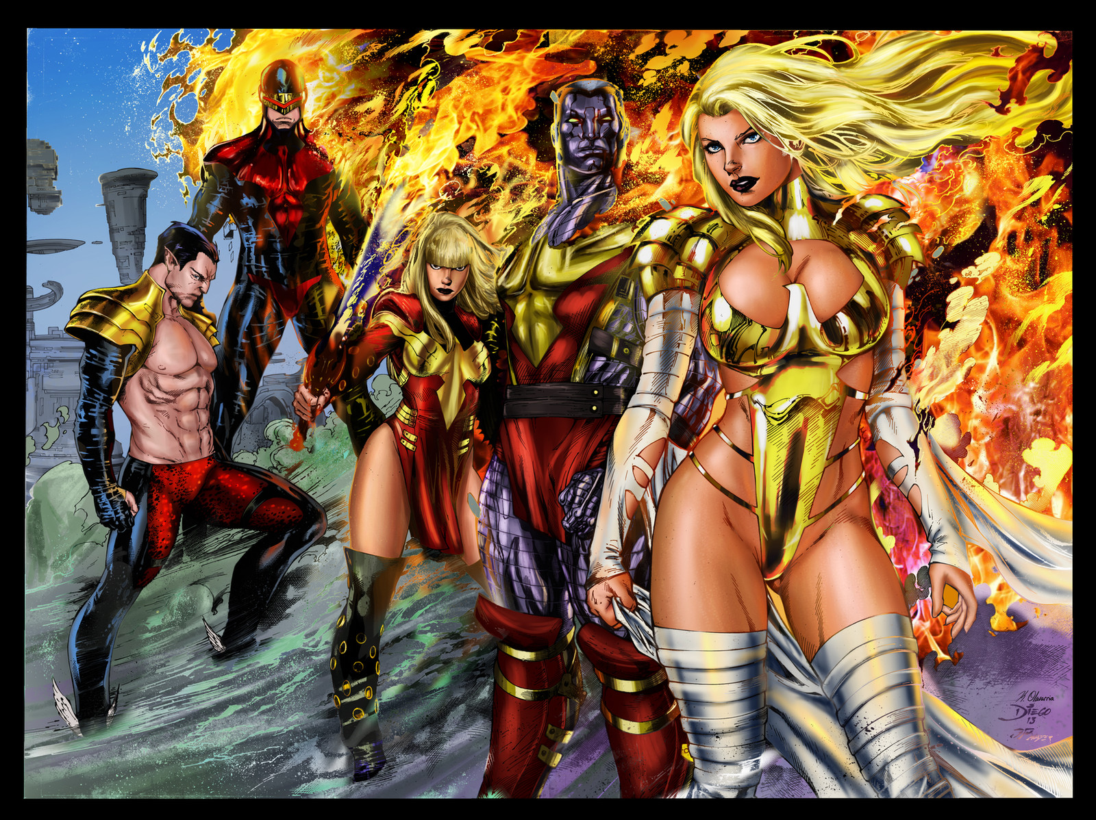
Colored forPencils by :
Inks by :
Flats by :
Colors by me
Edit: just the fire from the lineart was selected and copied to another layer, it was colored yellow and red. I duplicated the lineart layer and set it to screen and added final touch-ups.
I also repainted the reflection off the mens outfits. Hope this looks better.
Related content


Comments: 25

Oh my gosh, that's such a huge compliment, thank you!
👍: 0 ⏩: 1

You're welcome! My compliments to the pencilled and inker as well. The combined effort is DEFINITELY professional grade!
👍: 0 ⏩: 2
^ ^ The colors would have been a train wreck if it wasn't for the the wonderful flats. ;v; The comic style is hard to get use to.
👍: 0 ⏩: 1
Yes it is! And honestly.... I SUCK when it comes to adding color to my artwork! I'd rather just do all the pencils and/or inks and let someone more talented than me handle the colors. Speaking of such, do you think you might be interested in adding color to some of my pieces?
👍: 0 ⏩: 1
I'm a little backed up with artwork I want to finish right now so I can't really say I could color your pieces anytime soon, but i'm interested. Is there any piece you would like to see colored?
👍: 0 ⏩: 1
I'll send you a note later.
 (Smile)")
👍: 0 ⏩: 0

do you realise that this is you 100 th submission ?
👍: 0 ⏩: 1
")


nice work here. i dig the colour change ups on the ground and the way you handled namor.
I like what you've done with the skin and steel textures, you seem to be developing a good handle on your textures
I like where you were going with the fire, but I think if you're going to go with photoshopped fire like you have (and that you've recoloured the inks accordingly) I think your line holds on the inks need to be a whole lot brighter.
Right now the yellow inks look messy against the fire.
Again, while I like the direction you were going in with the fire, you would have a much stronger piece if you had pulled the fire out more - made the flames bigger.
The black edges at the top of the fire really are not working for you.
Hope that helps and best of luck in your battle
👍: 0 ⏩: 1
Your suggestion helps tremendously, thank you!
👍: 0 ⏩: 1


Looks like everyone is ready to kick some butt!! Loving the fire in the background
👍: 0 ⏩: 1
Thank you! This piece was inspirational
👍: 0 ⏩: 0
Ah, thank you, i've been studying like crazy about color theory.
👍: 0 ⏩: 1

Thats awesome. Keep up the great work!
👍: 0 ⏩: 0
