HOME | DD
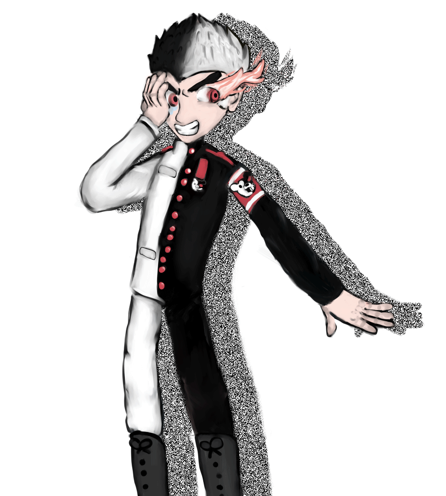
 fuchsiasquid — Mastermind Ishimaru
Published: 2013-04-21 15:44:35 +0000 UTC; Views: 1528; Favourites: 17; Downloads: 2
Redirect to original
Description
One of my favorite AUsRelated content


Comments: 16

Look, buddy, I know people will constantly tell you that drawing hands is incredibly impossible and all that stuff but it's not like you don't have two references for them at all times. Just look at your own hand and don't rush it. Also,when it comes to doing the "airbrush" style, just forget about outlines. Please slow down when doing the buttons. Only two of then are appropriate distances from each other. As for the flaming eye, that's going to need some serious work. It looks like a shark or a wolf's tail.
👍: 0 ⏩: 0

Hello ")
First off I want to start off by saying that this is really expressive- the facial expression really conveys the emotions of the character. this is really important, because an artists can be amazing at drawing, but can't express emotions, and this, I find, is quite offputting.
However, there are things to work on. I know this is a cartoon, but it still needs a certain grasp on real life. The anatomy every artists worst enemy could do with a little more work. For example, the arm on my right (the character's left arm) is thinner at the beginning than it is at the end, which isn't usually found on humans. Of course, maybe the sleeves are just wider at the end than they are at the beginning, but in this case this would need to be expressed through folds to make it clear. Which brings me onto my next point; folds. I can see that there are quite a few folds that your coloured in, which is great, but there would be a lot more than this (especially where the extra material would gather around the boots). In terms of the anatomy of the face, then the hairline looks a little too low down.
Don't let any of this put you down, though. This is a lovely picture, and I think that the animation adds to the emotions conveyed in your picture. :'D I hope that this critique is useful, and that I haven't been harsh.
👍: 0 ⏩: 1

OMG THANK YOU FOR THE CRITIQUE
NO IT WASN'T HARSH AT ALL YOU'RE REALLY HELPFUL!!
i hate it when people think that if you point out the flaws in something while they're critiquing it that means they're being mean.
but seriously, thank you! I've already gotten this feedback before, and over the past few days i've been doing nothing but anatomy studies.
thanks again!
👍: 0 ⏩: 1
I'm glad it's helpful ;v;
awww >W< I don't know. I just feel like I'm putting someone down when I critique.
anytime
you've gained a watcher
👍: 0 ⏩: 1

Hello! Here's a few things I thought I'd critique/comment on:
-The thickness of the limbs aren't even/proportional. Limbs are generally thicker near the joint than near the end of the limb, rather than how you've drawn the limbs here. (For instance, the arm on the "black" side begins narrower, then widens nearer to the hand, when it should be the other way around.
-The crotch/hips of the character isn't thick enough. Hips are almost always (if not always) thicker than the legs combined. I suggest drawing wider hips to make the body more proportional. Also, remember that there's space between the legs! Legs don't just join together at the crotch (haha), so it would be good to leave a little more space there.
-The hands. They're a good start (it's good that you put joints in!), but I would suggest using references to make them even better. For instance, for the hand on the "white" side, the fingers are a lot longer than the palm, but in reality, fingers and the palm should be about the same length.
I hope that this helps, and I'm sorry if I sounded harsh!
Also, I would really appreciate it if you could critique me back (you don't have to though)! C:
👍: 0 ⏩: 1
NO NO ONON ON ONON ON ONON ONO ONON ON ONTHAT ISNT HARSH THANK U
ACTUALLY ITS NOT HARSH ENOUGH OMG
THANK U FOR THIS THO!!!! ANY LITTLE HELP AT ALL IS GREAt!!
oh man but still thanks a bunch! i'm definitely keeping your advice in mind, especially on the anatomy/hands and stuff because hands are still an enigma for me and knowing that i've started well on it is good omg
i'll give you crit back definitely bro!!! ;u; sorry but im only really good on critiquing coloring and only lik MAJOR anatomy errors so sorry if thats not what u need
im going to bed now, so i'll crit one of ur works tommorow then!!
👍: 0 ⏩: 1
Hahaha, I'm glad to have helped!
And thank you! I would greatly appreciate any critiquing! C:
👍: 0 ⏩: 0

Ok I have a few things I'd like to go over:
1. You have some stray color brush strokes at both arms.
2. I also suggest showing depth in the clothing instead of it being seemingly tight, not that that is bad but a little extra cloth around the neck or sleeve cuff would give more depth.
3. Given his position I believe the legs would benefit from some folds.
I did a quick redline of some of the things that struck me: his arms are a little too long If you stand up they are generally fingertips below your waist. I would suggest the most hated word but references are great tools!
Here are my redlines and a photo of me in that position as reference
[link] -redline
[link] -and here is me attempting the pose
Overall I foresee many great work in your future
 (Smile)")
👍: 0 ⏩: 1
OH MAN THANK U Y OS MUCH HF H
I LVOE YOU
I LVOE SYO USO MUCH
THNALK Y OUFOR THE CRITIHCQUE YOU ODNT KNOW HAOVW LONG IVE WANTED OWNE YOU BEAUTFUL PERSON
TANK YOU HTANK TY OU THANK YOU THANK YO UTHANK YOU THANK YOU THANK YO UTHAN thank yyou thank you so much i appreciate the critique omg also thanks for the reference i really need those!!! omg just thanks a bunch
👍: 0 ⏩: 1
It's been a while since a gave a critique but I'm getting back into the swing of giving it.
I learned early on compliment sandwichs are bad. It doesn't help in reality. Just politely go over what needs to be touched on. And then build them back up with the knowledge I gave them coupled with their natural talent to be great after some practice because that's all it takes. I promise
👍: 0 ⏩: 0

While I like the artwork, I have to confess I don't see the reason for the animation. It seems to be animation just for the sake of animation.
Animation should be used to add to the image, and here I feel it subtracts; or rather, it distracts.
👍: 0 ⏩: 1
thank you!
but i disagree, i like the animation on here. but i'll keep your advice in mind next time.
👍: 0 ⏩: 0
I'M VERY SORRY BUT THERE IS SPAM ON THIS. PLEASE DO NOT FOLLOW THE LINK MR. DIEDREMIOS91 HAS POSTED. IT CONTAINS SEXUALLY EXPLICIT CONTENT AND POSSIBLY VIRUSES.
👍: 0 ⏩: 0