HOME | DD
 FudgeX02 — Parkour! Process Animation

#bodybuilder #fmg #muscle #musclegirl #musclewoman #muscularfemale #massivemuscles
Published: 2021-01-14 07:24:26 +0000 UTC; Views: 42807; Favourites: 128; Downloads: 28
Redirect to original
Description
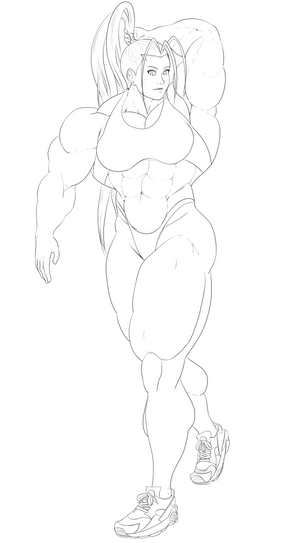
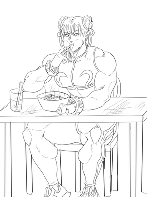
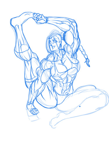
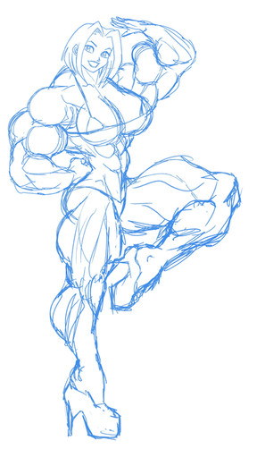
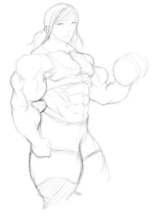
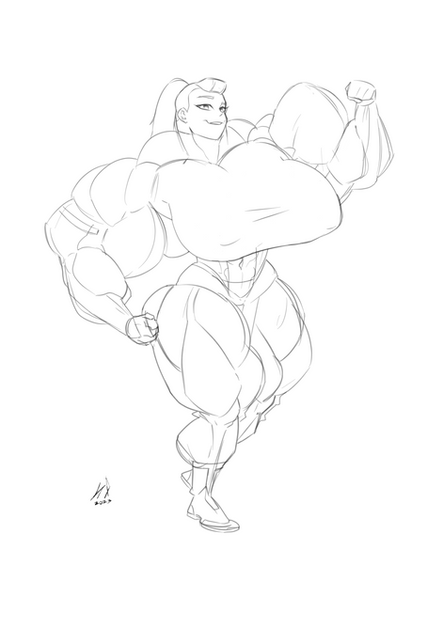
I made this and then noticed that it's got serious "Draw the rest of the owl" vibes. Oh well. Kinda tutorial, awaaaaaay~1: Sketch/Frame Usually I split these into two steps, but sometimes they blur together depending on the pose. Draw a rough, rough sketch for the body, almost detail-less besides the basic shapes for the body and head. That's the "frame". Then, draw the face, clothes, and add more detail to make sure the body is lined up properly and the anatomy holds together. That's the "sketch". Depending on how I approach the sketch, it can be really clean like lineart, or rough like this. Usually if I'm going to color it, the sketch is rough because I want really fine-tuned lineart for coloring. For this one, the pose has a lot of slight bends and curves, and a lot of bulk, so most of the frame is gone after corrections were made for the sketch. (I erase the frame as I make the sketch if it's too far off because it messes with my perception of the drawing.)
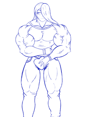
2: Lineart Yay this one is easy to explain! Go in, decide exactly what your lines are, and draw them! No fuzzy lines, no wiggles, no back and forth over a single line, just precision.
3: Lineart Addition I lied. The lineart isn't the lineart a lot of the time. There's a bunch of little points where you can thicken lines or add little, tinier lines to make the lines *pop* on certain points that you want to draw the eye to. Remember, if lines intersect at a point, your eye will naturally be drawn to them, so increasing that density at certain areas that look flat can quickly take it from "flat" to "dynamic" with very little change! Very high density next to empty space is especially eye-catching! Pizzazz.
4: Flat Colors Weeeee the part that is secretly hard or easy depending on your intuition and understanding of color theory! So, it sounds easy right? Just hit the bucket tool, make a separate layer for each general color/material, fill, fill, fill, you're done. Nope. Gotta match those colors. If you pick a bunch of grey-ish tones and then pick a highlighter-shade of green, you're gonna end up with a surreal color space. Awesome if that's what you want (like you want glowing eyes in a dark scene), but absolutely terrible if you want a color space that doesn't look like an acid trip. This is a rule in VFX that makes some CGI look like ass when it's broken (movie Sanic violates this-he's too saturated), and can make or break your coloring job. Pick reasonable base colors that are similar in warmth, saturation, and brightness while still matching their material! (Vantablack is fun because it has no brightness, which is why it totally breaks your perception of it in real-life. It doesn't match anything in a brightly lit area and looks impossible.)
5:Shading Draw the rest of the fucking owl. xD Pick a lighting source/sources in your mind, decide the final color space (Is it bright? Dark? Is the light green? Muted? Super saturated? Etc), and start imagining your subject as a 3D object. I personally add the lightest shading tone first, then the darker one, then the highlights, then the shadows, and then add more saturated colors into any areas that got too "flat" looking from my shading. I'll shade whatever makes up the bulk of the subject first (in this case, the skin), and then let that dictate how everything else is shaded so that those parts match the "main" part. This is also where I decide on what the materials are. Different materials have different ranges and responses to light. Metals get really dark and really bright. Fabric doesn't change in brightness too much. Skin is all over the place depending on how smooth/young/wet/dry/sunburned/tanned/sick/hot/cold the person is, so there's a whole bunch of decision making to go there. Too much to cover. : P I never just pick darker shades and work with that, or just make things more grey. Usually things will get darker and more saturated, and then get even darker and less saturated, all while changing the base color slightly. For example, the skin is in a yellow-orange base, but the shaded parts have more red in them. Shadows will tend to push towards the purple/blue hues in a warm scene if they maintain any saturation.
6: Background Sketch Woo let's start again! Frames! Sketches! Bob Ross-style big decisions! What is this world?!!?!? xD
7: Background Lines Time to set things in stone, but for the background elements. Big thing to keep in mind here is not to make your background dominate your subject. If you're making an HR Geiger monster out of your background, maybe try to make sure the lines still lead you to your subject instead of making things into a big ol' cloud of lines or accidentally making the corner of the image your focal point. All roads lead to Rome, and Rome is your subject! (Again, I'm oversimplifying.) Also, side note: I'm trying to study city scenes. If I had infinite time, I could draw a cityscape, but I don't. The tricky part is that I'm not quite sure how to drop the information density properly. Cartoons are all about knowing what the real thing looks like, and then removing detail until you have your cartoon version, but there's so, so much information in a cityscape that I'm not sure what is and is not okay to remove...T_T
8: Line Addition Speaking of information density, the lineart looked waaaay too flat and empty this time. I tried to correct that with more linework, but not lines that give shapes. Instead, I wanted lines that give character/noise to increase the perceived activity of the scene while working with the lighting in some elements.
9: Background Flat Colors Try to match your subject's color space. Remember that things far off in the distance have atmospheric effects, meaning they're usually kinda whiter as they get far out, and the resolution and detail of the far away stuff should decrease. Close objects have more detail, far objects have less detail.
10 and 11: Lighting Effects Normally I'd say to pick out each and every color for your shading, because that's usually how I approach coloring...but this space is complicated and I'd be here for months painting. So, we get the cheapo method: Linear Burn (not Multiply, LB respects your different hues more without making things grey) and Overlay! Fudge around with the lighting to try to make the space look better, and then quit because we're not architecture students or concept artists and Fudge has a big hole in his education!
-------------
Commission Info: www.deviantart.com/fudgex02/jo…
Comic "Work-In-Progress" about my character Lilly is available here! fudgex02.e-junkie.com/
Full Resolution, Sketches, Lineart, and Monthly Exclusive Art available on my Patreon! Commissions too through Patreon or DA! www.patreon.com/FudgeX02
I'm on Twitter finally! twitter.com/FudgeX02
Related content
Comments: 10

👍: 1 ⏩: 0

👍: 1 ⏩: 1

👍: 0 ⏩: 0

👍: 0 ⏩: 1

👍: 0 ⏩: 1

👍: 0 ⏩: 1

👍: 0 ⏩: 1


