HOME | DD
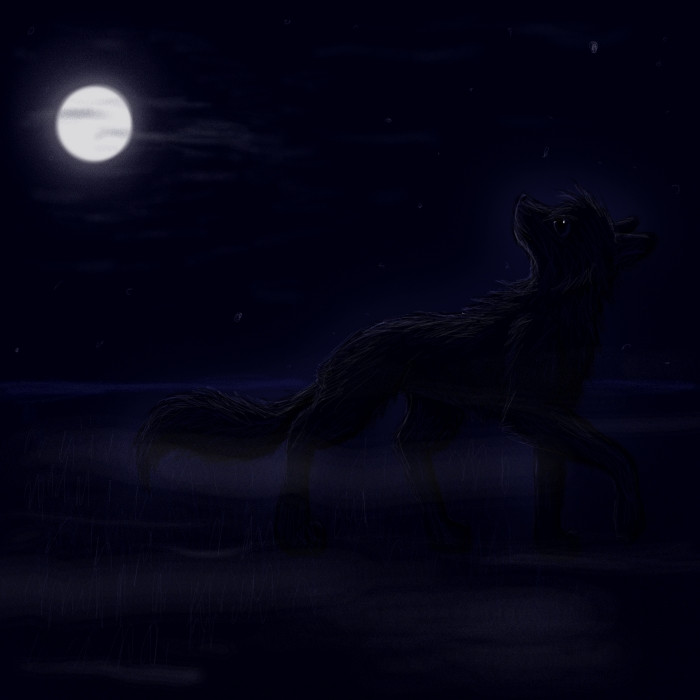
 Funest — Night
Published: 2007-07-05 21:27:31 +0000 UTC; Views: 356; Favourites: 7; Downloads: 2
Redirect to original
Description
Made from an old sketch, I'm not sure if this is my own pose... D=Update: I changed some things, but there is still not enough contrast and the sky looks weird xD
Related content


Comments: 17

i think its very good ^^ it would look even better if you took the bottom mist off it looks a bit silly there and to make the moon more realistic would make it look perfect XD i though i would just give my opion >< but its very good all together 8 out of 10 keep up the good work i will be watching your work i will be happy any time to give my opion so like i said keep up the good work
👍: 0 ⏩: 1

Thank you very much for your opinion and the watch! ='DD
👍: 0 ⏩: 0


Wow. There are only a few artists who can make a great picture with only a few colors and values.
👍: 0 ⏩: 1
Whow.. *blushes* Thank you for your comment!
👍: 0 ⏩: 1
 (Smile)")

it is soo beautyfull!
w00t can't keep my eyes away from that pixels!


👍: 0 ⏩: 0


I'd say this was a good picture, if I could see it. It's a little too dark to make anything out, even the vauge silhouette. This is the full moon here, there's a lot more light than that coming from a full moon.
Other than that this is a solid pic. A little standard, but wolves and the moon always seem to end up together so I won't argue.
Keep it up and, brighten it just a little bit and we'll all be happier.
👍: 0 ⏩: 1
Thank you vèry much! ")
*starts changing*
👍: 0 ⏩: 1
People seem to be saying that a lot lately. I'm just calling it how I see it. Be glad your art doesn't include a lot of continuity errors. That's more common in writing, but it happens in drawing and painting. I tend to have a mean streak when it comes to outright bad writing or art.
👍: 0 ⏩: 1
Your comments are very helpful.
Ahh, that's not nice Dx
I changed some things, but it still looks so... unrealistic.
👍: 0 ⏩: 1
Realism is okay, but personality is better. Give a picture personality and everyone will love it. That's what I do with my writing, creat a feeling rather than a situation.
👍: 0 ⏩: 0

Very nice! I like the glow of the moon and the kind of mistiness close to the ground! The sillouette (sp?) is also VERY good.
--------
P.S. If you click here I will love you forever!
👍: 0 ⏩: 1
Thank you very much for the detailed comment!
👍: 0 ⏩: 0