HOME | DD
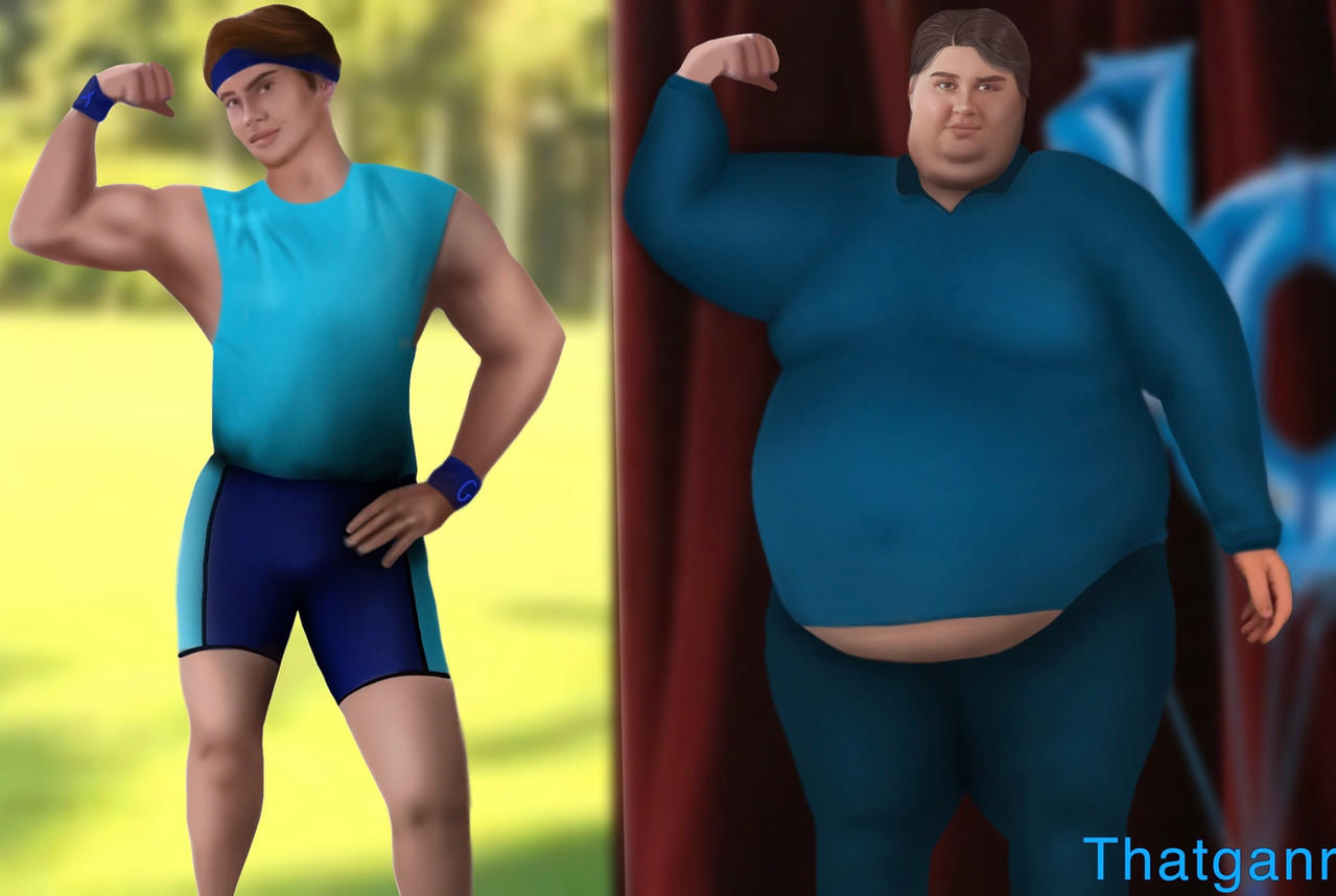
 FUNKYMONKEY1945 — Before and after Workout WIP 3

Published: 2014-01-21 05:36:26 +0000 UTC; Views: 2007; Favourites: 28; Downloads: 84
Redirect to original
Description
Almost doneRelated content


Comments: 12

These WIPs are both hilarious and awesome. Not only does it show the changes in the painting, it shows his physique becoming more defined too.
If only getting cut would happen so quickly haha
👍: 0 ⏩: 0

lol way to similar to my progress photos! (lol I wish)
👍: 0 ⏩: 0

I like how in both versions he looks like he has a mild farmer's tan going on.
👍: 0 ⏩: 0


is this a photo? I don't mean to offend but it looks so photo-like o_o
👍: 0 ⏩: 1

lol no. Wanted it to look like photos taken at home. Like a selfie  (Smile)")
👍: 0 ⏩: 1
WOW!!!!!!!! I WISH I COULD PAINT LIKE THIS!!!!!!!!! *_____* are u a god? ?? ?? ?
👍: 0 ⏩: 2

his artwork is really really good for learning to paint like that, though.
he hides nothing behind glittery and shiny this and thats, or texture overlays or effect-y things… he has very simple and concisely laid down darks and lights, and just a little variation inside each of them. there is nothing in there without a point, there is nothing to make it look extra photorealistic, its just sound drawing and good structure.
i mean, look at the e.honda to the right and squint your eyes a little – he is really just made up of two tones: light and shadow. there is no mushing around between them: all shadows are a certain amount of dark, all the lights are a certain amount of light. nothing inbetween except maybe a little modulation of the edges where they butt against each other. some are harder, some are softer. but that big distinction is the basis that sells the entire figure. it makes it believable, so its important to not mush it down. the variations inside the lights and shadow are just nuances, never overpowering that structure.
they merely tell a little more here or there: the reflected sunlight bouncing off the floor into the downward facing parts of his pecs, making the shadows a little warmer, for example. or slight hue changes telling where the skin is a bit more ruddy or more rosy.
when you look at it carefully, it is a very down-to-basics approach to drawing and painting. its just that he is really good at getting the basics so spot-on to not make us bother about details everywhere.
👍: 0 ⏩: 1
I know it's quite good; I mean, I thought it was a photo at first which is why I asked the question. Thanks for those tips, by the way, I'll be sure to use them in my future paintings. I don't like sparkly shiny either even for anime. The only time I ever use highlights is when I have a light source and I use real colors. I never use dodge and burn.
")
👍: 0 ⏩: 0
Thanks. You give me too much credit. Just mileage and you can do it too
👍: 0 ⏩: 1
Thanks! I hope so too!! I look at historical artist like micheal angelo and leonardo davinci.
")
👍: 0 ⏩: 0