HOME | DD
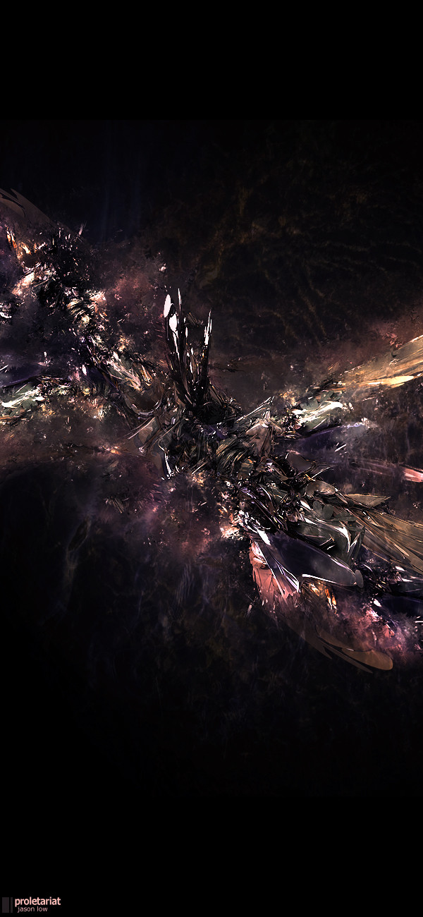
 Futurisk —
Sunset
Futurisk —
Sunset

Published: 2006-02-20 13:09:37 +0000 UTC; Views: 70188; Favourites: 406; Downloads: 9067
Redirect to original
Description
Futurisk serving KonvulsePack1 :: Delirium
[link]
[link]
[link]
Related content


Comments: 103

 (Wink)")


Dude this outta control.How in the hell did you do that? Wow..
👍: 0 ⏩: 0


")
")

this is an awesome piece...love the shape and the colors
 (Smile)")
👍: 0 ⏩: 0


iT´S CERTANLY ONE OF THE BEST WORKS I HAVE SEEN AROUND:::::::::::::Congratilations::::::::
👍: 0 ⏩: 0


materials are very apropriate for the environment, but as far as critique goes, work on your typo
props again on dd ;D

👍: 0 ⏩: 0


OMFG GRATS ON THE DD FAZEN ITS ABOUT DAMN TIME RIGHT!
I do feel that you've made pieces more deserving than this though.
👍: 0 ⏩: 0


thats so cool!! and WoW and simplified would make a stunning tattoo. i mean the... may i call it a Robotronic wave? again WoW
👍: 0 ⏩: 0

Very lovely, the red glow on the left looks more like the glow of a fire than it does a sunset though... Ah well, who cares! It rocks! Thumbs up to you my man!
👍: 0 ⏩: 0

Wow...

👍: 0 ⏩: 0


I really love the colors and perspective - nicely done!
👍: 0 ⏩: 0

There's certainly a problem with the blending, it just doesnt fit, i mean the background and the object. Just my 2 cents.
Brilliant choice of colors though.
👍: 0 ⏩: 0


ok, that is the sexiest thing i have seen this whole week.

👍: 0 ⏩: 0


Wow. Really impressive. The wood texture distracts a bit but else is just fantastic.

👍: 0 ⏩: 0


Really Beautiful, in a way it reminds me of Susan Sedon Boule (I think that's how you spell it.) Gorgeous piece!
👍: 0 ⏩: 0


COOOOOOOOOOOOOOOOOOOOOOOOOOOOOOOOOOOOOOO OOOOOOOOOOOOOOOOOOOOOOOOOOOOOOOOOOOOOOOO OOOOOOOOOOOOOOOOOOOOOOOOOOOOOOOOOOOOOOOO OOOOOOOOOOOOOOOOOOOOOOOOOOOOOOOOOOOOOOOO OOOOOOOOOOOOOOOOOOOOOOOOOL
(not spam)
thats so awesome!!
XD
--
👍: 0 ⏩: 0


It was all because I wanted to match the skill of the other KV designers.
")
👍: 0 ⏩: 1

| Next =>