HOME | DD
 FuyusFox — Rainbow Power - Twilight Sparkle
Published: 2014-06-20 16:30:42 +0000 UTC; Views: 4130; Favourites: 201; Downloads: 0
Redirect to original
Description
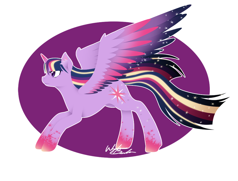
Alright, last of the mane 6 is done! I didn't have any issues with Twilight's base design, so a lot of the changes for Twilight are just additions.Low res once again due to future plans and possible changes.
I think Twilight's design was my favorite overall as far as colors. There was only one color added to her palette but the way they used it was pretty nice. But of course, NOT ENOUGH STARS /shot
Also, I've figured out what i'm doing with the backgrounds, I'm in the middle of editing them at the moment.
Just one more left. :3
Let me know what you guys think, and as always, enjoy.
Updated Post: fav.me/d7p0j94
More Rainbow Power:
Applejack: fav.me/d7mr31k
Fluttershy: fav.me/d7mlswt
Pinkie Pie: fav.me/d7mjll6
Rainbow Dash: fav.me/d7n12ab
Rarity: fav.me/d7mvtxf
Spike: fav.me/d7qaorp
Vinyl Scratch: fav.me/d7npflq
Related content


Comments: 11

I love how she looks so determined in your style, but also looks like colors are better too in my opinion. You did great work on her!
👍: 0 ⏩: 1

")


I agree, Twilight's Rainbow Power design was the best. The yellow actually works well with her, it's a nice contrast from all the purple.
Amazing work yet again!
👍: 0 ⏩: 1

Yes. Simple is sometimes best and it really did work out with Twilight. Some of the others just had a bit too much on them.
Plus the whole yellow/purple contrast is perfect given they are exact opposites. So overall her design was just a big color theory YES.
And thank you, once again! : D
👍: 0 ⏩: 0

i like how you changed up the designs a bit, and i think your edits make them look a lot better
👍: 0 ⏩: 1