HOME | DD

fuzzyzebra — GradNite Booklet

Published: 2007-10-30 12:40:55 +0000 UTC; Views: 3840; Favourites: 37; Downloads: 131
Redirect to original
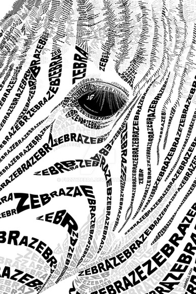
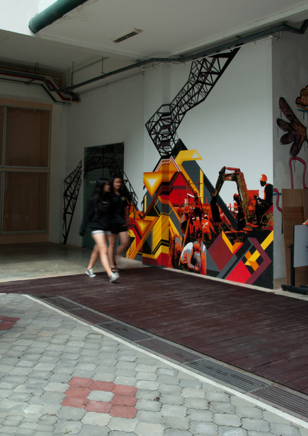
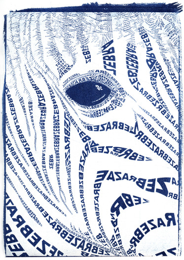
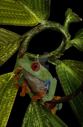
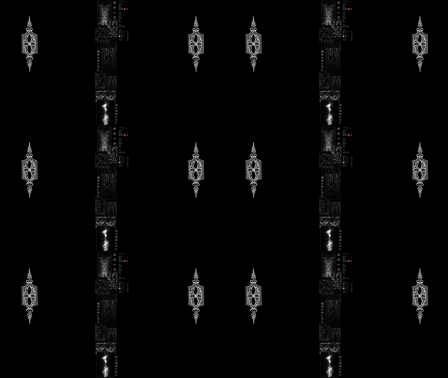
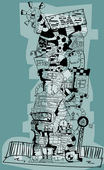
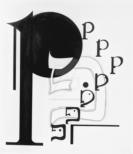
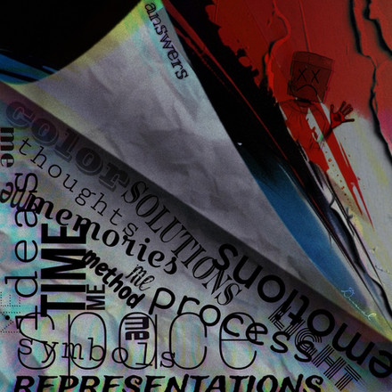
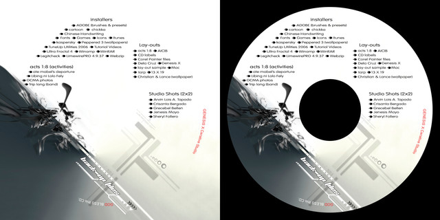
Description This design marks the transition from Raffles Institution to Raffles Junior College. Gradnite in 6 days! oooh!

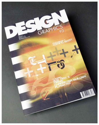
These are the souvenir booklets, given to everyone on Graduation Night!

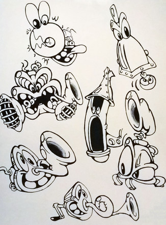
I hope it looks like someone's blanko table-top doodling - I was trying to achieve that look!

edit: new presentation and pictures
Related content
Comments: 22

chyropractor [2011-01-16 15:25:47 +0000 UTC]

awsome! ^^

👍: 0 ⏩: 1

fuzzyzebra In reply to chyropractor [2011-01-17 12:19:27 +0000 UTC]

👍: 0 ⏩: 0

AhmedGalal [2008-10-31 15:28:05 +0000 UTC]

nice work !

👍: 0 ⏩: 0

SirGrunt [2008-08-11 01:06:25 +0000 UTC]

Nice work.

👍: 0 ⏩: 0

thehinkydonut [2008-03-04 15:51:53 +0000 UTC]

wow, awesome!!

👍: 0 ⏩: 0

kinonotabi [2008-02-18 07:39:03 +0000 UTC]

dang cool man. (:

👍: 0 ⏩: 0

PersAbsynthFaerie [2007-12-20 12:41:01 +0000 UTC]

oh, and, to really sneak in a subtle yet highly effect technique; vary the width of your lines!! This is awesome like it is, but the subtle use of varied width makes a huge difference between a lovely piece, and an amazing piece that you can stare at for hours!

👍: 0 ⏩: 1

fuzzyzebra In reply to PersAbsynthFaerie [2007-12-20 14:09:47 +0000 UTC]

noted! tyty! =]

👍: 0 ⏩: 0

PersAbsynthFaerie [2007-12-20 12:38:53 +0000 UTC]

Very nice! I love how you drawn and shaded the central element, with all the supporting elements not in as much detail in the background. It's very well composed and I love the drawings, you pulled off the idea well! Would be nice to see a splattering (not necessarily literally) of colour. Just one thing shaded in any colour of your cjoice. Has to be a very bright colour though. Red is the designer chic colour of choice with black and white, but atm the trend for the 'trendy' designers is highlighter colours bright baby pinks and oranges etc

👍: 0 ⏩: 1

fuzzyzebra In reply to PersAbsynthFaerie [2007-12-20 14:15:27 +0000 UTC]

hell yeah that would have been awesome. it'll give a little highlight to the whole monochromatic piece, but i kinda was restricted to grayscale for $ issues and printing for the booklet covers >:[ budjets suck. im sure this point would come in useful for other future ctuff tho!

i really appreciate all your comments. u always leave such meaningful pointers and tips on every comment! thx ya!

👍: 0 ⏩: 0

pudzmaria [2007-11-01 22:18:56 +0000 UTC]

some pretty amazing pattern there you have talent

👍: 0 ⏩: 0

SealSlammer [2007-11-01 14:32:41 +0000 UTC]

At first I thought it was a bunch of wires crumpled together, than I took a closer look and see the real picture.

Good art like this must be looked with a full view. *thumbs up*

👍: 0 ⏩: 1

fuzzyzebra In reply to SealSlammer [2007-11-01 15:49:33 +0000 UTC]

thanks!

👍: 0 ⏩: 0

Irishchicky [2007-11-01 11:04:18 +0000 UTC]

really interesting. Good work

👍: 0 ⏩: 0

Hisui-mi [2007-10-31 09:39:11 +0000 UTC]

It's so damn fun to watch thx!

👍: 0 ⏩: 0

Sublimis [2007-10-31 06:50:10 +0000 UTC]

love it

👍: 0 ⏩: 0

ReflectionInDoorknob [2007-10-31 01:37:14 +0000 UTC]

"The classes are cleaner on the other side.." LOL.
The person is so cute though, I love the legs! P:

👍: 0 ⏩: 0

inthename [2007-10-30 21:52:25 +0000 UTC]

This is so cool! I love the legs and feet...too cute!

👍: 0 ⏩: 0

gryphonsshadow [2007-10-30 20:34:02 +0000 UTC]

it really does look like doodles

👍: 0 ⏩: 0

bluem00n [2007-10-30 17:03:40 +0000 UTC]

It looks awesome

👍: 0 ⏩: 1

fuzzyzebra In reply to bluem00n [2007-10-31 05:30:43 +0000 UTC]

weeeeeeee thank you!

👍: 0 ⏩: 0

Reanimated-Theories [2007-10-30 16:43:04 +0000 UTC]

WOW!

You so achieved that look! I'm hella jealous! *downloads and stares in awe*

👍: 0 ⏩: 0