HOME | DD
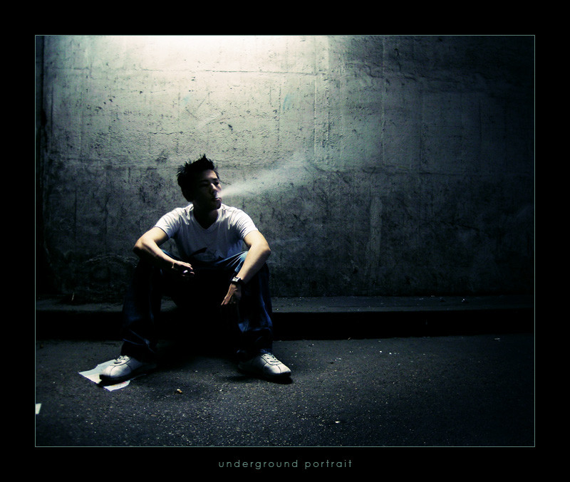
 fxcreatography — underground portrait
Published: 2004-09-05 13:46:17 +0000 UTC; Views: 4320; Favourites: 92; Downloads: 1056
Redirect to original
Description
this is very similar to Thomas Yung but i still wanted to submit it because the lightning and the perspective is quite different.. tell me how you like it, maybe in comparison to "Thomas Yung"?!Related content


Comments: 82


Amazing, wow! I have to ask, how on earth did you achieve those colour tones?
👍: 0 ⏩: 0

das ist auf jeden fall mal ein sehr sehr geiler schuss.
an und für sich ist das bild eigentlich eher kalt, aber es steckt trotzdem viel leben und ausdruck in ihm.
respekt das bild ist zucker.
👍: 0 ⏩: 1


I swear this is just one of the most most most amazing pieces I have ever seen on deviant , i have tried so hard but not a single time have a captured the smoke no nice and the background so dark , I have tried I know thats sometihng that speaks out for itself i wish there was this thing saying super duper 
Fahim.
👍: 0 ⏩: 0


Each has it's advantages, and (predictably) the ideal is somewhere between the two.
The colouring definitely works a lot better in this than in it's sepia counterpart - sepia is the wrong kind of mood for this situation, and it's a lot moodier like this. It's also a very nice tone here anyway
Unfortunately, though, this is also a lot more of a cliché. Although it's done nicely, with the thirds and the lighting, the fact is it's been done before, many times. Thomas Yung is a more dynamic composition, with more movement. It's not quite perfect - he's too close to the left border, the tunnel end might have been better on a horizontal third - but it shows thinking and creativity. You could have made more of the lighting, it's quite interesting how the closer light stops halfway down the wall, yet the next light covers the floor, so perhaps positioning him under that light would have had a more intriguing effect, as well as placing him further into the photo. As it is, you can just about get away with having him so close to the edge because he's looking inward and draws you in, but for a portrait of the guy you've chopped half of him off
Both photos have interesting textures, they're probably brought out more in this one just because you're closer, although TY has some interesting cracks along the ceiling to pull you in. I like the focusing effect you have on this one, as it's very subtle, you only really notice it when you look at the floor but it definitely guides your eyes in. I'd have healed out the scrap of paper on the left border, though, it's too small an element to be anything other than distracting.
So, to summarise this 2-in-1 comment (that's value for money), the idea from TY is better, but you managed to execute this one better

 (Wink)")

👍: 0 ⏩: 0

this one is more misterious, the colors create a better enviroment and the model is more "in" the photograph. there are details, that make it interesting.

👍: 0 ⏩: 0

great texture, color, and lighting! love the feeling this shot puts off.
daveainley

👍: 0 ⏩: 0

in my opinion this one is about 10X better. the lighting and color tones really help to make this feel a lot more underground or rough than the first portrait.
👍: 0 ⏩: 0


nice.
erinnert mich an ein photo aus der kunsthalle MA, wo ein mann eine milchtüte zerquetscht...weiss leider nicht von wem das war...
👍: 0 ⏩: 0

i really like the fact that it's color... but in a way it seems black and white. i dont know the word for it, but anyway, i love the lighting and the contrast, and the concept
favourites
👍: 0 ⏩: 0
i really like how itz color...but in a way you hardly notice because itz so.... i dont know the word for it. but i like the contrast and lighting. :-D nice work
i checked out his site too, both of u are very talented.
favourites
👍: 0 ⏩: 0


Every picture tells a story and I think this one is no different. There's so much one can infer from your piece, which I think is the aim of good photography. But i think it'd be more artistic if the smoke was being blown out in clouds instead of a puff. But then again, the puff works with the whole rough surroundings of the subject.. So that's ok too.
👍: 0 ⏩: 0


for me this is much better... the contrast and the perspective is better... and this light from the top is awesome
👍: 0 ⏩: 1

Sehr sehr schönes Photo. Beleuchtung, Farbe und der Rauch gefällt mir extrem gut !!
👍: 0 ⏩: 0

this is a really great great shot.. i like such urban style very much (Smile)")
i like this one really very very much
wish u a lovely day
👍: 0 ⏩: 0

i really like the shawdowing on his face kinda makes yea think o do i kno him? but u cant quite tell cause of the shawdow
👍: 0 ⏩: 0

i think ive commented already, but all the same, i LOVE LOTS. very very very very very very very very very very very very very very very very very very very very very very very very very very very very very very very very very very very very very very very very very very very very very very very very very very very very very very very very very very very very very very very very very very very very very very very very very very very very very very very very very very very very very very very very
GOOOOD. i love so much. anyways, i'll speak to u later,
bye
Jen
xx
👍: 0 ⏩: 0
like this urban style very much.. don´t know why but it is like it is

👍: 0 ⏩: 0

the trash under his foot adds a lot to this. it doesnt look too composed. nice job.
👍: 0 ⏩: 0


wow...
das is fast no besser als das erste ....
Licht und Schatten is hier wirklich besser, und der Rauch kommt ziemlich kewl
Super gemacht!
")
👍: 0 ⏩: 0

awesome lighting.. a lamp on the street?
her pose and the smoke is just amazing. awesome colours as well.
gotta +fav this one.
good work pal.
👍: 0 ⏩: 1

thanks for commenting! but well.. she's a he actually
I hope for you that she..eerrr.. he won't read it
Greets,
fx
👍: 0 ⏩: 1
aww sorry.. i know it's HE.
sorry my bad.
👍: 0 ⏩: 0

The lighting on this one kicks ass !
likethat you kept it in color
and that you can see his smoke
thats tight as heck
awesome shot !
👍: 0 ⏩: 1
glad you like it! thanks for commenting & faving!
Greets,
fx
👍: 0 ⏩: 1
keep up the good work
cant wait to see smore more
👍: 0 ⏩: 0

This is loads beter than 'Thomas Yung'. Love the lighting, composition and frontal angle.
👍: 0 ⏩: 0

I love the lighting on this, and the smoke.. it makes the model look very mysterious and dark, like a "bad boy". I also love the textures on the wall and how clear the photo is. Great work!
👍: 0 ⏩: 0

")
Danke und gude Besserung,
fx
👍: 0 ⏩: 0
i prefer this to the Thomus Yung one. its kinda different and the lights and darks are nicer and in more contrast
👍: 0 ⏩: 0

Well, I prefer this one over Thomas Yung .
As it's been said, the ligting in this one put much more emphasis on the personality of the model and the lighting is much stronger here (for a portrait).
Regarding the smoke, I'm not really sure it adds something here, I find it nearly distracting with this light... On the other hand, I really like the paper under the shoe, it adds some dynamics to the symmetry of the model and works well in relation to the dark background on the right.
Nice work
👍: 0 ⏩: 0

wow! awesome! great shadows and the smoke is just perfect!
👍: 0 ⏩: 0

I really like the lighting in this. Back lighting worked very well. However, I don't like how the smoke looks, almost fake. Perhaps the setting you had your camera on isn't smoke friendly? Maybe if the face had a little less detail and you could see the smoke, it would have given a more mysterious effect. Other than that nice, very nice.
👍: 0 ⏩: 0

Beauitful composition. I love the lighting.
👍: 0 ⏩: 0

Smoking is bad for you... but it definately adds a really great effect, the colors are really nice too.
Good job
👍: 0 ⏩: 1

haha, for this shots i had to smoke a lot for fx!
I'm the Model... not the photograph.
👍: 0 ⏩: 0


In my opinion the subject of the "Thomas Yung" photograph is primarily the architecture. My eye naturally travels across the image from the left to the right and then lingers at the far end of the tunnel and my mind engages in speculation as to what might be down there. The actual person in the photograph is more of an atmospheric element than the location itself. In this photograph I have a completely different response. The person is obviously center of interest and the surroundings add atmosphere to him not the other way around if that makes any sense... You did a great job of capturing the smoke in both images.
Thanks for sharing with us, keep up the good work and take care!
👍: 0 ⏩: 1
thanx a lot for the comment, now i think i should have swapped the titles but "Thomas Yung" was finished earlier so..
whatever, thanks a lot for commenting!
Greeets,
fx
👍: 0 ⏩: 0
| Next =>