HOME | DD
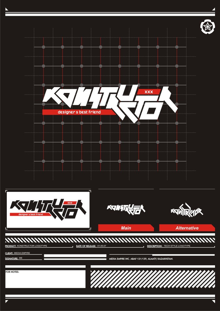
 g2x — Konstructor logotype
by-nc-nd
g2x — Konstructor logotype
by-nc-nd
Published: 2007-05-16 08:39:57 +0000 UTC; Views: 3183; Favourites: 30; Downloads: 113
Redirect to original
Description
Konstructor logotype100% hand made---100% vector
__________________________
please comment or fav
")
Related content


Comments: 32


thanks a lot for all the comments mate

👍: 0 ⏩: 1


по мне "N" не смое хорошее решение так нарисовать
а так все круто! молодец!
👍: 0 ⏩: 1


Hi There, Roman.
I find it VERY hard to read, and despite knowing that a logo is more than a few clear glyphs, I still consider very important a certain level of readability. The 2nd character, the O looks like an A because of the angled low right. It doesn't have to be like the second "O", but there are no connection between these two same letters. The rest of the composition is far better, but the whole picture is unbalanced and not bonded to fit, as it drifts in a few diferent diagonals that tire the eyes for being inconsequential. I don't consider this a logotype, its more a type experiment, which by the way is very well achieved.
This is positive critiscism, its not offensive. I hope you understand.

👍: 0 ⏩: 1
hey i really appreciate your comment thanks a lot! this was an experiment in such type of logotype design! this is a logo for a journal that we want to launch! so i guess need to work on it  (Smile)")
👍: 0 ⏩: 0


В буквах не видно единого стиля. все разное. и в Кon - И вместо N
👍: 0 ⏩: 1
нууу такая вот задумка  (Wink)")
👍: 0 ⏩: 0

