HOME | DD
 GabrielRodriguez — Locke and Key WtL 02

Published: 2008-09-08 22:56:31 +0000 UTC; Views: 4402; Favourites: 69; Downloads: 197
Redirect to original
Description
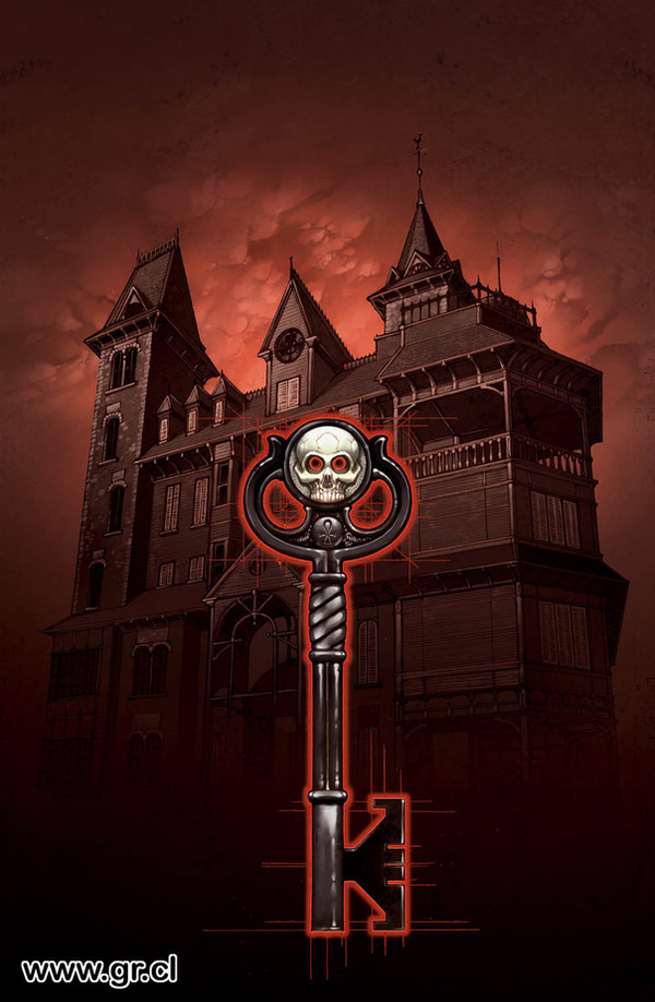
The cover of Locke & Key, Welcome To Lovecraft, part 2. I'm still not fully convinced with the colors, but it worked really well for the book...Related content


Comments: 14

I absolutely adore your work. Especially the way you design faces and the attention/energy you put into every minor detail.
👍: 0 ⏩: 0

dude, i just finished crown of shadows. your art rocks my socks! i love this series!
👍: 0 ⏩: 0

Here is the analysis of this cover that I mentioned:
[link]
It's also posted here on my journal. Nice work!
👍: 0 ⏩: 1

Amazing analysis, thanks!
Really glad to see someone as enthusiast about illustrations, and I'm absolutely flattered of being in such amazing company in your list of studied illustrations!
I'll link you article from my blog, too, if you don't mind.
👍: 0 ⏩: 0
This is the cover that did its job on the comic stand and made me pick it up and give it a look. It's a great image. The gloss on the cover was the very first thing to catch my eye because the light flashed off of it. So, for at least one person the extra production value paid off.
I'm planning to do a deconstruction of it in the new year. (See my journal for the type of analysis I do.)
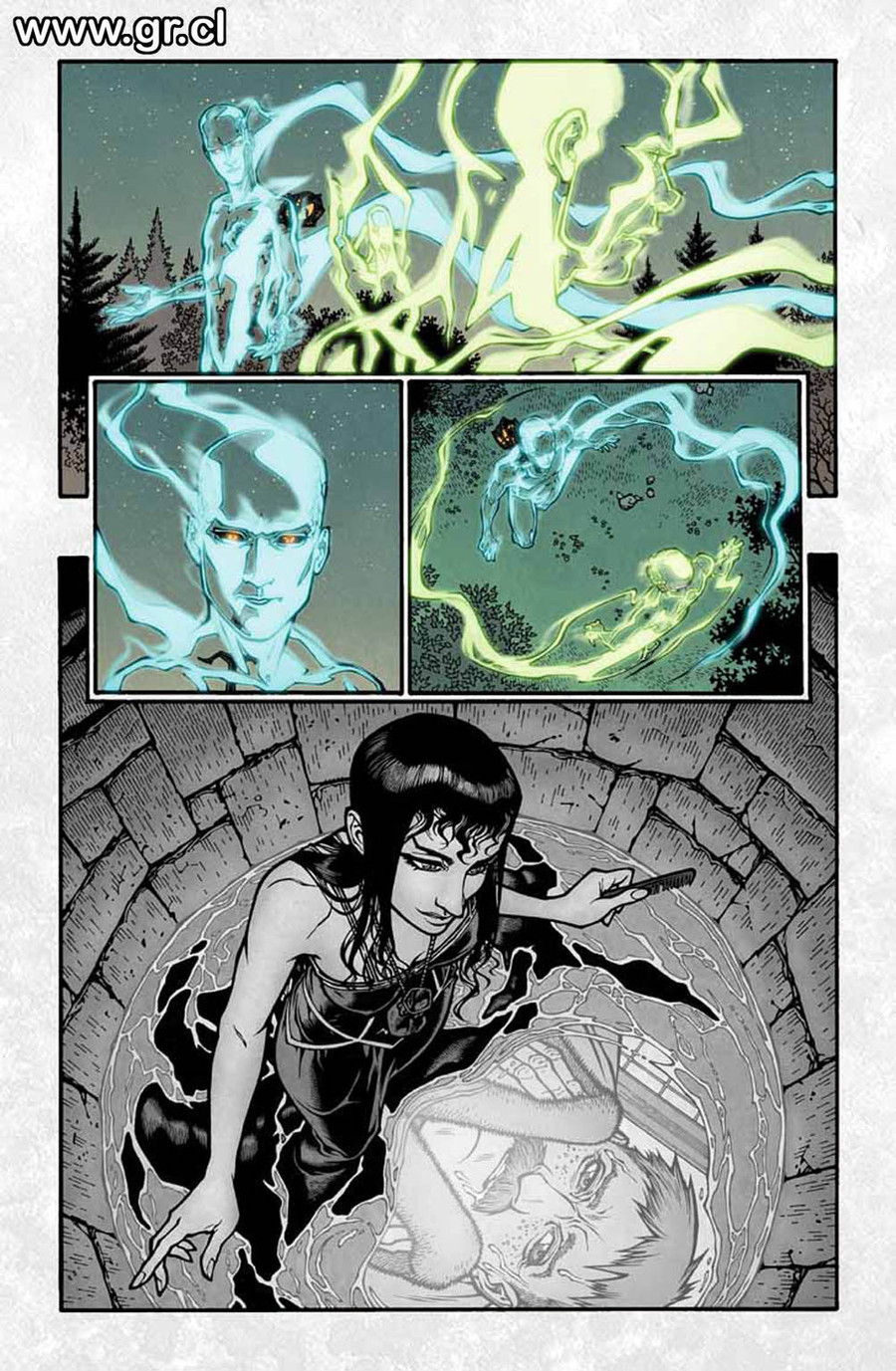
I love the effect of ghosting here and for Sam in the last cover. How did you develop and execute that look? Also, did you use any kind of reference for this shot?
👍: 0 ⏩: 1
As for the "Ghost effect", I tried to make them look as made of a fluid substance, like some dense smoke.
I didn't use any reference for the shot, just did a very detailed design of the wellhouse considering that it will be a very important location during all the Locke & Key saga...
👍: 0 ⏩: 1
Neat - that's what I'd guessed.
 (Smile)")
👍: 0 ⏩: 0

I've pretty much always loved this picture, it's probably my favorite extra bit of art that's in the book. I would KILL to get a print of it.
👍: 0 ⏩: 1
Haha...
Thanks. I'll ask the IDW people to see if I can make deviant prints of this stuff....
👍: 0 ⏩: 0

I just read this series... Wow. The story was brilliant, but would have been less so without the incredible artwork. The down-to-earth characters with the tripy fantasy elements made it so enjoyable.
👍: 0 ⏩: 1
So far, this series has evolving with a visual language pretty much of its own... in part it was planned, and in part flowing very naturally...
Really glad you're enjoying this story that much.
best, G.
👍: 0 ⏩: 0

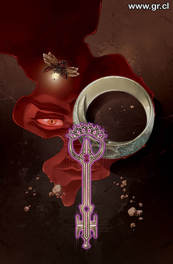
I really like this one. The creature seems to be so light.
👍: 0 ⏩: 0

Gracias!
Fue lo que me dio más dolores de cabeza al hacer la portada, pero creo que valió la pena!
Salu2!!
G-
👍: 0 ⏩: 0