HOME | DD
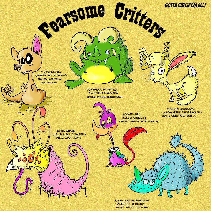
 Galago — fearsome critters
Published: 2007-03-09 07:47:07 +0000 UTC; Views: 2985; Favourites: 13; Downloads: 26
Redirect to original
Description
What I like: Decent coloring in this one. I learned how to use dodge and burn.What I don't like: with a little extra effort, I could have probably made this look more 'field guidey.' But there ya go.
Related content


Comments: 12

Pardon me, but what is a Poisonous Darbyhick, and what does it do?
👍: 0 ⏩: 1

They're cute! There supposed to be scary, but they're cute!
👍: 0 ⏩: 1


Except that everyone I've shown it to is too familiar with megafauna, so they're all THAT DOESN'T LOOK LIKE A GLYPTODONT and stifling my zany creativity. But thank you!
👍: 0 ⏩: 0
You've got a really nice grasp on coloring. Any particular tricks you might be willing to impart?
👍: 0 ⏩: 1

Yes. But they're very tricky. I would have to show you in person.
👍: 0 ⏩: 1
Yeah, I guess they would be. Darn it all! In any event, I really dig your coloring.
👍: 0 ⏩: 1
That's cool.
Well, if you know Photoshop, here are my secrets, in brief...
-- give every character their own color layer, then use "inner shadow" under layer properties to add shadow and depth.
-- for really dramatic shading, use gradients set to "Difference" and then fade appropriately. Difference shading is very chaotic, and it takes several tries to get the right effect.
-- to get metallic textures, select the color layer, use a Chrome of Plastic Wrap filter, then fade it.
-- The Pen Tool is your best friend. I use it to define large areas of flat color before doing everything else.
^__^
👍: 0 ⏩: 1
Nifty keen, thanks for the tips
👍: 0 ⏩: 0