HOME | DD
 gammon — Scrapped Ryu Illus. -TEST

Published: 2011-02-24 21:24:00 +0000 UTC; Views: 3733; Favourites: 73; Downloads: 117
Redirect to original
Description
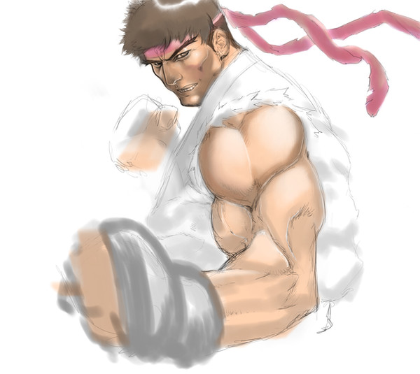
An image I scrapped! I didn't like how static and "trunkish" his pose was.A quick color test to see how it would've looked!
Related content


Comments: 12


I dont see why you would ever scrap this. The face is spot on! Maybe just show Ryu's face as you drew it and already it stands out more than the other Ryu drawings
👍: 0 ⏩: 0

I would never scrap something so amazing as this was starting to look, but I think you're on a whole different level from me : )
👍: 0 ⏩: 0

Nice! I see what you mean about it being a little static. I think if you brought his front arm further out into the foreground that'd fix that problem (but I'm sure you already came up with a solution ")
👍: 0 ⏩: 1

I always render a picture to completion in greyscale and then use "select color" to change an entire value range's color using "hue/saturation" sliders. "Replace color" also works, but it isn't as effective. You have to make sure that the character or object you are trying to "select color" on is entirely opaque (or filled in) otherwise it will produce undesired effects. I also set the brush to "color" and render with it, while selecting values with "select color" to make more intricate color changes.
👍: 0 ⏩: 0

oh man, i was missing your art
this is just my opinion here
but one of the things i love about capcom's art of ryu
is that it's so solid and strong
which is what it looks like here
very daigo esque
i for one, like this
👍: 0 ⏩: 1


yeah I can see that this isn't dynamic and it feels like he's tryign to put a facade of confidence that is unbelievable. What do you set your brush settings to paint like this on?
👍: 0 ⏩: 1
I typically don't use any weird brushes. Both of the brushes I used were the "hard round brush." One with pressure set to opacity and flow (for sketching and rendering), the other set to size (for sharp shapes and flat color).
👍: 0 ⏩: 1
ah ok, so set you your opacity and flow on the usual? 30-50 percent?
👍: 0 ⏩: 0