HOME | DD
 Gaston25 — Sentinel Concept

Published: 2008-04-01 11:02:54 +0000 UTC; Views: 3454; Favourites: 54; Downloads: 36
Redirect to original
Description
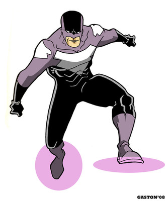
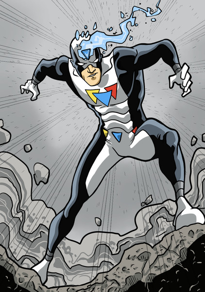
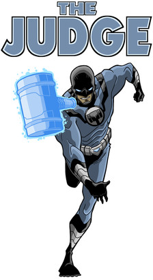
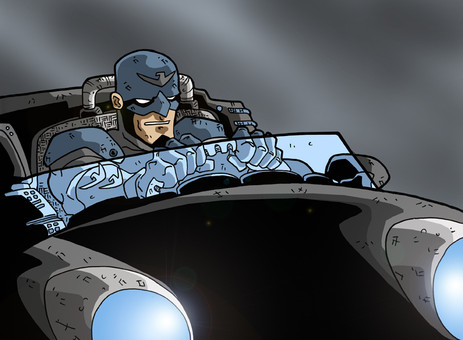
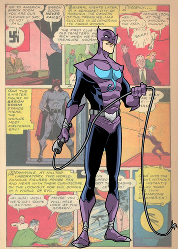
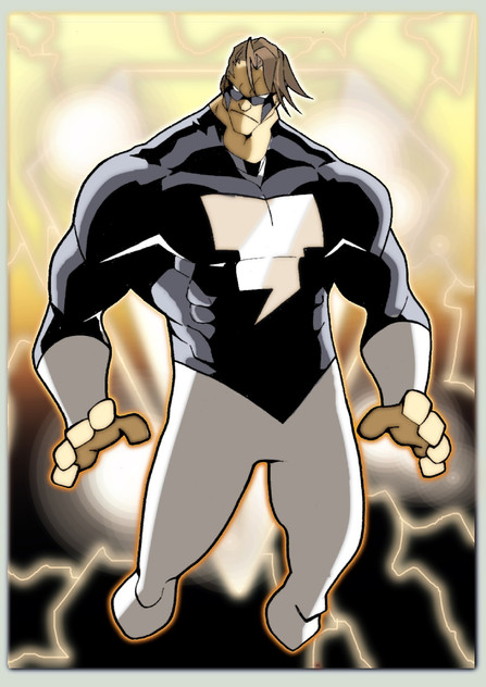
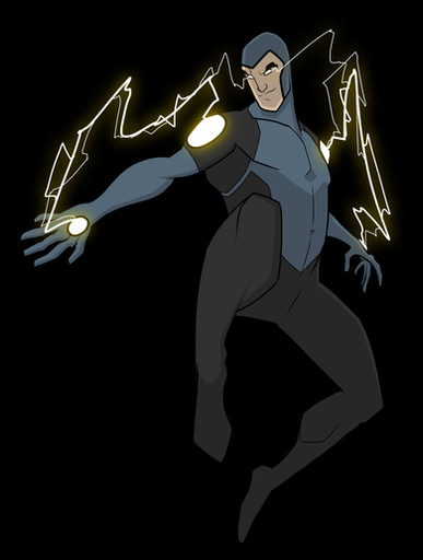
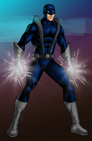
Another character concet that I have been working on called, The Sentinel (still in the works on the name)Sentinel can create force fields and manipulate them into any shape, and has about a four foot radius that he can effectively use/manipulate his force field. This is a fancy way of saying he can use the field to "push" people away from him or give him a little extra force when punching people and things.
I have some good ideas for this character, and you may see more of him in the future.
Related content
Comments: 43

i like the look of the character and look forward to seeing what he does. a defensive power like this is usually reserved for the women of the superhero world i think, but i wanna see more of this character, cool design.
👍: 0 ⏩: 1

Glad you like the design Leigh, and I agree with you about your female assesment. I wanted to try something different and not mainstream.
👍: 0 ⏩: 0

Another really awesome original character! Maybe him and Watchman should join up and become a two man team!
👍: 0 ⏩: 1

Looking good so far. I like the idea of the defender/protector-type character with his force fields as opposed to an overtly offensive super power. This is sort of off topic, but man, that foreshorted arm looks sweet, lol. Seriously. I usually find that straight on angle to be quite tricky.
👍: 0 ⏩: 1

Me too. It took me a few tries to get it right, glad you like it Gene!
👍: 0 ⏩: 0

i don't wanna make comparisons right off the bat- i know that's what we were talking about last week WAY too much, BUT....the black pants thing is being overused by the established right now, NewCap, Invincible (so i'd steer clear)
If you're going for classic golden age feel (while this color scheme is cool) the name of the game seems to be avoiding likenesses (however odd the may be). I'd say blue-ish tint is out because of InvisibleWoman and green obviously because of GL. Go wierd, yellow or something odd as a theme...and incorperate more of those shields too (forehead, shoulders, etc)
The idea of force fields AND THAT'S IT, as a power, is really fun. You could use them for everything from offense & defense to locomotion, surfing on one to fly around would be sweetness.
👍: 0 ⏩: 1

Good point about the balck and blue color scheme. I have a few ideas that I would like to bounce off of you in a note if you have time. And yes, I agree with you of just a force field as a power. Nothing else. I want to keep it simple yet challenging for the character at the same time.
👍: 0 ⏩: 1

yeah dude hit me up!
I think making it tough for the hero is always a cool way to go. Can't wait to see this guy's progression
👍: 0 ⏩: 0

I like the overall design (not as much as the Watchman however). The shield chest symbol kind of reminds me of the Supes supporting cast member the Guardian (I think that was his name) though so you might want to tweak that a bit.
👍: 0 ⏩: 1

The first thing that popped into my head when I saw this was Golden Age hero. I dig that costume - love that powder blue.
👍: 0 ⏩: 1

Thanks man, glad you're liking it. I think I definitely have a good foundation here, just going to tweak it a little more.
👍: 0 ⏩: 0

another great design man, your style and work always makes me want to sit down and draw (which means a lot)
👍: 0 ⏩: 1

That does mean a lot as I know exactly what you are saying. That is a great compliment man! Thanks
👍: 0 ⏩: 1

Thanks. Better than what by the way?
👍: 0 ⏩: 1

from that watchman... he looked like bunch of stuff put together(to be blunt)
but this... although rings a distant bell... looks more independent... more genuine... and i love his colors...
👍: 0 ⏩: 1

Thanks, glad you like it. He's going to get modified a bit though. He's a definite work in progress.
👍: 0 ⏩: 1

other then the half-gloves it needs no change... it's a perfect simple design... and the simple ones are the great ones...
👍: 0 ⏩: 1

Hus chest emblem feels a little derivitive of some other character, but I can't recall the name...
👍: 0 ⏩: 2

If you are thinking of the same character as me - i think hes called Guardian - was/is a DC character - but then you might be thinking of someone completely different.
Anyway the pic itself is awesome - i like that hes not overly muscley and i like the colour scheme you chose.
👍: 0 ⏩: 1

Yes, Guardian. He had a blue and yellow/gold costum,e and a shield that looked like the chest logo, yeah?
👍: 0 ⏩: 1

Still working on the overall design. Any suggestions?
👍: 0 ⏩: 1

Overall I do like it, I'm even fond of the paler colours.
But his logo looks like a shield used by a DC character, so the first step would be to change that.
👍: 0 ⏩: 0

I'm mixed on the colors, fellow mudkip. I like it for the drawing, but wonder if it's masculine enough to instill fear and foreboding in his enemies.
I like the shield power. So it's kind of a mix power like GL or such?
👍: 0 ⏩: 1

What the hell is this mudkip thing?! AIt has taken over all the avatars on my screen. I opened a note and think I got stuck with a bug or something. Do you know how to get rid of this?
👍: 0 ⏩: 1

Apparently it's an April Fool's joke. I don't think it's funny.
👍: 0 ⏩: 1

I don't either.
To get back to the character design comment, I wanted a superhero feel that wasn't too complicated and had a classic Golden Age feel to it. It's still a WIP and you may see some more changes. Any suggestions?
👍: 0 ⏩: 1

yeah i'm not sure if any one thinks its funny.
👍: 0 ⏩: 0
