HOME | DD
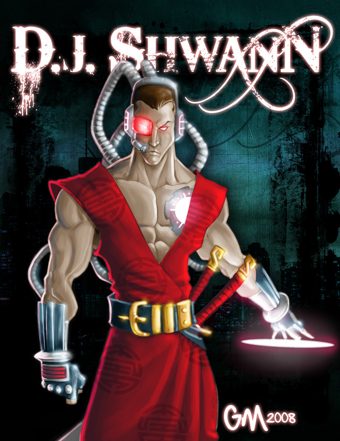
 GavinMichelli — The Dynamic Duo

Published: 2008-05-19 21:31:18 +0000 UTC; Views: 1698; Favourites: 26; Downloads: 38
Redirect to original
Description
I finally finished my entry for 's contest. I don't know why, but I never really found my stride on this particular piece.Related content


Comments: 32

i think this came out really well, i like the whole feel of it and the facial expressions match the characters well i think! great job!
👍: 0 ⏩: 1

Awesome dude. They both look like ice cold killers.
I love the hints of purple around, they work well.
👍: 0 ⏩: 1

I just felt like I had to do something severe with the color to spice it up ")
👍: 0 ⏩: 1
Yeah I really like it. I don't know if you're completely happy with it. But I love it heheh.
👍: 0 ⏩: 0

Damn... those are some badasses that i dont wanna cross paths with!
Love how you made the guys have different features as other comic artist juz slap a different hair to the same face. Awesome poses as always!
👍: 0 ⏩: 1
Thanks, man. I do try really hard to make the character's facial features look different, so I'm glad you noticed
👍: 0 ⏩: 1
And one should notice it! I hate how others do the same face over and over again... even popular comicbook pros fail to do that. Good job Gavs!
👍: 0 ⏩: 0

...And as for advanced crit, I think the guy with the blades and the green straps shoulda been in front of the other guy. He kinda detracts from the other becasue of his lighter arms and greeness. If the other guy were behind I think it would encourage the eye to 'flow' a bit better instead of looking at something that (no offense intended) looks a bit cobbled together.
👍: 0 ⏩: 2
Thanks very much for the crit. I'd say you're absolutely right. The only reason I put Kalum up front is because I felt like the lineart was exponentially stronger. There's not as much detail, but it has more style  (Smile)")
👍: 0 ⏩: 1
NP man. There's never enough of the GOOD crit to go around anymore.
👍: 0 ⏩: 0
Gun, I meant gun!!
Gah, I'm whooped tonight.
👍: 0 ⏩: 0
Doncha hate that? When you got inspired at the beginning but that's really all you got...I get that way with commissions sometimes. Still though, nice work. I like the purple highlights.
👍: 0 ⏩: 0

It looks awesome even if you didnt find your stride! Looks already a finished comic book heroes or kiddie cartoon heroes!
👍: 0 ⏩: 1
I appreciate you saying that
👍: 0 ⏩: 1
Im only telling the truth, sir. lol.
👍: 0 ⏩: 0

no problem
you've always had me as a fan anyway
")
👍: 0 ⏩: 1
Awwww, you big sweetie *smacks Will's ass and winks*
👍: 0 ⏩: 1
most attention i've gotten lately so fuck ya
👍: 0 ⏩: 1
I leik 'em FIESTY!!!
👍: 0 ⏩: 0

They're tall. They're dark. They're handsome. They can kick your ass.
Can't fault that, lad. It looks sleek, clean and to the point.
Kalum looks amazing. This look suits his personality to a T!
My only gripe is that the pic is too small! I can't zoom in on your great work!
I'm adding your entry to my journal. Thanks so much dude, I love it ^_^
👍: 0 ⏩: 1
I'm glad you think I did them justice 
👍: 0 ⏩: 1
I do want to show it to the guy that wrote Kalum's story and I wanna see it properly so please do send it to me. I'll note you my email since I don't want it in public.
👍: 0 ⏩: 0


It looks pretty good to me. I can't even see anything to critique!
👍: 0 ⏩: 1
Thanks
👍: 0 ⏩: 0

It looks great...now I know my entry is doomed for sure! great work!
👍: 0 ⏩: 1
Your entry ain't so shabby either!
👍: 0 ⏩: 0