HOME | DD
 gbindis — Paperwork

Published: 2011-04-28 19:47:06 +0000 UTC; Views: 16363; Favourites: 158; Downloads: 779
Redirect to original
Description
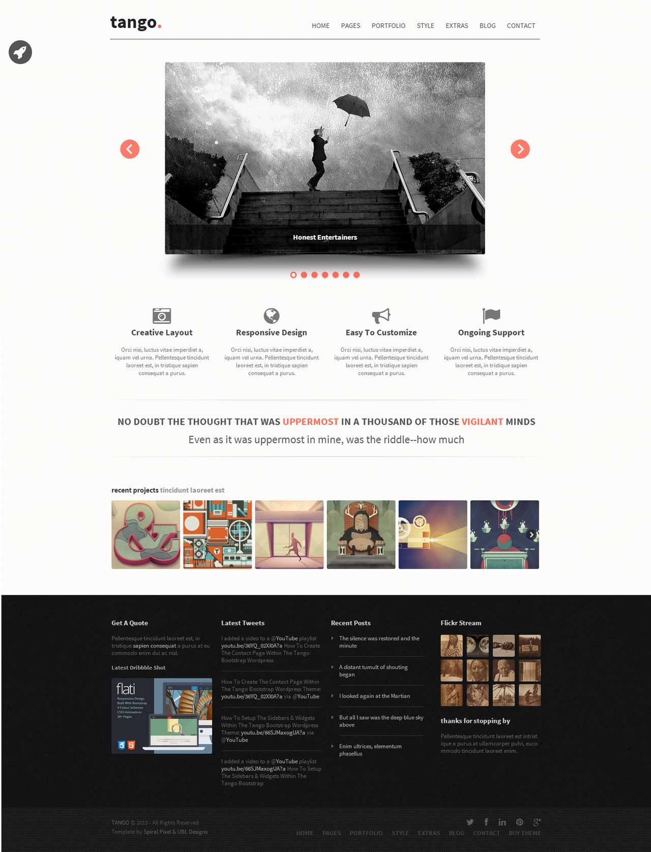
Full view recommended.I'm still working on the "clean looking" sites with a lot of content - that's what I find difficult atm.
Paperwork is a fictitious website, where you can submit, sell and buy prints. No real print artworks were harmed in the making (all are actually mine, and the main one is still in progress).
Hope you'll like it.
All rights reserved.
Related content


Comments: 46


Thanks. As much as I hate my earlier works as I get older (and better I hope) this one is among those that I still like.
👍: 0 ⏩: 0


The navigation could use a bit more legible typeface. Right now the script font you selected delays the orientation and the navigation should orientate the user quickly, since it's his last hope for navigating through the site, if the inner links and CTA fail to do so.
👍: 0 ⏩: 1
Thank you, what you wrote is very useful for me
👍: 0 ⏩: 1
You're welcome.
Might wanna check the alignment of the Subscribe button in the top right corner of the second screenshot, compared to the content below it. Actually the main content on the 1st and 2nd screenshots are of different width. And repetition is a key factor in making the layout.
Also regarding the small thumbnails (2nd screenshot) - the "View more" button is center-aligned, while the layout is leftaligned (and some buttons of the same type are right-aligned.
Have a look of this nice article: [link]
Best wishes
-Boris
👍: 0 ⏩: 2
Wow, I haven't thought about that! Thank you
👍: 0 ⏩: 0
P.S. Sorry for the typos, I wrote it in a hurry. lol
👍: 0 ⏩: 0

Kurczę, naprawdę ładne  (Smile)")
👍: 0 ⏩: 1
 (Wink)")


website can to be designed so beautiful!!!good good
👍: 0 ⏩: 0


Ciekawy pomysł. Podoba mi się nietypowa kolorystyka którą dobrałeś. Projekt jest unikalny i przyciąga uwagę. Dobra robótka
👍: 0 ⏩: 1
Dzięki, nie podejrzewałam, że tak sie spodoba
PS: Tylko proszę mi nie zmieniać płci
👍: 0 ⏩: 1
hehe, przepraszam. W końcu jakiś grafik płci żeńskiej. Witaj w klubie
👍: 0 ⏩: 1
Nie szkodzi, w sumie przyzwyczajona jestem
👍: 0 ⏩: 0
Which font? In menu it's Wrexham script
👍: 0 ⏩: 1

Thanks man that's what I was looking for
👍: 0 ⏩: 0


clean layout, nice colors, little hard to read the text in areas imo though
👍: 0 ⏩: 1
I was thinking about it too, and yes - the text could be a bit darker, so it would be easier to read. Thank you!
👍: 0 ⏩: 1


")
god dammit, you're polish! używaj polskich słów - kiełbasa! gżegżółka! urząd skarbowy! tak! przesadziłam z kawą! ha!
👍: 0 ⏩: 0

Thanks
The font's name is Wrexham script.
👍: 0 ⏩: 1