HOME | DD
 General-RADIX — why

Published: 2008-09-29 02:09:48 +0000 UTC; Views: 3388; Favourites: 55; Downloads: 13
Redirect to original
Description
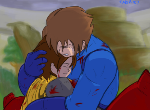
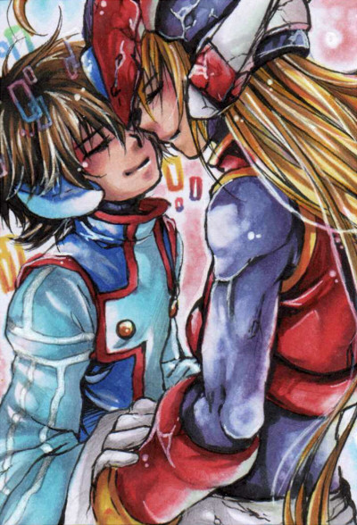
One word can say more than anything else.*Megaman's colour scheme is the same one used on the VHS covers. Maybe it was done so he'd look a little more like Protoman, thus making it easier to identify them as brothers?
Related content


Comments: 24

ruby spears! I love you! (well I love your art anywho)
👍: 0 ⏩: 0


Just see Mega huggling Proto and Proto comforting him... is way so lovely ^^ I love see Proto and Mega so close, so warm ^^
👍: 0 ⏩: 1

That's deep... The brotherly love on these two is really touching on this scene.
👍: 0 ⏩: 1

I so wanna say... "Because", but that's inappropriate at this moment...
")
👍: 0 ⏩: 0


Unfortunately, it made the description difficult. And kinda cheesy.
Thanks.
👍: 0 ⏩: 0


Mmmm... took me a minute to get that. The mere question CAN indeed say a lot more than the answer. (In my case, that's mostly because any question I ever ask reveals the catacomb-like depth of my crushing ignorance.)
Nice work with the orange reflection thing, too. I always saw in my mind the cartoon Megaman as being moreso spandex than metal, but the orange shine on him easily dissuades that subconscious notion.
👍: 0 ⏩: 1
Thanks. I always figured armour made more sense, plus it would silence the morons who hate on the cartoon just because Megaman no longer looks like jailbait.
👍: 0 ⏩: 1
...
... I was blissfully unaware that there was a specific group of fans that large and vocal enough to warrant notice.
👍: 0 ⏩: 1
The ones that complain about the Megaman 'toon are some of the biggest cases of "They changed it now it sucks! BAAAWW!" I've ever seen concerning the Mega-mythos. It's infuriating, and makes me wonder if they actually watched the entire series, or just five minutes of one episode.
👍: 0 ⏩: 0