HOME | DD
 genesischant — Project: Batman
Published: 2009-01-31 23:19:24 +0000 UTC; Views: 2934; Favourites: 35; Downloads: 13
Redirect to original
Description
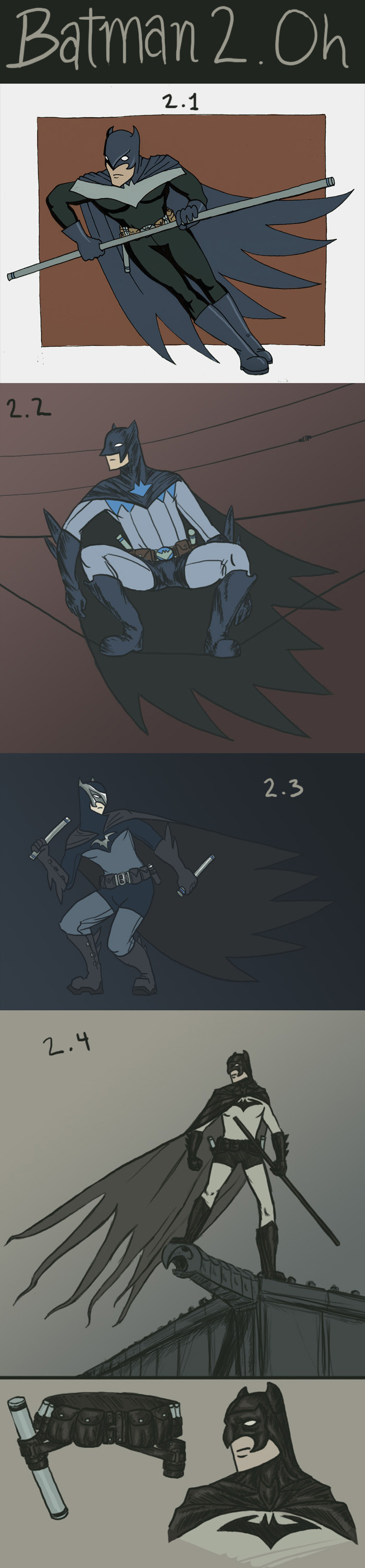
In light of recent events in the DCU, the website devoted to superhero fashion, Project: Rooftop [link] announced a contest to design a new costume for Dick Grayson (currently Nightwing) if he was to take up the cape and cowl to become the new Batman. Leaping at the opportunity to draw and design for one of my favorite superheroes, I plunged headlong into it. My interpretation of the situation was that the costume must be first and foremost "The Batman". Continuity in the minds of criminals and ordinary citizens between Bruce Wayne's Batman and Dick Grayson's is essential. If the supernatural aura Wayne fostered is to continue its work, protecting its new wielder and aiding him in his superhuman task, Batman must seem to still be Batman. How this is balanced with Grayson's understandable need to embrace his own strengths and distinguish himself from a man he does not wish to become (no matter how much he respects him...), this is the challenge of the design.2.1
This design attempts to capture aspects of Nightwing's design (the mask, the upper chest "bat/nightwing" symbol) while still being recognizable as the Batman. The costume features a short cape and tight-fitting costume to better make use of his acrobatic skill set.
2.2
This design (which took extensive revising) tries to marry the "bat" symbol with the "nightwing" symbol in a more complicated way. The costume is in general more complicated, with seams as design elements. I went with a less bird-shaped "beak" for the cowl, too. Had some trouble with an overabundance of bat-crotch, unfortunately.
2.3
This design goes out on a limb in some ways, the metal elements of the costume don't make strict sense if Grayson wishes to remain as sneaky as is traditional for the Bat. This version is much more superheroey in an iconic Superman way. As Grayson took his cues for Nightwing from that source, it isn't entirely out of the question. The colors are muted, and I wrestled with different color schemes, settling on a dark Wayne-Batman theme, but using blues as a nod to the Nightwing costume.
2.4
This is by far the most Wayne-Batman of the designs I worked up. The design allusions to the Nightwing persona are small and pretty far integrated into the original costume. I tried to use the Classic Batman costume as a base to work from, feeling that this "new start" deserved a return to basics. The cape and cowl are the most detailed visual elements, along with the utility belt (I have had detailed and real-looking belts for all the designs, a personal preference really). I tried to make this costume look useful and "made" but also have it be iconic in silhouette, truly reminiscent of the original fearsome "Bat-man".
And that's it. There are a few more sketches and so forth, some which I never posted, but these are the ones I'm submitting. Here's hoping someone over there takes a liking to one of them, hahaha.
Also, if you haven't seen it yet, here is 's incredible design: [link]
Related content


Comments: 11

I like it! I wish they would have used some of these designs for Dick's Batman suit in the comics.
👍: 0 ⏩: 0

i agree that 2.3 is the strongest design, but 2.4 is the best composition. (though i do like the phone line balancing act alot too, but not the crotchy-ness that you mentioned) i really like your cowl designs, they are somewhere between a mask and a helmet. reminds me of batman year 100.
👍: 0 ⏩: 1

Yeah, if I had more time, I would have worked over 2.3 into something as nice as 2.4, hahaha. And I really wish I could have given 2.2 a better shot. Next time. More revisions.
👍: 0 ⏩: 1
you still did many, many more than i did even including the stuff that didn't make it online. i don't think i'll do well.
👍: 0 ⏩: 1
Well, best of luck. The scattershot approach may backfire on me...
👍: 0 ⏩: 0

Well, when they're all side-by-side, I'm afraid I can do nothing by compare.
I like the last one most artistically, but I think I like 2.3 design wise. The only solution is for you to put 2.3 in the same pose as 2.4. I like the idea of the logo marriage in 2.2, but I don't think it comes through as well and as strong as it could. Overall, these are very, very cool.
Hahahahah bat-crotch.
Also thanks for the plug!
👍: 0 ⏩: 0

lotsa neat and thoughtful designs here. i think i like 2.3 the best especially the logo
👍: 0 ⏩: 1
That seems to be winning the poll!
👍: 0 ⏩: 0

awesome, so thats why you did all this batman nonsence...i was hopeing to see a comic by you out of this
but it okay
")
 (Smile)")
👍: 0 ⏩: 1
I'm working on my own comic, so there will be another page soon!
👍: 0 ⏩: 1
but no batman comic?
okay anyway.
👍: 0 ⏩: 0