HOME | DD
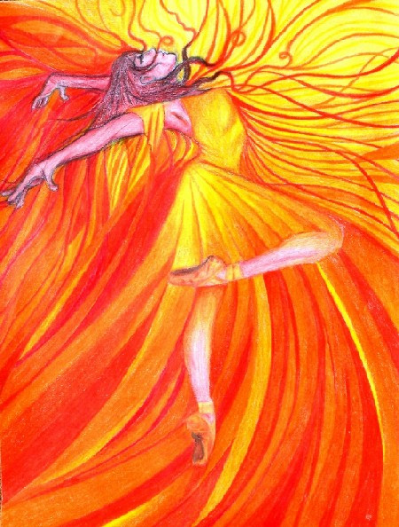
 geralin — Autumn

Published: 2009-10-10 16:29:44 +0000 UTC; Views: 1503; Favourites: 34; Downloads: 21
Redirect to original
Description
I did this already quite a time ago^^It's a personification of Autumn as I see it swirling around like leaves in the wind.
Hope you like it^^
I would like to know what you think about the colours and the composition.
Does it looks at least a tad dynamic and does it look autumnly?
Related content


Comments: 86

Vielen Dank für den lieben Kommentar!
Freut mich sehr, dass es dir gefällt^^
👍: 0 ⏩: 1


To me this has more of feel of fire then of Autumn. That said, I do see how the twirling figure is reminiscent of the falling twisting leaves. I think your color selection is gorgeous.
👍: 0 ⏩: 0

i love this style i cant find any faults. the only thing i have to say is that to me autumn would have more dark orange and reds rather brownish. ya know, leaves
👍: 0 ⏩: 0
:gimmefeedback"
a lovely personification of autumn! yes there is a real sense of movement here I love the colours and it's very dynamic, though if you wanted to enhance this I would suggest maybe adding some darker shades, to make the light and bright autumnal oranges,reds and yellows really stand out and add more movement? but still, lovely job
👍: 0 ⏩: 1
Thank you alot for your comment^^
👍: 0 ⏩: 1
👍: 0 ⏩: 1

I love this! The hair and the dress are beautiful and full of flowing movement. She is incredibly thin, but somehow that adds to the pictures delicate-ness, if you know what I mean. And the background is wonderful!
One thing I would point out is the wrists. The wrist on the right looks okay, as it is from the front, but the one on the left looks far too thin. Plus, it's bent a little too far.
Other than that, a truly beautiful and delicate-looking drawing!
👍: 0 ⏩: 0

This is a very beautiful piece and it caught my immediatly with the soft, pastel colours  (Smile)")
For an more autumn-like feeling it could use some stronger shades, like bright orange and deep red, right now it's a bit too "bland" for an autumn scenery - I suggest looking up some photos of autumn/fall sceneries (fallen leaves etc) to get some inspiration.
The framing around the characters upper body is wonderful and fits very well, I think you could continue that to the lower body.
👍: 0 ⏩: 0

I love this! I wish I'd drawn it! I really like the simplistic style, it's what I try to go after in some of my pictures.
The colours are very topical - a touch more brown and a touch less pink would have made it more autumny but it's pretty well suited. As for dynamic, yes, she looks like she's swirling about. A couple of things you could have done if you wanted to make it more dynamic would have tbeen to make the background "swirl" a bit more with her, or to add something (leaves?) swirling about around her dress. You've done this a bit with the ribbony thing (and it works very well) but to make it even more so you could have added some things that weren't attached to her.
Anyway, great pic!

👍: 0 ⏩: 1
Thank you for your tipps. I'll think of that
👍: 0 ⏩: 1
In case it wasn't clear in my original post, everything here is fine. They're just a couple of little things you could have done to make it even more autumnal and even more dynamic.
👍: 0 ⏩: 0

The lines of the figure look very dynamic to me. Yet, the composition, with the figure at the center, is not a dynamic one. It looks very nice at it is, but if you want it to look even more dynamic, you can play with the placement of the figure.
The colours you chose do look autumnly to me, yet the brightness of the background reminds me of summer warmth.
👍: 0 ⏩: 1
Thank you very much for the advice.
So would a asymmetrically placed figure make it look more dynamic?
👍: 0 ⏩: 1
Images are complex and unique, so I can't say that would be true always. In very general terms I find that placing a subject a little off center can give more dynamism to an image. It also requires you to balance elements. So, lets say for example that you move the figure to the left, then perhaps some tendrils of her hair or an element on her dress can flow right to balance things out.
Again, It looks dynamic as is. But I hope this is useful to you.
👍: 0 ⏩: 1
Thank you alot for this explanation, it was really helpful. Now I will give more thought into the placement and arrangement of figures in the future.

👍: 0 ⏩: 0

Yes it does look dynamic!
I love the color choice too, and how you blended the colors together.
The only thing that bothers me a tiny little bit is her right hand, it's in a strange pose.
Great work here!
👍: 0 ⏩: 1
Thank you so much!
It's great to hear you liked it nonetheless
👍: 0 ⏩: 0

Doesn't really seem autumn-ish. Looks more summer-y, maybe you could put more yellows and browns in there? To me it seems very summerish and bright and happy, like a day at the beach.
But yeah maybe some more yellows and browns in there could tone down the colors a bit and make it seem more like autumn.
👍: 0 ⏩: 1
Thank you for your advice.
It's very much appreciated^^
👍: 0 ⏩: 1

nice drawing, love the colours and the blending of them
👍: 0 ⏩: 1
Thank you alot for your nice words^^
👍: 0 ⏩: 0

I love the pose and the flow of the colours. Blending looks great to me also
It makes me think of fire more than autumn though, a bit less red/pink and a bit more orange/brown? Maybe a touch of green
👍: 0 ⏩: 1
Thank you alot for your comment^^
👍: 0 ⏩: 0

First the positive: The flow of the figure is delightful and my eye is very intrigued by the simplified/symbolic facial features.
Second, I agree with the comments so far regarding color scheme.This could benefit from a tad more brown, tan and green tones. I suggest green to play off of the red/pink tones. Swirling leaves or other autumnal debris could help with the motion that you were desiring for the piece.
I sincerely enjoy your work here and I'd love to see you revisit the theme.
👍: 0 ⏩: 1
Thank you alot for your comment^^
Maybe I will try a new version
👍: 0 ⏩: 0

I defiantly feel that idea of autumn moving the leaves. Its very autumny, but my one big problem is the colors.
Its too pink.
There is some yellow in there and some orange, and I guess the pink is supposed to be red, but I feel like there is too much of it. There is also very little brown. If it were me, I would have concentrated more on the browns and oranges than the reds, as those are the colors that really remind me of autumn.
Hope it helps!
👍: 0 ⏩: 1
Yes, thank you alot for your comment^^
👍: 0 ⏩: 0

I really love the idea of this
The composition is great and the colours are autumnly great !!
But how about adding darker tones of red ??
It'll really liven the pic.
Try adding them in the dark spots where the shadows are to give you the twist effect.
About the background, I think it mixes with your main charecter, so it's harder to determine the details at the first sight.
Try seperating them by a black outline, I guess it'll help.
Hope that helped
👍: 0 ⏩: 1
I tried to make the red darker but all the reds I had at that time were very light...
Guess you're right about the outline.
Thank you alot for your comment
👍: 0 ⏩: 1

beautiful! i adore how her skirt seems like part of her ")
besides the right wrist, the only thing that bothers me about this is that you hid the face behind her arm. i think it would've been fanstastic if you maybe showed a bit of her nose and mouth? and maybe add a little brown to the pic. while it does remind me of autumn (nice job on that) it could also be taken as an embodiment of fire.
but that's just my opinion. lovely job overall!
👍: 0 ⏩: 1
Thank you for your nice words, they are very much appreciated.
Well, for her face... I tried to draw it but it didn't seem right to me. As much it was fun to draw a personification of autumn I just couldn't give it a fitting face if that makes any sense
You are right about the fire. I never saw it that way and it's surprising how much you learn about your own art if it's seen through different eyes.

👍: 0 ⏩: 1
no problem!
i know, right? i love getting feedback on my stuff. sometimes you think you can't make it any better, then other people point out the minute little details and they make all the difference.

👍: 0 ⏩: 1
That's so true, it's all about the details^^
👍: 0 ⏩: 0

I like the colours,they are very warm. Yes it does look autumny.
Nice work.
👍: 0 ⏩: 1

from
lovely image, there's a joyful feeling in it
don't ask me why but at a first sight she seems a mermaid to me, i know that colors are completely wrong for a mermaid but it is so (^____^)
by my point of view there's too much red to create an autumn feeling there should be a range of colors from yellow to brown to me. but it's only my opinion.
great pose even if arms and hands don't seem right to me in size and proportions
bye
👍: 0 ⏩: 1
Thank you for your comment^^
Maybe she looks like a mermaid because she seems to have no legs
It's interesting to hear what other people see.
👍: 0 ⏩: 1
yes probably is the legs but also the pose, that thing where the legs should be which look like a wave and hair which in that position seem under the sea (^__^)
but it's only the first sight, soon colors and the lack of a fish-tail (^__^) make me understand that she's dancing in the wind.
one question (if i may): there isn't a single leaf in the illustration, which is curious for a representation of fall because the yellow leaf is the symbol of fall, is it a chance or you want it without leafs?
👍: 0 ⏩: 1
I thought about leaves at first... and I forgot about it
👍: 0 ⏩: 0

I love the pose. She could really make leaves dance! For composition, it seems to be missing some small details. It would look really neat if she had leaves swirling around her as well, but that's a matter of personal opinion. I love the ribbon that swirls around her skirt!
👍: 0 ⏩: 1
Thank you very much for your comment, the leaves are really a great idea
👍: 0 ⏩: 1

That's very pretty!
Ok about your questions: I think the composition is ok and it does look autumnly and dynamic.
Colours: I may associate more earthy colours to autumn, say the same colours but blending more towards orange than pink/magenta in some areas.
Other than this, nothing to say
👍: 0 ⏩: 1
Thank you very much for your comment!
you are right, I could have used a bit more brown and it's always so hard to find dark red, my red pencils are very light.
👍: 0 ⏩: 0

First off I want to say that yes, this look very much Autumn, with your use of colors and whatnot.
Her right wrist seems a bit too long and it is bent in an odd fashion. Other than her wrists being a little long, you've done a great job (in terms of colors and the flow of the piece)
Lovely work.
👍: 0 ⏩: 1
Thank you alot for your opinion
it's very much appreciated.
👍: 0 ⏩: 1
| Next =>