HOME | DD
 Gigglejigglepuff — Gmod Explosion Improvement

Published: 2011-02-13 02:15:37 +0000 UTC; Views: 2798; Favourites: 21; Downloads: 5
Redirect to original
Description
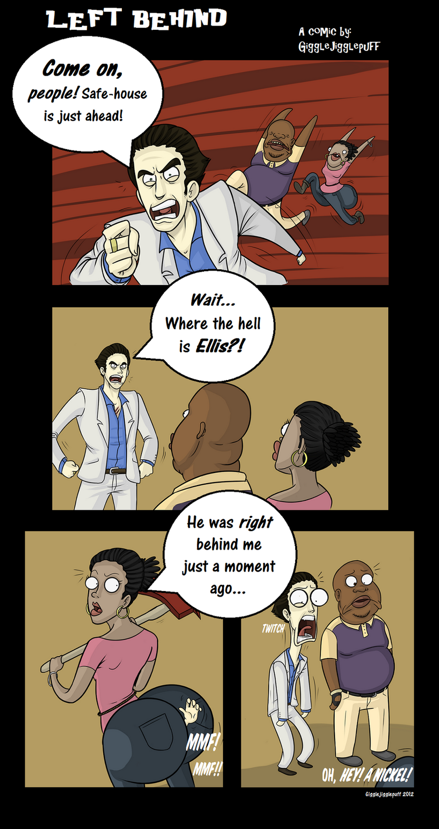
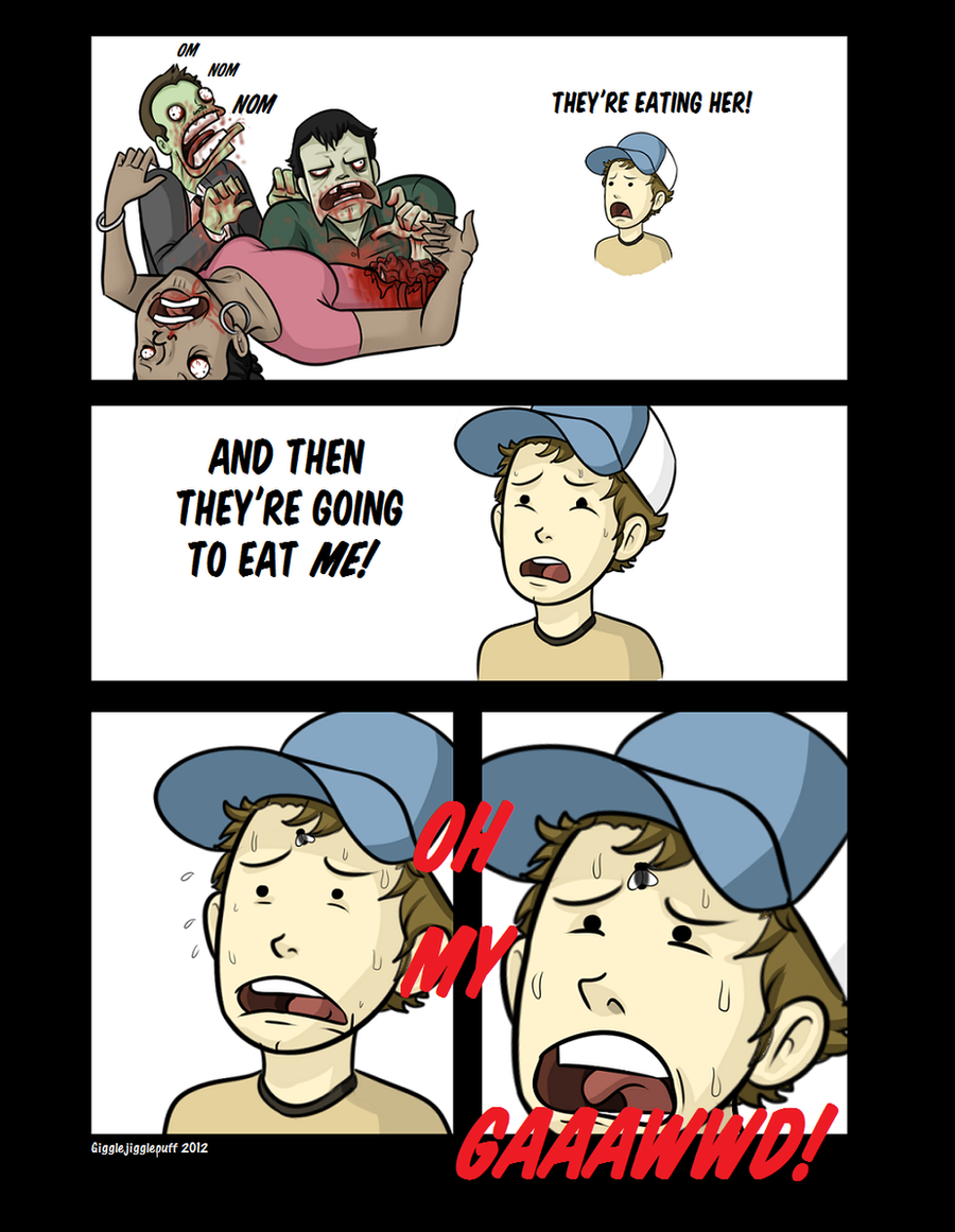
Imagine if I posted the top one up in my comic ... *shivers* Yeah, I know, the stuff I'm doing now is still really old, but I'm too lazy to redo all of the screen-shots. You'll just have to wait till it gets better! xDYeah, just wanted to share this with you guys... I can definitely see where I have improved and where I need to improve now. xD
Bottom one still sucks.
")
Comic page here: [link]
Related content


Comments: 19

I like how Francis is just watching.
Cause real men don't flinch.

👍: 0 ⏩: 0

Huh, interesting to see the tiers of improvement
👍: 0 ⏩: 1

Thanks!
Yeahhhh... Most of the screenshots I've been posting with the left 4 vacation comic are all like the one above. Old, and crappy. xD Though, I'm getting close to the more enhanced screenies!
I still need to get good at text, words, letters, etc. >_<
👍: 0 ⏩: 1
lol
don't worry about the text n' all
I can show you a tutorial page later
try working with Color Mod and Bloom in the post Processing section
You might be amazed at the results
👍: 0 ⏩: 1
Yeah, that's what I did with this, and it looked 10000x better!
I'd really appreciate if you did a neat tutorial! That would be really convenient!
(Though I should probably look some up on Google first. x3 )
👍: 0 ⏩: 1
huh.... Never though about doing a tutorial,
then again several others are out there that'd be a hell of a lot better
but anyways:
[link]
Good Ol' BDu, bringing Epic tutorials to you everyday.
Personally though I use Paint.net and do the same thing as in there,
only I use a 30 unit wide like for the border of the whole page, and a 10-20 unit line for the bubble, then change it to a 7-12 unit for the pointer to the character.
Seems to work well for me.
👍: 0 ⏩: 1
Heh, it's really up to you.
Thanks a bunch! I hope this'll help improve my comics!
Yeah, I was playing around with Paint.NET the other day. I actually used it to better my explosion shot.
All this unit talk is making my brain hurt... xD I'll figure it out........ eventually.
👍: 0 ⏩: 1
lol
the units is just the setting for the width of the line
top left there's a number, you can change it, that's the units
👍: 0 ⏩: 1
Oooh, I think I get it, okay, thanks. xD
For Paint.Net, right?
👍: 0 ⏩: 1
Awesome! That's what I've been using lately.
👍: 0 ⏩: 0

First panel: Did someone fart..?
Second panel: FFFFFFFFFFFFFFFUUUUUUUUUUUUUUUUUU-
👍: 0 ⏩: 1
LOL! Man, that made my day.... Twice.
 (Smile)")
👍: 0 ⏩: 0


the way Louis is reacting to the explosion is perfect ^^
👍: 0 ⏩: 1
Thanks! I like Louis too.
👍: 0 ⏩: 1
Welcome. Cool ^^
👍: 0 ⏩: 0