HOME | DD
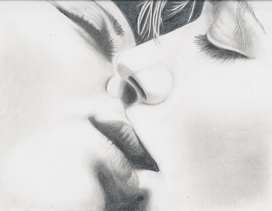
 giglebox — Passion in a Kiss
Published: 2010-06-17 03:01:12 +0000 UTC; Views: 19599; Favourites: 285; Downloads: 811
Redirect to original
Description
Done with multiple pencil types and blending stump.
Created for a contest depicting a 'kiss'. Tell me what you think. How realistic do you think it is... what are the flaws... good, bad or indifferent. I've learned so much from everyone's critiques! Thanks!
Source: [link]

My new DA freind Frenk also created a great piece based on this source photo. [link]
Related content


Comments: 144


I really love this sensual picture. The escence of lesbian kissing. Breathtaking and highly erotic!
👍: 0 ⏩: 0


wow!great job! i like how you did the highlights!the lips look perfect and the skin seems so tender!i also like the girl's lashes
the piece of work looks so naturally!keep on drawing!
👍: 0 ⏩: 0

Good work! For me it's a little difficult to draw two people kissing? Can you give me any tip?
👍: 0 ⏩: 0

Very nice work with the pencils. The shading of the eyes especially. Only the hair of the right one is a little bit thick I think.
👍: 0 ⏩: 0

I find this to be a very powerful drawing. You can really feel the emotion that was put into it.
👍: 0 ⏩: 0

 (Smile)")

simply amazing. u captured the scene so perfectly
👍: 0 ⏩: 0

This is an absolutely stunning piece. When I imagine PDA, I am often disgusted by the thought of wet mouths and slurping noises - something nobody wants to see up close! But you have managed to transform somebody else's moment into something tender and beautiful that captures the passion they share, and is not so disgusting to look at after all. I particularly like the shading you have used to produce the 'yin, yang' effect that gives me a sense of harmony and parallel between the two lovers.
👍: 0 ⏩: 0

Wow this is amazing. I'm truly speechless at this, though I'm not sure "passion" is the correct word to use.
This makes me think more of "tenderness". Almost like a first kiss.
The proportions seem great. Nothing looks off. I do think maybe a little extra shading just to give their faces a tad more depth, but don't do too much more.
Other than that, I really don't know how to critique this. This is a beautiful piece.
👍: 0 ⏩: 0

Nice details. I think shading should be a bit stronger.
👍: 0 ⏩: 0


It is very good. The figure on the left appears to be more defined though. Is it supposed to be like that? Plus I like your line style and eyebrows.
👍: 0 ⏩: 0


")
👍: 0 ⏩: 0

Fantastic. Great job shading, very emotional, the whole thing is beautiful.
My critiques are few. The person on the right's upper lip doesn't seem quite right, but that could just be me. Also, the person on the left (side of the paper)'s nostril looks a bit dark and too wide for the angle.
I love the person on the right's eyelid and the person on the left's lips. Fantastic.
Overall, you did a great job. Kissing is VERY hard to draw.
👍: 0 ⏩: 0

The foreshortening is done pretty well in this drawing, as well as the shading. The bottom lip of the person on the right looks out of place though, increasing the angle would probably help. I really like the detail you put into the eyebrows and how you made the hair look really light. As far as realism goes I'd give this a 9.5/10 (because of the lip) you are excellent at pencil drawings though
👍: 0 ⏩: 0

This looks magnificent. You captured the passion really well.
Your shading is so subtle that you can see the little details very well.
The only thing is that you could have made the skin a bit darker but that is always a problem I have, too.^^
👍: 0 ⏩: 0

i love how simple the skin on the face(cheek area) and how nice and defined and detailed the 

👍: 0 ⏩: 0


All is a title : the passion! It is rather made a success!
👍: 0 ⏩: 0

With your skills, I think you should be giving out more feedback so that people like me can improve! You've captured the mood very nicely and the shading on the lid is so delicately executed. I cannot think of any possible improvements apart from darkening the shading on their cheeks a little more, but maybe that is just me.
👍: 0 ⏩: 0

it looks good, but still you could do more shading
👍: 0 ⏩: 0

I would say looks very realistic, but a lot of it is either shaded or not shaded, there's not a lot of in between, though at the same time it produces an interesting look. I guess it could use more mid-tones, just as long as it's not over done of course. Still looks nice, but more mid tones would allow more detail.
👍: 0 ⏩: 0

Very nice drawing work.
Im not very good at drawing so for me it's really good
The only stuff I've noticed is that there is not enough shadow... Maybe that it's false ?!
PS: Sorry for my bad english ><
👍: 0 ⏩: 0


Awesome work. And so much love to details...this is really great
👍: 0 ⏩: 1


:icongimmiefeedback:
I know you're getting this comment a lot, but I figured I'd mention it anyway, lol.
The shading xD Comparing it to the photo, your picture is very very bright and white. Don't be afraid to step in with darker shades. (That's what the eraser is for, haha).
I feel like if you used a softer/darker pencil lead, you'd get a better effect since they are easier to blend and work with (at least in my opinion) than harder/lighter leads.
Also, see if this tutorial can help you out any: [link]
Good luck! Very stunning drawing
👍: 0 ⏩: 1

Thanks for the helpful tutorial... I am sure it will come in handy!

👍: 0 ⏩: 1
You're very welcome ")
👍: 0 ⏩: 0

I was looking through the gallery in the group GimmieFeedback and this picture caught my attention immeditatly. This picture makes me have butterflies in my stomach, it's such a realistic kiss. You did an amazing job bringing this picture to life. The shading it great, and overall a great peice of artwork. Great Job
👍: 0 ⏩: 1
YEAH!! YEAH!! I couldn't ask for anymore... just knowing that it struck you with the same emotion I felt it portrays makes it all worth while! THANK YOU FOR SHARING!!

👍: 0 ⏩: 0

Can you link to the contest please?
This is absolutely beautiful! The kiss is deep, like the two have a special connection, but I think there is a bit of a playful element, as if one of them is catching the others lip with their teeth. (maybe I'm just squeeing myself over the romance 
You have the shading just right, as I can see the depth in the cheeks, eyes, etc., and the proportions are right. The image is simple and clean so you focus on the kiss, but you can still see the pencil strokes - this is good because, though almost photographic drawings are skilled, they lack personality.
👍: 0 ⏩: 1
The contest can be found here [link]
Thank you for sharing the emotion this emoted in you. It still makes me a little happy each time I see it. hee hee
👍: 0 ⏩: 1


This is wonderful! Very realistic. I give you props, i can say that is a hard position to draw. Love it.
#GimmeFeedback
👍: 0 ⏩: 1
Thank you so much, so glad you enjoyed it!
👍: 0 ⏩: 0

WOW.... THANKS FOR THE FEATURE! It's a true honor!
👍: 0 ⏩: 1

Wow. This is totally excellent. I thought it was a photo in the thumbnail. 
I only see a very small thing. The eyelashes on the person to the left don't look... eyelash-y enough to me. Maybe they don't look tapered enough? ~Skeptikern v v made some good points, but I think the lack of shading in the cheek areas looks like a stylistic choice rather than a technical thing. I like it, actually. It looks softer and draws attention the the areas that really matter... the lips. ")
👍: 0 ⏩: 1
Thanks! I agree... the eyelashes on the left do look a little too last minute I'm finished... honestly that is what happened tho. LOL Glad you like it otherwise!
👍: 0 ⏩: 0

I really like this one. It looks very sincere. Like it gives you a calm feeling over it. the way their heads are tilted. It looks slow and nice. Not just a fast sloppy kiss that are most commonly portrayed. Anyway. Even if it is a lovely drawing. I miss some more shadows on their skin. Even if it would have been rather light wherever they are. There should be just a little more shadows that forms their facial structure. Such as cheekbones. Also the right person's "top lip" is a little... well flat I would believe it would just need some slightly shading to show the form. Also, same person, but bottom lip should have some more shading. Comparing to his/her partner who's lips are beautifully drawn the right person should if not as "fully" lips still have pretty much the same shading structure.
And just as for a short thing. The little well line on the left person just to the left of the right person's nose. I presume that's to show where the nose is. But again there should rather be some more shading around it than a shaded line. It looks a little odd at first and would be easily solved with a little shading. Not much over all is needed. But some.
To wrap this up. The drawing is really good. I love the eyes or eye lids. They look really soft and sensitive as they IRL are. That's really nice work. Also like the left persons lips. They look really soft and realistic. That's probably the two favourite parts of the drawing. But over all it does indeed look great
👍: 0 ⏩: 1
One day I will get the shading right! I'm so greedy with the pencil it seems! 
👍: 0 ⏩: 1
Well I don't blame you. The little shading you have used is way better than the shading I can use. But I'm glad you seem to want to work on it. That's what will make you an even better artist
👍: 0 ⏩: 1
| Next =>