HOME | DD
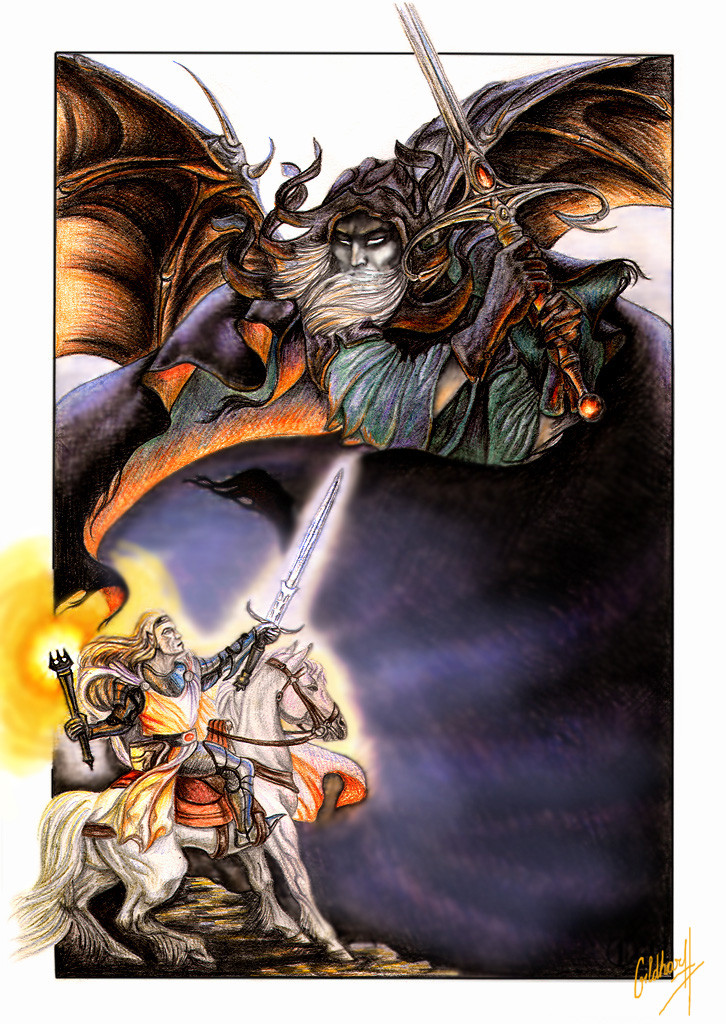
 Gildhartt — Melkor and Fingolfin
Published: 2009-11-22 19:16:01 +0000 UTC; Views: 5930; Favourites: 84; Downloads: 1582
Redirect to original
Description
Episode from The Silmarillion by J.R.R.Tolkien.Colour pencils, Photoshop
Related content


Comments: 10

I like it!
Mi piace questa rappresentazione dello scontro tra Morgoth e Fingolfin, trovo che sia originale, si distingue tra le innumerevoli illustrazioni della stessa scena che sono tutte uguali.
Mi piace anche come hai rappresentato Morgoth
 (Wink)")
👍: 0 ⏩: 0

Apart from Morgoth not having the right weapon, this a good picture.
👍: 0 ⏩: 0

It would be great if you got rid of the blurrines, but the composition and Morgoth himself are fantastic. I'm definitely fan of your vision of Morgoth
But why oh why Fingolfin is blond? ;(
👍: 0 ⏩: 1

thank you.  (Smile)")
he's not blond? oops.
👍: 0 ⏩: 1
The book doesn't say it explicitely, only decribes Finarfin's hair colour and his descendants as exceptional among Noldor. Official illustrations are also misleading in this case. Pity that this line does not appear in the Silmarillion:
"Fingolfin was his father's son, tall, dark, and proud, as were most of the Noldor" The Shibboleth of Fëanor, HoME XII.
I hope you don't take it as accusation, not my intention.
👍: 0 ⏩: 0

Whoa, your pencil work is simply amazing, I kinda wonder why you didn't use that for creating that aura around Fingolfin and his mighty steed, rather than Photoshop. Colored pencils and digital media rarely mix well together, because the airbrush cannot mimic the texture of the pencil on paper entirely.
Other than that, I like the fact that Melkor looks like a sort of viking figure. Apparently, drawing him as an uglier and more evil version of Sauron is the way to go about it, but I like the way he looks here.
👍: 0 ⏩: 1
thank you.
well, while reading the book I got an impression, that Melkor is not and should not be ugly, he's just different. that's why I pictured hom likie this.
👍: 0 ⏩: 0


Absolutely amazing! You did the horse beautifully as well!
👍: 0 ⏩: 0

")