HOME | DD
 gillon — Folder Icons
Published: 2001-11-19 16:57:16 +0000 UTC; Views: 7268; Favourites: 4; Downloads: 3126
Redirect to original
Description
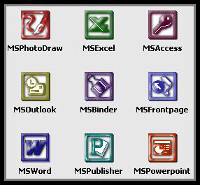
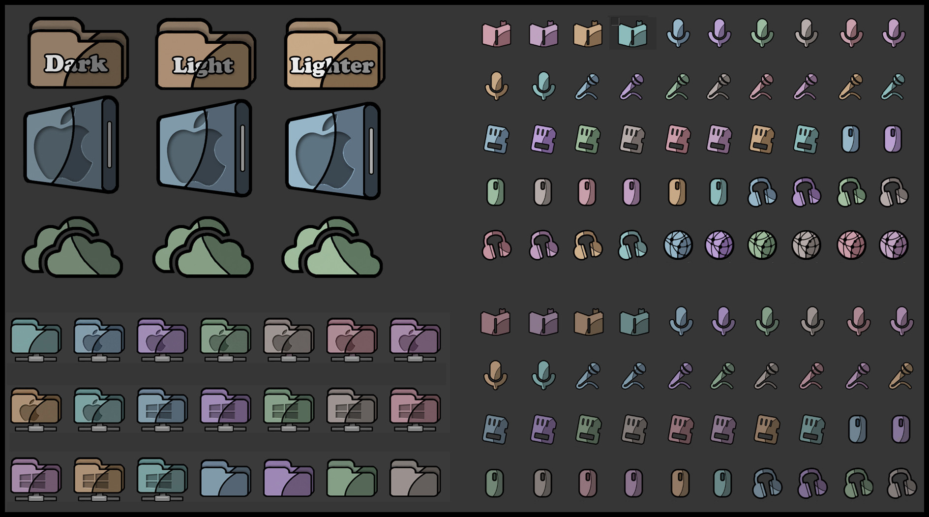
Extra folder icons to go with OrangeCreme Icon Package for customizing folders in ExplorerRelated content


Comments: 51

very cool looking, nice to have a fresh category for Daily Dev
:: Mage ::
:: Factor Five http://www.factorfive.net ::
:: Moving at the Speed of Dark ::
👍: 0 ⏩: 0


Yeah those are nice, but kinda riped from scrow(speaker...), copland(ghost) and block(iexplorer e)...
👍: 0 ⏩: 0

reminds me of macOS icons, which is great since i love macs
____// necron
digital.imag ery
http://necron.plastiqueweb.com/
👍: 0 ⏩: 0

tis very nice. i might use these
..:: ART|hive http://jamesmusgrave.cjb.net ::.
👍: 0 ⏩: 0

nice one
vivacious // http://www.vivacious.faithweb.com
-
Rusted Wires Of Twisted Hate
👍: 0 ⏩: 0

I totally agree with Barta - ghost folder really is the coolest in the set. Awesome pack of icons!
.::[bonfire]::.
[kick the can]
👍: 0 ⏩: 0


look at the little ghosties!!!
aww!
how cute!!!!
*swoons*
http://www.disstophya.com
👍: 0 ⏩: 0

DAMN icons for DD, oh well they look pretty fucking sweet I will say. Nice job.
[Me Against Me|Head Against Kore]
https://headkore.deviantart.com/
👍: 0 ⏩: 0

Yes, these icons look great. Try to combine them with "Seer" or "DDE" themes for WindowBlinds. Too bad you made only folders. Think about the whole suite.
Raw
[this message will be self destructed in 1 second]
👍: 0 ⏩: 0


yeah, like starvingartist mentioned there are a couple of scrow's glyph icons in there... but overall you've done a great job on them, nice pixel pushing
👍: 0 ⏩: 0

Yes it's really nice but is it good enough for a DD?
C YA
IXNAY
:frown:
👍: 0 ⏩: 0

hey, that's nice to have icons as DD.
Anyway, the "E" of the Explorer folder stings my eye a lil' bit.
neviotH
👍: 0 ⏩: 0

Deviantart is every bit as it was a year ago: it rocks. so shove your words up your ass brub
anyway
nice icons!
wouldn't they go under the Daily Skin tho?
anyway
they're nice
and useful
and they look great!
👍: 0 ⏩: 0

This DD is a proof of thing I thought all the time
They are good icons, but not great. And yet, nobody would have pass any comments if it would not have been a Daily deviation. It's a sort of proof of what Deviantart as become. If everyone else says it's great, then it must be great.
If a moderator says it's great then it is. Taste as nothing to do with it anymore. deviant art as become like Coke and McDonald's if someone important says it's great it is.
Now, I'm not dissing these Icons, They are good, and I did downloaded them the first day they where on, and not when they became DD.
Good Job Gillon.
👍: 0 ⏩: 0

Rawkin' set of icons, i am definetely gonna get these crankin' on my machine.
||D.V.S||
👍: 0 ⏩: 0

*cough*gillonisagirl*cough*
wow these are ace dawn. a nice set of icons is so hard to pull off....
moppy.co.uk - http://www.moppy.co.uk/ - skins, snaps, blog
teknidermy - http://www.teknidermy.net/ - skinners journal
👍: 0 ⏩: 0

looks like scrow's glyph icons (the paintbucket, hand and lock icons), and the blockos 'e'...
but as other people have mentioned, the lower resolutions still looks nice and clear.
👍: 0 ⏩: 0

very nice set, good work fella
.:Never underestimate the extent of human depravity, it even surprises me:.
http://members.tripod.com/tgeee/index.ht m
👍: 0 ⏩: 0

aren`t icons in a way skins?
:frown: rock on - BIG faen
👍: 0 ⏩: 0

One evening in the life of gillon an upload is occurring. Inconspicuously he uploads his icons onto the popular art site deviantart (damn, i used the word POPULAR in referring to DEVIANTart... hrm...). Unbeknownst to him that night or early morning his icons would be chosen for Daily Deviation. Probably the first icons ever chosen for such an honor. Later when he finds out such he jumps out of his chair and screams Hurray! for secretly this was his intent all along.....
SPOOKY!!! isn't it?!
👍: 0 ⏩: 0

looks a bit like the BlockOS icons...
_________________
Have fun!
a
👍: 0 ⏩: 0

I can tell a lot of effort went into these icons...the shades, the smaller sizes. Wow, a good pick for a DD. Congrats.
👍: 0 ⏩: 0


Smoothe as a babys butt
Nothing to lose, so lets give it all up.
👍: 0 ⏩: 0

Didn't icons win DS before? Should've won it today
👍: 0 ⏩: 0

those are damn sweet icons!!!
very nice indeed, congrats on the DD!
👍: 0 ⏩: 0

these are nice and they're ORANGE.
rock my socks! http://khoa.hypermart.net
👍: 0 ⏩: 0

Nice and smooth; pretty neat-o!
--
TheWill
http://www.aoe2.com ~ AOE2.com
http://www.focstudents.com ~ FOC Students
👍: 0 ⏩: 0

really cool and simple, i like them alot. good work there!
👍: 0 ⏩: 0

yeah.. odd DD but nifty.. althou i dont like creamy orange colors..
MatanzA does not 0wn j00! http://www.matanza.cjb.net
👍: 0 ⏩: 0
guesshimself [2001-11-20 03:48:43 +0000 UTC]
ooh, folder icons...i was just about to change the gray folder ones that i have...these'll look great! congrats on DD too
¿GUESShimself?
30 Helens agree.
👍: 0 ⏩: 0

i like these icons...but the smiling man face kinda reminds me of mac, for some weird reason. i do love the ghosties tho!
and this is really good work
👍: 0 ⏩: 0

even though I'm not really crazy for those colors (just not my thing) they are some pretty good icons. Good work.
[::shadowfuri::]- http://www.shadowfuri.com/ - [::latest::]- https://www.deviantart.com/deviation.php? id=96551
👍: 0 ⏩: 0

these are nice, plain looking minimalistic icons...perfect for light colored desktops...very nice job on these..i'm gonna use em...
.8b
[eu·pho·ri·a (yoo-fôr-ë-a) n. : a feeling of great happiness or well-being.]
[coming soon]
👍: 0 ⏩: 0

unsure how to use these, but neat nonetheless. any color scheme variations?
:anobody:
👍: 0 ⏩: 0

well done, but not my color scheme.
and as an icon conisuer I would just like to thank you for making the 16x16 icons too, instead of just letting windows shrink and screw-up the nice work you've done.
(i know i didn't spell conisuer right but i just spent 5 minutes trying to find the right spelling and gave up.)
👍: 0 ⏩: 0

Well, if you want to change something, icons are definately the road not followed. These are incredibly nice though. Stein Auf.
Agent *http://agent86.deviantart.com* 86
:thisshouldbeanicon:
👍: 0 ⏩: 0

hhhrrrrmmppphhh, icons as DD, this is something different....but, they're still nice!
..:: What was Winnie doing in the toilet? Looking for ! ::..
👍: 0 ⏩: 0

icons as DD, thats a new one. Looks good though, good functionality.
-] pha|anx.out
👍: 0 ⏩: 0

gillon has always done a wonderful job with things like this. It's tough to really have a great set of icons and it's always pulled it off so nicely. Congrats.
However I would have linked to the original set so the people that don't already have them can get them.
You wanna sniff little piles of demon poop? You oughta know where the trail leads, right into the devils hiney!
👍: 0 ⏩: 0

Nice icons
Eyes Of Jade : http://members.tripod.com/michael_evelyn
👍: 0 ⏩: 0


nice
this is so neat
they look like i have had them for a while already, like they are already mine
:smiles:
:goes to download:
---------------
Woman by Birth
Bitch by Choice
👍: 0 ⏩: 0

that's very interesting
[ all realism without imagination is mere reductionism ]
[ s . 2 . r ]
👍: 0 ⏩: 0

I like these a lot, im gonna download them right now!
::Visions are Deeper than Sight::
:: ::
::
::
::
::
::
👍: 0 ⏩: 0
