HOME | DD
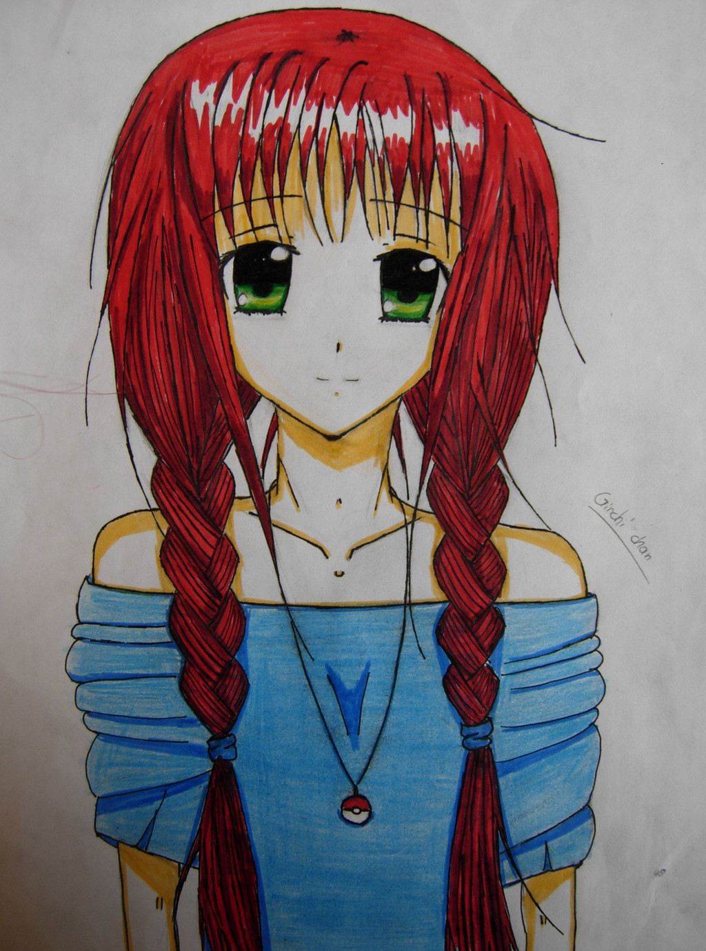
 Ginchi-chan — Me as an Anime character
Published: 2013-07-12 20:18:50 +0000 UTC; Views: 3465; Favourites: 151; Downloads: 2
Redirect to original
Description
Hihi :3 well i decided to draw myself as a anime-manga character and this is com it turned out..i wanted to make the shirt black but my marker decided to stop working -_- well anyway i didnt have inspiration so i did myself :3 hope you like it")
Related content


Comments: 298

You look beautiful in anime form. And I'm glad your black marker stopped working that day. I think your shirt looks better in color. I also hope you decided to get a replacement marker.
👍: 0 ⏩: 1

haha i did take a replacement marker  (Smile)")
👍: 0 ⏩: 1
You're most welcome ...and I've just added you to my watch

👍: 0 ⏩: 1

hi i'm with but you already know that 
first of all, i'd love to say this is such a nice drawing, i love the innocence the character is displaying, also the casual style. the braided hair added a lot more innocence as well. I adore it.

 (Wink)")
the thing about the coloring though is that it's a bit all over the place, especially on the blouse, the direction lines are quite clear and in some places you've pressed the pencils a bit too hard. To get the most out of coloring, the lines should be all going in the same direction. I've taken a look at the rest of your drawings and the colors are more accurate as the coloring lines nearly all go in the same direction which gives the image a higher quality, art wise.
over all this is a great drawing and you should keep going. would love to see more of your art 

👍: 0 ⏩: 1
aww thank you for helping me improving :3
and thank you for this critique
👍: 0 ⏩: 0

I am a huge fan of Anime, and I think it is a genre of art that is put down a lot. Others don't realize how much work it does take.
I absolutely love the facial features and hair. It is in the usual anime style that I never get sick of, and the hair contains a lot of realism - which many anime artist seem to forget about, but I think anime should always contain a kind of realism.
I do have some suggestions...
The arms of the shirt seem slight overly bunched, this isn't wrong - it is just a style choice. Secondly, the cleavage shown through the shirt seems odd. It would come off better if you did the slight outline of "under boob".
Besides that, this is a near perfect piece - that can improve with simple touch ups. As well, I love the background!
I apologized for the wait, our galleries are a little backed up, but we are getting on it right away!
Critique by Critique for All
👍: 0 ⏩: 1
wow thank you soo much you made my day
👍: 0 ⏩: 1
You welcome! I hope you use our service again, and I apologize for the wait!
👍: 0 ⏩: 1
o problem and i sure will
👍: 0 ⏩: 0


thank you so much
👍: 0 ⏩: 0

I didn't mean to post that three times, my phone malfunctioned but actually you deserve to hear it three times
👍: 0 ⏩: 1
Your pictures are amazing! You're so talented!!
👍: 0 ⏩: 1
thank you you are soo sweet
👍: 0 ⏩: 1


<= Prev | | Next =>