HOME | DD
 GiraffeMeow — Frederik from Fire Emblem Awakening

#digitalpainting #fireemblem #frederick #handsomeman #procreate #fireemblemfanart #fireemblemawakening
Published: 2018-08-08 02:42:33 +0000 UTC; Views: 615; Favourites: 39; Downloads: 0
Redirect to original
Description
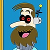
The pose is referenced from the official artbook of fire emblem awakening. I'm trying to practice opaque coloring without lineart, but in the end I think the drawing turned out better with the lineart...")
The version without lineart can be found here:
Which version do you like better? Any suggestion/critique is welcome!
 (Smile)")
30-second timelapse video:
youtu.be/82ZOX619Wzw
Related content


Comments: 26

Overall


Vision
Originality
Technique
Impact
Hi, I am from Project Comments!
(First, I am no professional artist, only do everything by selfteaching and hobby).
The outline version is much better, in my opinion, its because you can distinguish better between the colours (since you have no shading/blending between dark to light, but more cell style and the gradients are good visible)
I like the good visible shadows and lights (the cell style), you managed the light source well.
Since it is cell style and there is no shading, i would do the outlines more exact... I know by myself, its a huge act to get very accurate lines (without seeing shaking), you can try by painting very fast and trying to get the right line, erase the edges if its too much or you can use the "smoothing" (in Photoshop), you can produce very accurate and smooth strokes without drawing very fast... though I must say, I dont like this smooting tool very much.
Ok... once more, I dont critisize because I dont like it or I think I am better or something (never ever!) I just say, what I see ^^.
👍: 0 ⏩: 0


Hey there! I'm from ProjectComment and well, since I like game-anime-show-related stuff your piece stuck out to me! I've already read the previous comment you've received from a ProjectCommenter, so I decided I'll give my own side on some things I saw.
Best Parts: Your color palette is pleasing and you've captured the 'anatomy' of his body AND armor is really nice! It feels smooth and true to his character. The shading of the armor, although sketchily done, is also nicely placed and doesn't feel particularly odd - you know where your light is coming from.
Improvements: The last commenter already caught the oddness of the shading dealing with the face so I wanted to point out a different thing that caught my eye. That being, the choice of background shading. I can spot where the 'haziness' in the background stops and/or backs off a lick before the character, creating an outline of your grey background color. This takes away from achieving a more realistic feel for your background. Another point of improvement for your background and character is how dark it gets around his hair. The black and brown merging is too close a color to his hair color that the character almost blends into it. If you take a 'far-away' look at this piece (such as the icon of your line-less version below) you can see just what I mean about the hair and background merging into each other. One easy fix to this would be offering his hair a lighter 'sheen' to stand out against the background like you did with the armor.
I hope this was helpful and I really enjoy this piece - I always love seeing more fanarts ;u; Keep the art coming!
👍: 0 ⏩: 1

Thanks for the feedback! XD
👍: 0 ⏩: 0

i agree, the one with line art seems more appealing than the one without. Aside from that i also like the shading and lighting in the piece, making it look more 3d.
👍: 0 ⏩: 1
ain't no thang, but a chicken wang
👍: 0 ⏩: 0

It's a fab piece. The lineart looks a bit wobly, and I think I prefer the version with no lines - it looks particularly good in a thumbnail too! As always, you've remarkably good in positioning shades and highlights, thus I think it works better lineless. Either way, the piece is good and this is just my humble opinion~ ♥
👍: 0 ⏩: 1
Thank you for the suggestions Ayumu!
👍: 0 ⏩: 1

From
Pretty good work here. The expression is nice and firm. Your shading is quite spot on. The colors nicely blend in to one another, especially the ones that transition from a darker shade to a lighter one. Your shading has really added a whole lot of dimension to the overall piece. The one oddity I do find in the shading is the lip. It's nothing too serious, just a minor nitpick. However, the shading on top of the mouth almost makes it look as if he biting down his lower lip or something. As I said, it doesn't ruin the image or anything, but it looks that way from my perspective.
Now, while the shading is good, I do find it a bit odd that you'd shade around the entire face. Since light seems to be coming from the right, there shouldn't really be any darker shades on the side, except for maybe where the hair is near.
The line art itself looks a little sketchy, and could be a bit smoother. However, it still works and helps give a more solid feel to the character himself.
Overall, good job here!
👍: 0 ⏩: 1
Thanks for the critique! I agree the shading can be improved ")
👍: 0 ⏩: 0
The clouds in the background added with his own faded colour pallet match perfectly with the character's it's on face.
👍: 0 ⏩: 1

PICK A GOD AND PRAY-
I like both of them a lot, hehe...
👍: 0 ⏩: 1
YES!!! Haha he's one of my favorites in FE
👍: 0 ⏩: 1
SAAAAAAAME
He's like the entire first 11 chapters destroyed
And his crit quotes are awesome
👍: 0 ⏩: 1
Haha yes he's so reliable in the earlier chapters!
👍: 0 ⏩: 1
Yep
It isn't until like chapter 7 or so when you start promoting your units that he falls a bit behind
Chrom, for example, when promoted gets some crit chance on his unbreakable Falchion
👍: 0 ⏩: 1
Hehe true, but he's still one of my favorites!
👍: 0 ⏩: 1

With or without lineart is always a dilemma for my art and this is too for yours! I think the line version is a little bit better (sharper).
👍: 0 ⏩: 1
Thank you for the suggestion!
👍: 0 ⏩: 0

Both versions are great! but i like the lineart version
👍: 0 ⏩: 1