HOME | DD
 Gknight13 — Kiros the barbarian

Published: 2010-04-24 06:33:37 +0000 UTC; Views: 4072; Favourites: 22; Downloads: 0
Redirect to original
Description
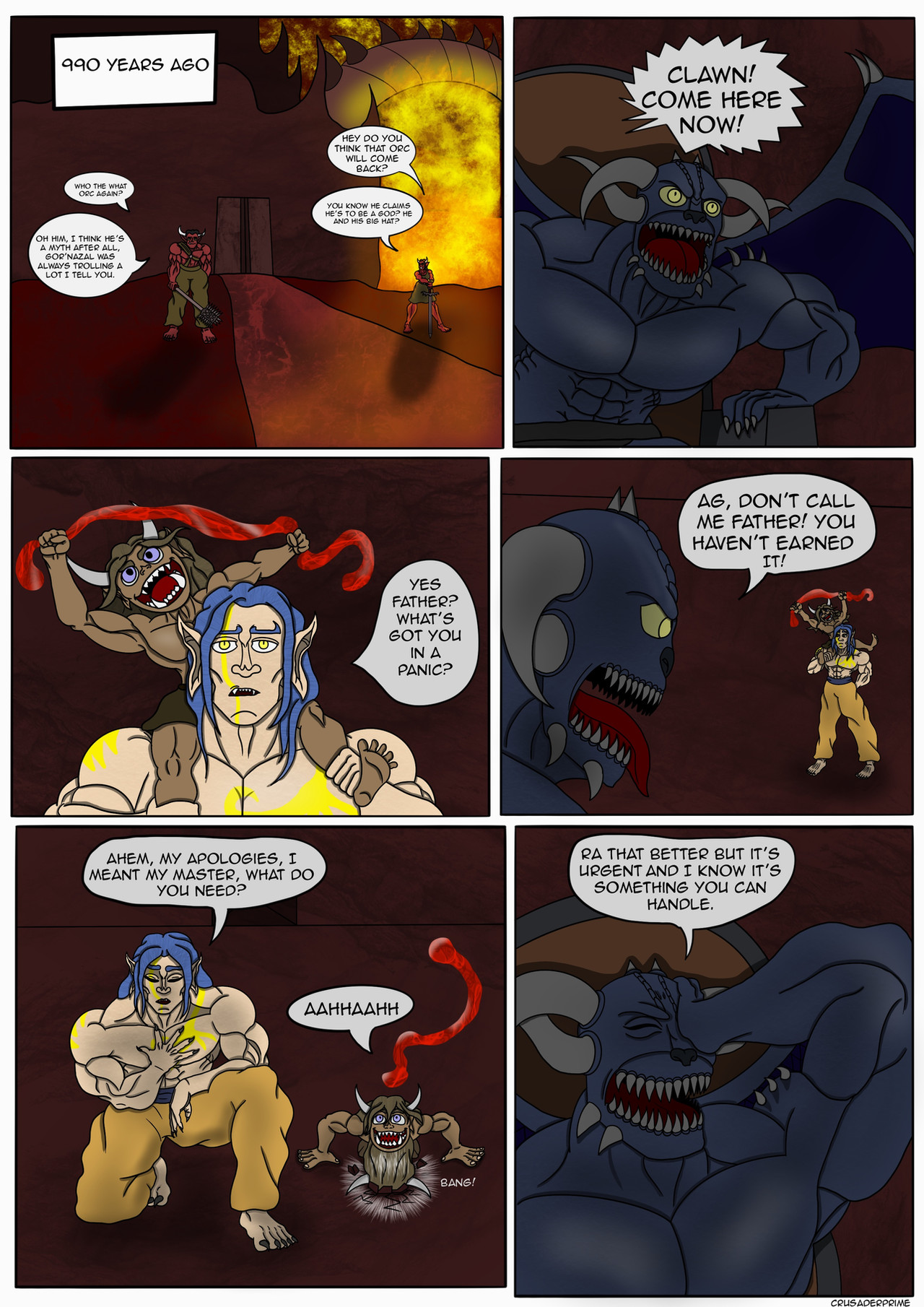
A visual of the barbarian Kiros who is mentioned in the little short stories I write. He was a character I played in a DnD game a long time ago. I'll get around to finishing it just thought it be nice to have pic up of him.:update:
Finally finished this pic it came out pretty good
Related content


Comments: 4


This work of late is a reflection of how much work and detail you have been putting toward progressing your technique. You have always done alot of detail work in your post, bust this one is a step further. The earthern tone the character's setting end matches like a tight slip on dress. The green mist or fog is a key attribute. He is fit for this environment, or fully embraces the tone. The small amount of lighting that peals through the forest reflects on his body very well.
The work spent on the armor and clothing are spot on, the knee guards I like especially, and the fur, dude, I tell yah, this sells the deal. The thigh pads are bad ass, not to mention the shadowing which without, would not have complete this drawing. The skin tone is better because you used different colors such as the dark red/brown, this worked very well as an addition. I also like the dread locks and accessories as well.
The weapons are done very well too, the battle axe, sword and knife with light spatters of dried blood lets you know this guy belongs here and will whoop yo ass. The only thing that looks out of the norm is his right hand, it doesn't look like it's gripping the axe or the fingers might be too long, not sure, I bring this up because I have trouble with hands myself and draw the same thing. Other than that the only thing missing is the bodies shadow, I rarely do these, but I think it would good on your picture, would have grounded the character to the background in epicness.
Final Comments
Overall, you alot better than me, your work is one to follow, your talented in darker colored settings, which I have no time for, maybe you can teach me a few things. Piece out homie!
Overall Grade: WINNING!
👍: 0 ⏩: 1

Giving the type of depth to the skin tone was something that I experimented with until it came to a level I was satisfied with. The hand, well I think that was pure laziness on my part because once I was invested so far into the pic it seemed minor but now I wish I would of taken more time because hands seem to be a classic difficulty. The environment was something I also debated on until I decided to keep it just green and browns to compliment his complexion with the acents of the rocks and mist. The blood splatters are something that made me smile when you mentioned them I thought I made them to subtle and that the effect faded once I had added additional colors thanks for the keen eye. The body shadow was also an oversight that I meant to add but no real excuse other than I missed it.
Thank you for the thoughtful in depth critique it has made my day

👍: 0 ⏩: 0

Really well done. If I had a critique, it would be that his head seems a tad small.
👍: 0 ⏩: 1
Trying to draw bulky big characters is something I'm slowly working on but I noticed a trend of slightly smaller heads once the body got big enough, but thank you for the observation
 (Smile)")
👍: 0 ⏩: 0