HOME | DD
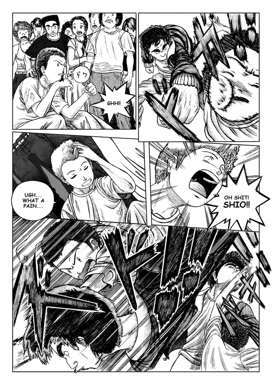
 Glaubart — Speed chapter 2 page 3
by-nc-nd
Glaubart — Speed chapter 2 page 3
by-nc-nd
Published: 2009-11-29 18:13:00 +0000 UTC; Views: 1381; Favourites: 28; Downloads: 45
Redirect to original
Description
Speed chapter 2 page 3Related content


Comments: 43

really cool! so dynamic, love the shading effects
check my pages out too
👍: 0 ⏩: 1


it looks very professional! o_o you're very good at speed lines and sound words xD
👍: 0 ⏩: 1

This is amazing. Your skill with whatever program you use makes it look professional.
👍: 0 ⏩: 1

Beautiful work! It looks so professional and well done. Is this going to be published/sold?
👍: 0 ⏩: 1

Hello! Yeah, someday! Actually I'm stucked in another project  (Smile)")
👍: 0 ⏩: 0

You have a really good grasp of perspective. The panels put you right in the scene.
👍: 0 ⏩: 1

Oh wow! This is beautifully done, not out of place in a Shounen magazine at all.
The only criticism I have is that you're using Comic Sans as your font for lettering... unfortunately this ruins the look of a lot of comics and most of my publishers hate it. Pick up a nicer font as soon as possible as your art deserves better! You can get them for free or buy them very cheaply from companies like Blambot, they specialise in lovely comic lettering, even with international character sets for different languages.
👍: 0 ⏩: 1
Hello! Thanks for your advices! Well to say the truth this project is stopped for now and I was testing what could be better in that time (past 2009) and yes, I know that font is not cool. My intention was just to put something to publication on DA. Thanks for your worries and keep on touch, my friend!
👍: 0 ⏩: 0
")

you're welcome, it's really
good!!!
👍: 0 ⏩: 0


Sorry but it reminds me of Tintin when you draw the eyes as dots XD
Other than that, damn man, you're really good at the linework O_O keep it up!
👍: 0 ⏩: 1
heeeeyy I love Tintin *--*
Nice to be compared with that awesome title! ^^
Thanks for everything Takutosuki!
👍: 0 ⏩: 0


I actually really enjoy the detail and the expressive-ness (is that even a word?) of this!
It looks very professional!
👍: 0 ⏩: 1

hey, só por curiosidade, esse speed já naum foi publicado em nenhuma revista brasileira naum? ^^
acho que vi algo parecido sei lá...xD
muito bom seu desenho!
👍: 0 ⏩: 1
olá!!Publicado oficialmente com minha autorização não!!
A não ser que tenha alguém safadinho por aí querendo ganhar as minhas custas hahahahaa
Mas a versão impressão é eu mesmo que faço e vendo. E claro, em português ^^
Valeu!!
👍: 0 ⏩: 1
ah sim...devo ter confundido alguma coisa xD
👍: 0 ⏩: 1

Wow man! Sequência de luta loka hein. Muito expressiva. Parabéns brother!
👍: 0 ⏩: 1
Falaaee!!Valeeeuu cara!!!
Abraço, mais tarde nos falamos!
👍: 0 ⏩: 0