HOME | DD
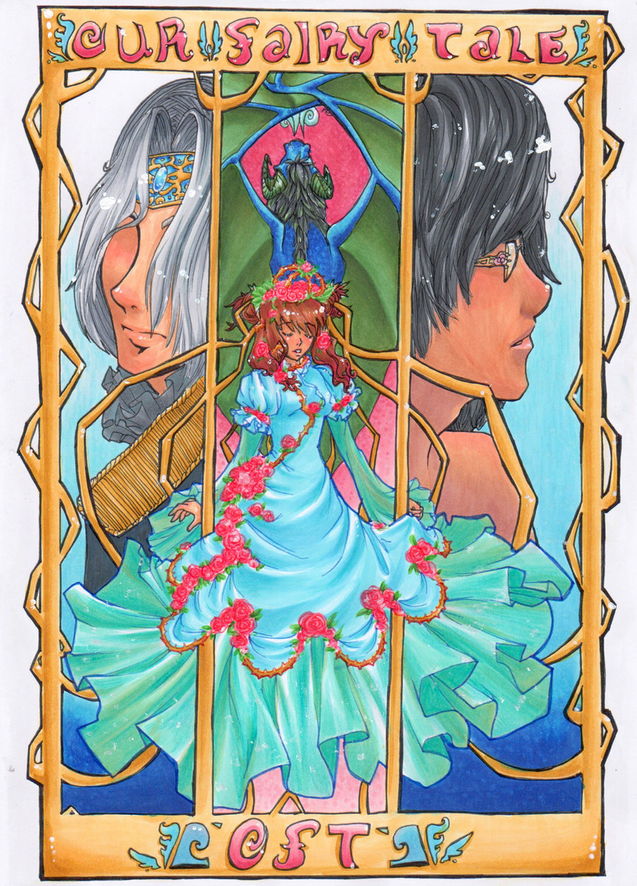
 GlyphBellchime — The Healer: intro redo

#amulet #coat #cuff #female #male #marker #panel #smile #artnouveau #backtoback #originalcharacters
Published: 2016-05-23 17:02:14 +0000 UTC; Views: 1438; Favourites: 46; Downloads: 0
Redirect to original
Description
Didn't want my marker skills to get rusty, so I redid the back to back art nouveau piece of the Healer. The characters are Adam and Xertis.Related content


Comments: 8

Hello !
I'm Nei from feedbackplease
I like the composition, it's giving me a bit of a tarot vibe.
Proportion wise I find you heads a bit big, you've kept the the rest of the proportions fairly realistic so think about lengthening your bodies a bit. Right now they seem to be about 5,5-6 heads tall (average real life proportion is around 7-7,5 ) you don't have to go by the realistic ones if you like slightly cartoon-ish proportions but maybe think about balancing it out  (Smile)")
What type of markers are you using?
Also what type of paper?
If you can afford it, I'd suggest you look for marker paper specifically, it'll help your markers last longer and reduce the patchiness the big filled areas sometimes have. Also won't bleed as much so you can be more precise with your shading.
If not maybe use some photo editing software to reduce some of the patchy areas. I think your drawing would pop out a lot better that way
I like the flow in the female character's hair + scarf? cape?
Linework looks pretty clean from what I can see.
Well that's about it, if anything I said sounds unclear/ needs further explanation please let me know !
Good job keep it up.
👍: 0 ⏩: 1

Actually the proportion thing is something I am working on. It used to be worse. glyphbellchime.deviantart.com/… the old one. So I am glad to see I'm getting closer!
As for your questions: I use a combo of copics, prismacolor, and finelines. As for the paper, I do draw out my pieces in ink first, copy them to clean out any white out, then color the printout to make it easier to deal with any mistakes. So I guess that the paper might be the issue. It's basic copier paper for a home printer. I have tried to run my marker paper through the printer, but it caused more jams than anything else. And any printer places around here really hate it when you bring in your own paper (I've tried, the dirty looks alone could peel any makeup I had on, off! Yikes.) So I'll see if there's any photoshop ideas to clean out the patchy spots. I have been looking up tutorials to fix problems like that.
As for the hair and the cape and the line work comments, thanks. I do think that the critique is exactly what I have been looking for when it comes to comments. It definitely avoids the "20% cooler" problem I have been running into!
👍: 0 ⏩: 1
Cool ! You're getting there
Don't be afraid to count how many heads you can fit in the whole drawing if you ever feel like something's off.
I have the opposite problem where I tend to elongate bodies a little , I blame late 80's early 90's anime for that aesthetic
Printer paper !? Well yes that'd definitely glide a lot easier ! You'll also gain time.
There are many ways to correct color inconsistency, one could be using a good part to cover up the other ones, either by layering it over or making a brush out of it.
I'm glad I could be of any use !
The better you're able to take critique, the faster you'll improve ! It's a great attitude to have.
Of course I'm not perfect either so if something I say ever sounds extremely wrong or debatable don't beat yourself over it
It's so hard to give people feedback without hurting people's feelings ! I'm always a bit scared the first time someone submits to the group because I don't know how they'll react
Anyways if you've got time feel free to check other people's works in the group and give feedback yourself !
 (Wink)")
👍: 0 ⏩: 0


Oh this conveys a nice history to their relationship.
👍: 0 ⏩: 0


