HOME | DD
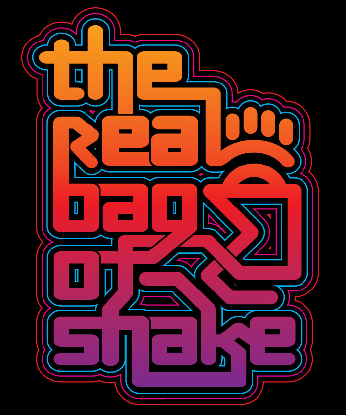
 gomedia — Real bag of Shake typography

Published: 2007-09-04 15:33:44 +0000 UTC; Views: 10207; Favourites: 97; Downloads: 595
Redirect to original
Description
Done for our friend DJ Moose . It was a typography concept for his new mix CD entitled "The Real Bag of Shake".Designed by jeff finley
Related content
Comments: 28

I am seriously envious of your skill. This piece is dynamic, balanced, has good flow, and the color transition is spot on. It's a fine, well thought out piece of work
👍: 0 ⏩: 0

May I ask if this is a typeface or custom made
👍: 0 ⏩: 1

Mhmm. I'm not sure (and I'll ask Jeff to correct me if I'm wrong), but if it's a typeface, it has been heavily customized.
^SBH
👍: 0 ⏩: 0

f e a t u r e d :
F E A T U R E S - 12 - TYPOGRAPHY
if you like it than fav it <33.
support is VERY appreciated <3.
have a nice day ^^
kisses,
Kishui
👍: 0 ⏩: 1

Thanks a bunch for the featuring!
^SBH
👍: 0 ⏩: 1

Love the style and how the x-height of 1 line overlaps the lettering of the previous line
:]
👍: 0 ⏩: 0

The 70s live!
But that's OK because they had interesting typography and the music didn't suck like the 80s.
👍: 0 ⏩: 1

haha nah, the 80's had some rad songs - that's when I grew up
👍: 0 ⏩: 0

that's cool...a little hard to read, but cool.
i have a question that i was hoping you could answer...on this piece there are line strokes that extend evenly around the piece of artwork. is there an easy way to do that in illustrator? because when i try to scale stroke bigger like that it doesn't line up exactly right. any tips would be appreciated!
👍: 0 ⏩: 1

it's done using mutliple strokes. First you select all your text, copy it and paste in on top by pressing Ctrl+F. Then use your pathfinder tool to ADD all your text together into one shape. Then give it a stroke of about 10 or something, your choice. Make the stroke aligned to the outside, not the inside or center. Then Expand the Appearance which will outline the stroke. It will subsequently group everything together when you do that, so ungroup it and then ADD again using your pathfinder. This should have given you a big fat version of your text. So then give it an empty transparent fill and a stroke of say 4 or 5. You will end up with just the outline of the fat text and then you'll be able to see your normal text underneath it. You basically keep doing that over and over for all the different strokes you want. Pretty cool effect if you can digest what I just said haha
👍: 0 ⏩: 0

yeah that's kinda where I was going with it, although it wasn't used in the final layout though but that's ok
👍: 0 ⏩: 1


