HOME | DD
 goodeggproductions — Selective Color. Ugh.

Published: 2010-08-15 02:06:28 +0000 UTC; Views: 7288; Favourites: 164; Downloads: 0
Redirect to original
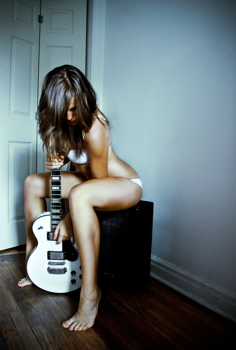
Description
I almost never do this. And I usually don't like it when other people do it either. Because it's almost never done well. Let me know if you think I did it well, or if it's crap like everyone else's attempts.Related content


Comments: 28

Nothing like a beautiful woman and a guitar.... so sexy. I like the selective color here.
👍: 0 ⏩: 0

Selective color gets a bad rap. Because it's trendy, people will use it just for the sake of using it, whether the picture demands it or not. But as a big fan of color pictures, I think it's at least more interesting than black and white, which is totally overrated - not that a good black and white image isn't powerful, but everybody makes their images black and white and thinks that automatically transforms the image into high art.
I think this is an excellent selective color.
👍: 0 ⏩: 1

Thanks for commenting on this image. I uploaded it over three years ago and took it probably 5 years ago. Looking at it now, I think it's a terrible gimmick that I thought didn't look as cheesy as what I've seen other people doing. However, I'd never do it today. I think that I can take a strong enough photo, color or B&W that stands on its own without goofy tricks. But it is interesting to look through older stuff that I once thought was so awesome.
On the positive side, that means I'm still growing and learning. I can live with that.
👍: 0 ⏩: 0

Sorry, by "this" do you mean a de/saturated mix, or the "musical instrument covering body" motif?
 (Wink)")
👍: 0 ⏩: 0

Hi there,
You are being featured overhere >A belated feature!!! PHOTOGRAPHY < please 
Cheers,
Berry
👍: 0 ⏩: 0


Yes, this technique is so trendy, usually done with blues or reds, but I think this composition looks splendid.
👍: 0 ⏩: 0

Best picture on this site by far! I have a 14 similiar to this one though mine is of a lower number (I have a 214. I want to say the one in the picture is 814 or 914.)(I also have a T5. She is great.)
In all seriousness though... I do love this picture. It's different. Too often in these black and white images that accent a single color you see red earrings or lipstick or flower or necklace.
I love the woodtone with the black and white. The examples I listed before are most often too strong and draw your eye away from the girl and her and image. She is supposed to be the center point of the picture.
The guitar is just right to where I see it there and it definately adds a lot but I am still drawn to her eyes (which are absolutly captivating). The guitar doesn't distract from the girl.
Definate favorite.  (Smile)")
P.S. I wish I had a girl like her to cuddle with my guitar like that. *sigh.....oh well.
👍: 0 ⏩: 0

Nice taylor guitar..very hard to made this selection.
👍: 0 ⏩: 0

I really like it. I actually use the isolated color often, but agree, it's not always used in the right way. this is perfect. This would make a great B&W shot, but the warm tones of the wood in the guitar warm up the image just enough. Well done. (Is that a Taylor?)
👍: 0 ⏩: 1
I don't have any idea. It was her idea and her guitar. Generally, I don't do girls with guitars, unless they really play and they really want to. And if it's a shot that's not the typical girl with guitar. I have a Paul Reed Smith signed by Carlos Santana, but I've never had a model pose with it.
👍: 0 ⏩: 1
Yeah, the over done "girl with guitar" shot has to work. It's easier to have them pose with it in a non-playing pose then as if they are playing. Unless, like you said, they really play. I'm a bassist and have done a few guitar/bass shots.
👍: 0 ⏩: 0

I actually really like this technique, and I think you did it very well.
👍: 0 ⏩: 0

Holly crap, please excuse the sentence structure. yikes!
👍: 0 ⏩: 0
I think it's a great image but what it is it that you don't you like about others doing the same concept or idea. Just curious on your own personal feedback. Nice work on this one.
👍: 0 ⏩: 1
Losman,
Selective color is usually a 1st year "cool thing" that lots and LOTS of beginner photographers seem to like. Frankly, I think it's cheesy. Hell, I did it when I was starting out. And typically, the uninformed public likes it too. But from an artistic point of view, it's stupid.
I've seen it done well about as often as I've seen caution tape and railroad tracks done well. Almost never.
So that's why I'm on the fence about this image. I did something I usually hate, and while I'm satisfied with what I've done here, I was just wondering what others thought of it. The general consensus is that it's not horrible. So I'll take that.
👍: 0 ⏩: 1
Creativity is allowing yourself to make mistakes. Art is knowing which ones to keep. It's a great piece. I look forward to reviewing some of your other pieces. What I love most about it is the composition.
👍: 0 ⏩: 0

you crazy! it looks great. The position of the girl's leg are a good complement with the guitar and the way she is holding it and looking here while only been able of seeing one eye and the color difference is awesome!! i love it so much that I will put it in my favorites
👍: 0 ⏩: 0

To my eye, it makes the object of attention the guitar, losing the body of the guitar/body of the model graphic. I can see this shot as an all-sepia monochrome, which would come across warmer than a strict BW. But, it's your party. Question is, if you don't like the technique, what raised the flicker of interest to try it here? Might help you judge better the result. Just a thought. Cheers.
👍: 0 ⏩: 1
The situation was like this. The particular model just kept giving me keeper after keeper for this shoot. I finished several images that looked similar and I decided for something very different to try one with selective color. Overall, I'm pretty pleased with the results, but I'm aware how the community at large feels about selective color effect. I presented this image as more of an opportunity for people to critique my effort. And I appreciate every comment, positive or negative.
👍: 0 ⏩: 0

This is a very beuatiful photo.
I believe it would have been made better if the colour had been removed from the guitar also or added more so into the beuatiful model.
I agree,
this kind of shot can either be amazing or flop.
Many of the aspects of this piece, however, are incredible.
nice work.
👍: 0 ⏩: 0

I actually like this :3
The nude picture is very tasty, not vulgar or anything. It's art 
About the colors. I do like that the guitar is o dull in it's color. It don't have to pop out for me, it's eye catching anyway. The only think I can think of is that the picture it self is a bit dark. But that is just a small thing ^^ lovely picture!
👍: 0 ⏩: 0


This was just the wrong photo for it. Personally, I don't like it. I think the color left in should be bright and eye-catching... the soft beige-brown looks very flat, especially since the outline of the guitar is still in greyscale. Had you done the entire instrument in color, I think it would be better. Selective color is very challenging to pull off.
Otherwise, it's a very captivating photo!
👍: 0 ⏩: 1
You made me double check. The outline of the guitar has an aluminum band around it. So that's not desaturated... that's the color of the band. I overlaid the edit to the original, and it looks to be about a 10-15% desaturate of the actual guitar face.
I agree that it's very difficult to be subtle, but show importance. I just hate it when people do roses or just lipstick in color. That's dumb.
This is mostly dumb too, but it's about as cliche dumb as I like to get.
👍: 0 ⏩: 0

Beautiful photo, you look great, an i like how the guitar stands out
👍: 0 ⏩: 0

I like it! I know what you mean about it being overdone, but it looks good here.
👍: 0 ⏩: 0

I think it looks great. It's very smooth and doesn't look forced, you know what I mean?
👍: 0 ⏩: 0