HOME | DD
 Goshun — VIC Design

Published: 2006-02-14 10:14:07 +0000 UTC; Views: 1600; Favourites: 8; Downloads: 86
Redirect to original
Description
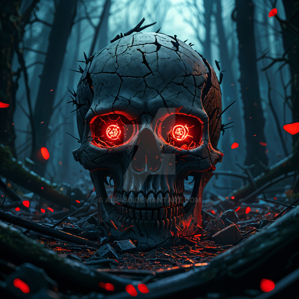
Design for the Megadeth contest.Related content


Comments: 8


")
👍: 0 ⏩: 0

oh, and would there be any way to get his eye to '
")
👍: 0 ⏩: 0
mm, i like the design, but i think it's too symmetrical. things like bloodspatter never comes out even both times... i think it would be more eyecatching if it wasn't so perfectly matching on both sides.
 (Smile)")
👍: 0 ⏩: 0

Hahah, love the way the hanging chin makes his grin look like.
👍: 0 ⏩: 0

Totally underappreciated. This is another one of the better designs I've seen; you're one of only five entries--so far out of all of them--that have caught my eye. Greatness.
👍: 0 ⏩: 0


thank you for the kind words man.
Just want to say that I haven't used any refference here. It is just me, my tablet and my PS.
👍: 0 ⏩: 1