HOME | DD
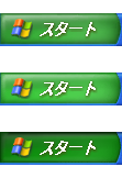
 GothaGo229 — Windows XP start button v2
by-nc

Published: 2011-11-12 15:24:50 +0000 UTC; Views: 22847; Favourites: 21; Downloads: 6165
Redirect to original
Description
V2 of the windows xp start buttons.Changes:
smaller text
different text type
New win flag(not realy a big difference)
Related content
Comments: 14

This is almost identical to the original start button, and I think it is pretty great. But it would be amazing if you stretched out the length a little (if possible) and move the Start text a bit further away from the logo. If due to constraints you can't do this, I totally understand.
👍: 0 ⏩: 0

it's not the greatest but it's good i wish it look like the windows xp one.
👍: 0 ⏩: 0

Needs more space between the start.
Then this will be pro.
👍: 0 ⏩: 0

you need to know that w7 has less space for the startbutton so it is hard
👍: 0 ⏩: 2

so im guessing its impossible to make an exact replica of windows xp's start button,correct?
👍: 0 ⏩: 0


