HOME | DD
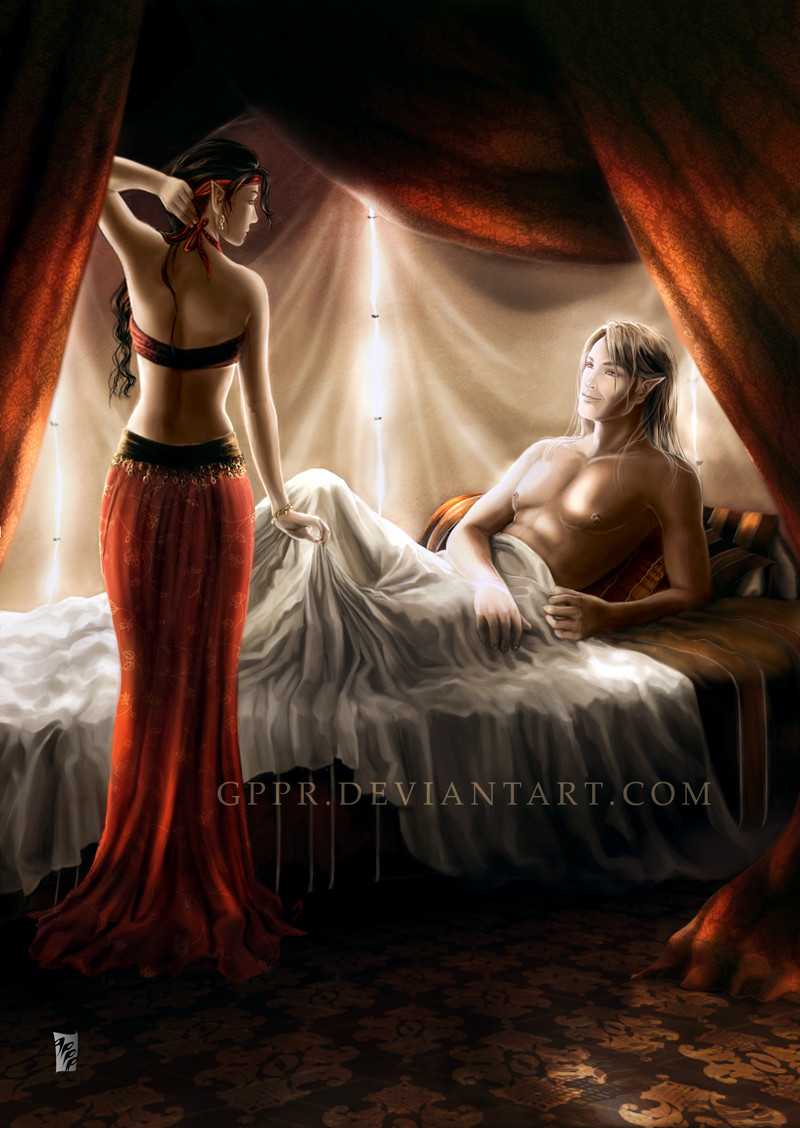
 gppr — Morning Light
Published: 2009-10-06 14:21:41 +0000 UTC; Views: 12110; Favourites: 281; Downloads: 0
Redirect to original
Description
Updated March 2021www.deviantart.com/pickled-jes… by Pickled-Jester-Inc
www.deviantart.com/julkusiowa/… by julkusiowa
-----------------------------------------
Thanks to everyone who left feedback on the original image.
Floral pattern by xe0s
Different pattern by Design-Maker
Related content


Comments: 153


Your style evolves constantly with each new artwork that you submit and with each artwork that you edit and update.  (Wink)")
👍: 0 ⏩: 1

Thank you, friends. 

👍: 0 ⏩: 1
You will manage to do that with time.

👍: 0 ⏩: 0

Incredible! I really love the atmosphere here... And the way you colour material is just divine!

👍: 0 ⏩: 1

I'm not very good with art, so no constructive comments I'm afraid, but I really like this piece. The lighting and their poses capture the anticipation very well
👍: 0 ⏩: 1
That's very kind of you! Thank you.
👍: 0 ⏩: 1

Do you mean beowulf? And no, it's not him.
👍: 0 ⏩: 0

Hi there. I got here from Critique It.
I have a paintover for you here: [link]
I usually dislike paintovers, but because mine is retardedly schematic I don't feel like I'm giving you a cheat sheet.
To explain my rough green lines: The woman's centre of balance is off in her current pose, it feels like she's going to topple over any second. I realize you were going for a heel-after-toe kinda sexy walk, but this is a bit exaggerated – so in my schematic I left her feet where they are but moved the pelvis sideways to correspond with the foot on the gound.
I also think you should look at some female back references – her anatomy is very smoothed over right now. Her shoulder blade would protrude to the side if she's holding her hand up etc., her neck is very wrong, as is the pose of the head. She doesn't look like she's even looking at him, rather staring into space distractedly. So in my brilliant emerald scheme I drew her facing a bit lower so her body kinda snakes in his direction.
Now the dude. In general, it seems like you had some more references for him than for her, or, you know – you just like drawing dudes more. his left hand is especially well done. The right one – less so. It looks like there are no bones in his fingers. Poor guy. His legs don't sprout from the right place, too.
But what bugs me about him more than anything is the pose of his head. The profile. It's so WRONG in this scene. It feels like you just drew a profile because it's easier (And it's not!). He is supposed to be looking at her – so why wouldn't he turn his face in her direction?
About the colour scheme – I don't know what feel you were going for, but it generally feels a bit too saturated. It lacks desaturated areas to accentuate the saturated ones and give some interesting contrast to look at. Try to use the rule of opposites when you paint or draw anything.
Stuff should be echoing and going against each other – if you want high saturation, put some low saturation in as well to counter it. If you want everything in red, put some dark, cold greens somewhere there to challenge the eye.
Apply the same thought process to the composition and those curtains.
Also they are the same value as her hair so her head is kinda lost in them – I'd suggest to either darken the hair, lighten the curtains, or remove them altogether from that corner.
Gl.
Hf.
👍: 0 ⏩: 1
Thank you for taking the time to leave this the very useful and spot on critique for me. You've given me a lot of pointers. I knew there was a lot of things gone wrong here. I will redo it and I hope to do a better job this time around. 
(And thank you, I wouldn't want a cheat-sheet either. What's the fun in that?
👍: 0 ⏩: 0

I'm too lazy to give a well written, full critique, but I'll try to make some suggestions based on your questions xD
First off, this is a stunning, beautiful piece. Just thought you should know that :3
With that in mind... I like the colors of the framing/curtains, and I do see how it's kind of unbalanced, but I'm not sure how to fix it either D: Try this though: add some curtains (red or dark red) to the right side, sort of opposite of the ones on the left side/upper-left corner. Also, consider changing that strip of light in the middle, like, moving it a little to the left, or reducing the lower half. Maybe that'll help :3
I also think the girl should be bigger C: IDK if she's just small or something, but she IS closer to the viewer, so... I'm not that great with anatomy myself =w=;
I think the pose looks fine as is. However, the pose and their expression is kind of sending confusing message... Her pose looks like she's trying to seduce him, but her expression is something like sad or bored, from what I can see. His pose looks like... he's enjoying being seduced xD? But his expression actually looks mildly annoyed. IDK, maybe that's what you intended.
Hope that helped...
👍: 0 ⏩: 1
Hi there!
I am imagining your suggestions about the curtains/the stripe of light and I think they will work wonderfully. Yes, she's definitely too small or him too big. I will revise that, but I think I might also change the pose. The expressions are all wrong indeed. I have to rework that, maybe if the pose changes, I will be able to have his face in a less profile view so that the expression looks better. Thank you very much for leaving your feedback, it is very useful to me.
👍: 0 ⏩: 1
You're welcome <3 glad I was of help.
👍: 0 ⏩: 0

This is beautiful. 
👍: 0 ⏩: 1
Thank you so much, Lumaris! 
The feedback I received on this helped a lot. I still think something is off with composition and maybe even colour, but I just can't see what it is.
👍: 0 ⏩: 0

The colours melt together like fine red wine and burnt chocolate... It intoxicates the viewer allowing a passionate feeling to emerge, which is depicted finely in this piece of work.
Every part of this pictures detail screams out to be noticed, from the peeking light through the gashes of material to the beautiful use of lighting that embraces both bodies with sublime touches.
One of my favourite pieces today so far
👍: 0 ⏩: 1
Wow, that is a very nice comment!

👍: 0 ⏩: 1


Thank you! I'm glad you like this revision.
👍: 0 ⏩: 1

Gracias! Y si, cada revision le da mas detalle. Yo vi el cambio tambien (y es dificil cuando se ha visto por tanto tiempo), es mas natural sin las lineas! Y la posicion de la elfa estaba muy mal antes... Gracias por el favorito y por tu comentario! Me anima mucho.
👍: 0 ⏩: 0

Hello!
First off, very well done in terms of color, it really fits the mood of the piece.  (Smile)")
I hope I can help.
However, I am confused slightly...is he staring off into space? and if so, why? He’s got a BEAUTIFUL woman right before him! His eyes seem to not be on her, but off at something else, thinking about a silly memory perhaps? Anyway, this might be corrected if instead at the "front" of the eye the iris and pupil are more at the center. (the head also maybe another thing that could be adjusted to insure that he is actually looking at her). Also, his tattoo stands out quite a bit, and looks to be "raised" up from his skin (not sure what you're going for with it...raised intricate scar?) With following his right leg, he seems to be missing his foot. His left foot pinky toe also has a bit of an odd shape to it.
With her, her pose is sultry and very smexy, and I especially like her "tugging" on the sheet. I'm no expert on lighting 
I hope this helps, and overall, I Really enjoy the piece.
👍: 0 ⏩: 1
Thank you very much for the detailed feedback! I'm glad you like this! Thank you as well for faving it. 
I've gotten a lot of comments regarding his eyes. In the close up view, it shows he's looking at her, but the detail is lost when I scale it down for submission, the same happens with her expression, she's actually smiling a tiny smile... Hmmmm, I see what I can do. (I might post close-ups) The symbol on his arm is meant to be a lighter colour. I like that it stands out, actually!
👍: 0 ⏩: 1

Okay, you're gonna hate me for this. Maybe. XD
I just realized two things. One, her right arm is so much longer than the left. Her left hand seems...flat. I think that this is partially due to the fact the pink is way too small.
Also, her right shoulder is way off. It's like shd doesn't have a shouler. It should be poking out more and be defined.
The folds. Are ftw. Now.
The right eye is too close to the bridge of the nose and I think that the lips need to stand out stronger.
The left hand is also way bigger than the right hand.
I feel like he's missing his right foot.
His head also might look a bit bigger rounder.
This looks sooo much better than the other one.
You really have done a gorgeous job and the lighting is so much better.
👍: 0 ⏩: 1
Not going to kill you at all! 
👍: 0 ⏩: 1
You're welcome! I'm glad I could be of service. ^^
👍: 0 ⏩: 0

I really love this,adore the colours and the soft blending, though my favourite thing is the textures you used in the fabric, just one of those things that bring the whole thing alive ")

👍: 0 ⏩: 1
Thank you! I'm glad you like it and thank you as well for adding it to your faves.
👍: 0 ⏩: 0

It seems like she should be stretching more on her left side. Her left side seems too vertical, or too flat.
Otherwise, it looks great! Her pose really communicates motion.
👍: 0 ⏩: 1
Thank you very much for your feedback!
👍: 0 ⏩: 0

The colors are really awesome, maybe the top part is a bit dark.
She looks also good, but her neck is a bit tiny and I don't know...but I think her head and left hand couldn't be like this in the same time, but it is not too bad.
👍: 0 ⏩: 1

Oooohhh, I love how well the colors tie this together!
Her neck looks a tiny bit off. I think it's because she's looking one way and her body is facing another, but her neck is just in the "profile" position. I would say the body has to turn to the right a bit, or her head should turn away some.
All the shading is really smooth except for her back. It starts to look a little patchy.
Overall, beautiful peice!
👍: 0 ⏩: 1
Thank you very much for looking and commenting. I have received a lot of very useful feedback on this piece and I can't wait to start revising!
👍: 0 ⏩: 0

The first thing that stands out to me is the girl's face. I like her pose a lot, and think it works well with the mood of the piece, but it seems a little odd to have such a complete profile view of her face. It would be very difficult to turn your head that far with your body at that angle. Her neck would come in front of her jaw and you would see some of the back/underside of her jawline.
And again, it might just be me being picky, but I feel like the guy's face would work better at a 3/4 view rather than a full profile, especially since his body is angled towards her. If you think in terms of real space, the guy is actually looking in front of the girl and not at her. It would also help if his head was titled up a little, to seem like he was looking towards her eyes and face, especially since she seems to be trying to seduce him. Of course, he could just be embarrassed and doesn't want to look her in the eye.
The colors work really well. I like them quite a bit. I really enjoy the highlights coming through the cracks in the tent, especially the one on the floor in the foreground. It's a small attention to detail that adds a lot to the piece. My only critique on that, and it could have been totally intentional on your part, is that the mark on the guy's shoulder is distracting. If it is a tattoo then it seems like it should be darker. But, if it's something completely different and it SUPPOSED to look like it's glowing...well, in that case, you nailed it.
Overall this is very well done. Your texturing is spot-on and everything looks like it should, from their skin to her clothes to the cloth from the tent. Great job on this piece.
👍: 0 ⏩: 1
Thank you very much for taking the time to leave me this detailed feedback. It will help me a lot!
I'm itching to start correcting, but I'm tablet-less at the moment...
👍: 0 ⏩: 1
Hey, no problem. That's what we're here for, right?
👍: 0 ⏩: 0

Firstly wow.......i think the colour is great i love it i think it totally helps set the mood I think her pose is lovely and she has perfect legs hehe
To help with the proportions for people what helped me alot was just looking at pictures in fasion magazines girly mags or even on the internet and I tend to look at how everything relates to everything else. I hope this helps
However after all that i stil totally love it I realy adore how you have captures the mood of everything a huge thumbs up
👍: 0 ⏩: 1
Thank you very much for the feedback and for the fave on this!
👍: 0 ⏩: 1
nice one i really hope I wasnt too harsh
👍: 0 ⏩: 1
Not harsh at all! I really appreciate feedback, it's the only way to improve when I can't see what's wrong. You can tell me how it is, I'll never get offended. (Maybe a little discouraged, but I'll bounce right back!) Heehee!
👍: 0 ⏩: 1
well try not to be discouraged remember its all in the practice
👍: 0 ⏩: 0

very good colors and light-shade ^^
👍: 0 ⏩: 1
| Next =>