HOME | DD
 grafick — 1 9 8 7 -
Published: 2006-01-24 12:39:39 +0000 UTC; Views: 961; Favourites: 21; Downloads: 90
Redirect to original
Description
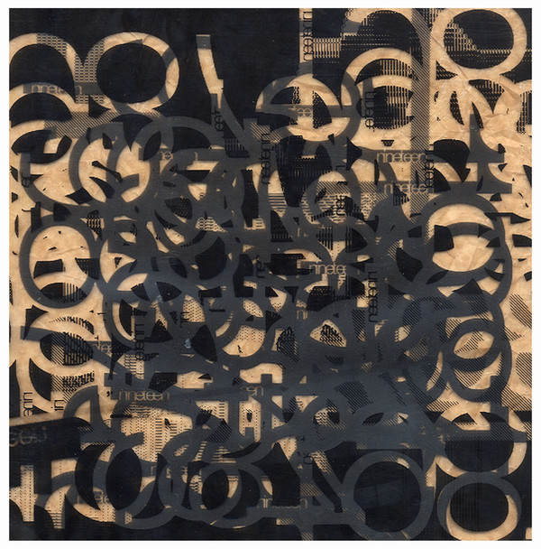
ingredients: 1 acetate sheet1 piece of crappy brown paper found at college
1 amazing photocopier
and a scanner
lol
[link]
[link]
[link]
full view pls
Related content


Comments: 21

its not digital though...
however text was done on ps and then photocopied again and again on acetate and stuck on brown crumpled paper. check out these other versions: [link] & [link]
x
👍: 0 ⏩: 1

I know it isn't. 's all good. The 15-2-07 one is pretty cool.
👍: 0 ⏩: 0


ooh..this one is even more interesting..especially in full fiew...

👍: 0 ⏩: 1

wow, omar would love to put a horrific looking filter on top of this!
I really like the busy nature of the whole thing, plus with the high-res-nes of the whole thing really brings out the quality of the material.
👍: 0 ⏩: 1

")


how in the name of Adam West have you made that!??!?!? I LOVE IT!!!! looks almost woodblock printed and carved... is it layered acetate sheets???
this is defo getting a fave
👍: 0 ⏩: 1
ingredients: 1 acetate sheet
1 piece of crappy brown paper
1 amazing photomocopier
and a f*ckin scanner
lol
love it!
👍: 0 ⏩: 1
SCHWEEEEEEET!!!!! 
take care
👍: 0 ⏩: 1

I was aware of interested typography when i full view.
Cool work.
👍: 0 ⏩: 1
i dont understand? but thanks
👍: 0 ⏩: 1
I am sorry mate. My english is little poor.
YOUR WORK HAS NICE TYPOGRAPHY... I would said.
👍: 0 ⏩: 1
ah i see - ye its helevicta!
 (Smile)")
👍: 0 ⏩: 1
