HOME | DD
 grafick — fer-esh
Published: 2006-07-04 12:51:57 +0000 UTC; Views: 1238; Favourites: 18; Downloads: 156
Redirect to original
Description
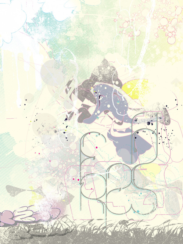
edit-+resizei am a fan of graffiti but evry1 else who has submitted to the contest has gone graff- i think thers more to a street scene.
it was really hard finding sumthin else i could do, so i came up with this.
urban/street scenes- pollution cough. hows that fresh? im not sure if it gets the urban feel?! well tell me wot u think.
________________________________________ _____________- didnt win but hey. congrats to the winners//////
[link]
thanks
[link] || [link]
Related content


Comments: 35

")

I love it! great colors, very neat. we should collab sometime.
 (Smile)")
👍: 0 ⏩: 1


Please, edit it and put a small image XD!
Love the style. Keep it!
👍: 0 ⏩: 1

relove wot u mean?? smaller size?
👍: 0 ⏩: 0

can't believe this didn;t win it mate! probably too modern and minimal for some of the graf heads I suppose. This batantly should of won it though, and kills the runner up pieces by miles.
👍: 0 ⏩: 1


this is shit hot. colours work well although maybe a bit washed out?
comp is good too.graff seems a little lost.
wicked effort. the open spaces balanced with the areas of intense splats and shit works well.somthing i like to do myself.
👍: 0 ⏩: 0
wicked mate I love it! I know what you mean about too many people doing graf styles, specially when they're shit letterstyles. Really love the textures and cleanness (in a messy dirty sorta way), and the fresh letterforms ar absolutely killer! Admitedly it took me a while to figure out they were text, but the more you push typo the better far as I'mconcerned! Sure fire winner for me!
Oh yeah...xcept... the throwup in the bottom left looks pretty rough, everything else is super crisp and clean, but it just looks really pixelated and rough. Would be sound if you just re-drew it in illustrator though, but I don;t think the peice really needs it to be fair. Still fucking killer even with it though
 (Wink)")
👍: 0 ⏩: 1
thanks now thats a good comment 
👍: 0 ⏩: 1
yeah you well deserve to win it at the mo, nie too see something a bit different!
👍: 0 ⏩: 1


Very Fresh,
Great job on the colors and the value..light
I absolutely think you got it right in making it all Summery!
omar
👍: 0 ⏩: 0

Love the fresh design on the bottm. So simple, but very intrigueing
👍: 0 ⏩: 0

nice piece man, really like it.
yeah i'd lose the graff tag in the bottom corner and maybe have a white fade behind the H on "fresh", its hard to tell the H apart from the dark blue image behind it.
lovin it though, great colour and texture use.

👍: 0 ⏩: 0

Yours looks a lot calmer than some of the other entries.
👍: 0 ⏩: 1

it is pretty good, but theres no real focus and nothign is really strong. As it is pretty, the kind of genre youre in will produce some pretty strong stuff. I thinky ou should try again, cuz I knwo youre good at making powerful stuff
👍: 0 ⏩: 1
well the flow is really good but the colors themselves lack the strong impact i was seeing from other things on the club site, and also the picture really has no focus, so i have no idea what you want me too look at
👍: 0 ⏩: 1
lol i know youre not gettin to me, your a nice guy
👍: 0 ⏩: 1
i kinda get it and i do believe you have a good interpretation but i know someones gonna overdo it to win
👍: 0 ⏩: 1
lol good luck, you can hit em hard
👍: 0 ⏩: 0


I like the piece, but agree with the comment above about the graff style writing in the top left. I appreciate that it is an urban contest, but it looks too top heavy. I would sit some solid writing towards the bottom of the piece, along with the faint bit - get the feeling of air/pollution rising. Having said that I can appreciate how that would mess with things, like the white drip effect you have coming from the writing - you couldn't really get that if it was at the bottom.
I like the rest of the piece all in all and feel that it has a modern urban design feel to it anyhow.
👍: 0 ⏩: 1
Yeah the top left. Could change it, perhaps make it faint like the on you have at the bottom, or as you said move it to the bottom. Lookin good though!
👍: 0 ⏩: 1
Yes, it looks alot better now that the heavy top left writting has gone. Tis a winner!
👍: 0 ⏩: 0

looks great, i like the dull/pastel colours, though i'm not 100% sure about the grafiti in the top left, dosent seem to mesh so well, since its more bold than everything else.
Also all the rough grainy eldges and specks make it look more urban, even though it uses softer pastels. The colours work great together.
👍: 0 ⏩: 0