HOME | DD
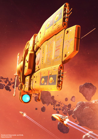
 GrahamTG — Container ship

#scifi #lightwave3d
Published: 2019-03-28 18:48:05 +0000 UTC; Views: 9628; Favourites: 596; Downloads: 0
Redirect to original
Description
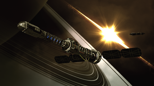
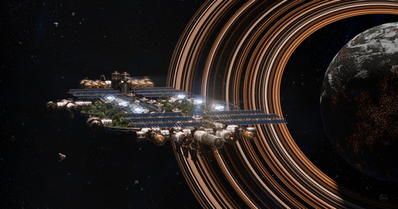
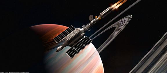
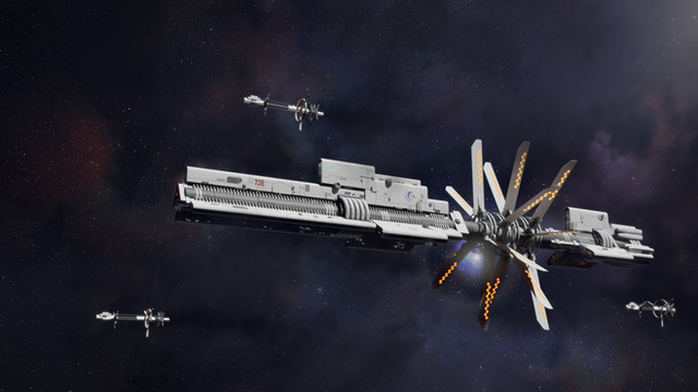
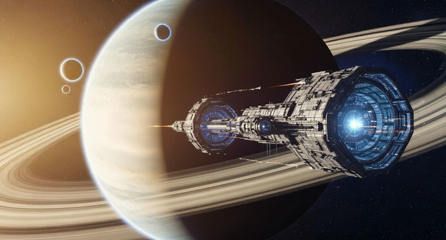
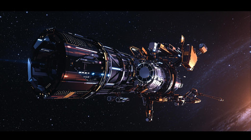
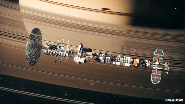
I picked up this neat low poly model recently, works perfectly in my attempt at a homage to the colourful 70's scifi images I grew up with.Related content
Comments: 42

👍: 0 ⏩: 0

👍: 0 ⏩: 0

👍: 1 ⏩: 1

Thanks. You are right I was definitely heading for a 70's vibe.
I really like this little ship design, as you can probably tell by all the renders I've done with it.
👍: 1 ⏩: 0

👍: 0 ⏩: 1

Yes. Sci-Fi was a lot more colourful back then. And I think it was better than now. Somewhere along the line they (producers/directors) have forgotten that sci-fi is meant to be escapism, not realism. Sharp, focused images, and bright colours was a core of that philosophy. Wish to hell they would get back to it. Great job by the way.
👍: 0 ⏩: 0

The colors are great! There's a bit of a Ralph McQuarrie vibe here, great work.
👍: 0 ⏩: 0

Colours are balanced to beauty, style striking - yeah!!
👍: 0 ⏩: 0

This is amazing Graham, Blew me away on Facebook and looks even better without all that compression. I adore your style and have zero idea how you make it look like a painting. makes me realise the vast learning curve I still have to tackle.
Cheers Ross.
👍: 0 ⏩: 1

Thanks Ross,
This kind of model lends itself very well to the painted look alon with strong colours and bright lighting.
👍: 0 ⏩: 0

Fits the 1970s well, at least the 1970s I remember. Which brings up the question, what happened to the 21st century the 1970s were forecasting, did I make a wrong turn and miss it somehow?
👍: 0 ⏩: 0

Oh wow. you've outdone yourself with this piece. This is fucking awesome!
👍: 0 ⏩: 0

👍: 0 ⏩: 0

Very cool. Reminds me of so many great book covers.
👍: 0 ⏩: 0

Makes me think of the Homeworld game series with its boxy industrial look. But I suppose the 70s scifi if where that series draws its inspiration from.
👍: 0 ⏩: 0

Is it possible for you to make 32:9 scaled pictures, e. g. 5120 x 1440?
👍: 0 ⏩: 0

Nice work. Can personally confirm definitely has 70s or 80s feeling on it
👍: 0 ⏩: 0

Beautiful work, it definitely has a 70s and graphic novel style. I like this a lot!
👍: 0 ⏩: 0

I think we looked at the same 70's books! They're what got me started in sci-fi!
👍: 0 ⏩: 0

Definitely has a Chris Foss feel to it! Beautiful!
👍: 0 ⏩: 0

👍: 0 ⏩: 0

Awesome work!
Makes me think of those books from the 1970s ... Terran Trade Alliance I think.
👍: 0 ⏩: 1

I was going to say the same thing and add that the art direction for the video game No Man's Sky was specifically inspired by TTA.
👍: 0 ⏩: 0

I don't know if I've ever seen something simultaneously more utilitarian and beautiful at the same time.
👍: 0 ⏩: 0

Bang on with the 70s feel! 
👍: 0 ⏩: 0

Yep, definitely getting a Chris Foss vibe, minus the pervasive stripes and checker pattern motif.
👍: 0 ⏩: 0

Beautiful! You've certainly hidden the low poly count! Amazing work, Graham!
👍: 0 ⏩: 1


