HOME | DD
 graphiqual — I

Published: 2009-12-28 08:23:25 +0000 UTC; Views: 8724; Favourites: 201; Downloads: 23
Redirect to original
Description
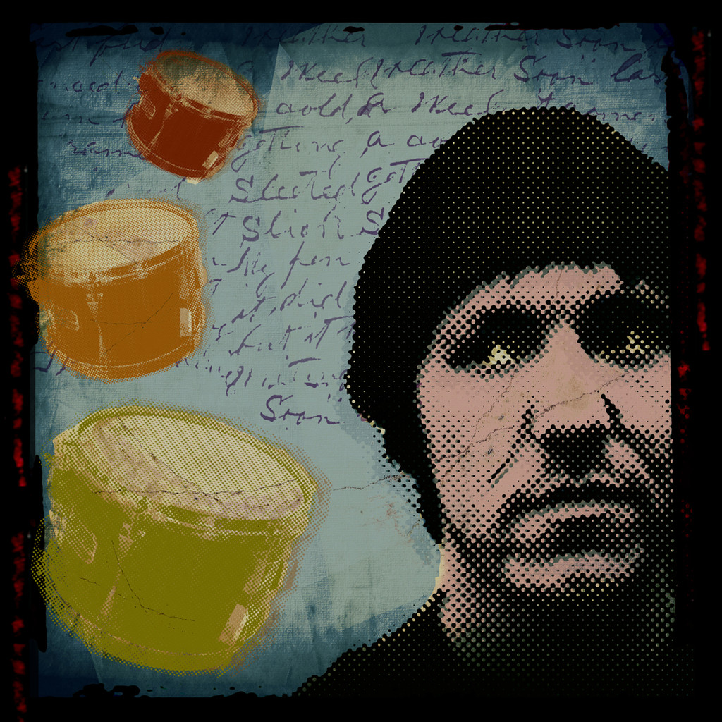
Ever felt like you were just crumbling and falling apart?featured by #ProjectComment : [link] and [link]
featured by ~allieweasley : [link]
featured by *BlueRose00 : [link]
featured by ^ScENeYmE : [link] and [link]
Related content


Comments: 77

Thankyou very much for your comments, and thanks for the 

👍: 0 ⏩: 0
")
Thankyou very much, and thanks for the
👍: 0 ⏩: 1

You’re very welcome; 15 years old?! I think your have a great talent; keep on practising art and you got a good future ahead
👍: 0 ⏩: 1
Yes, I'm 15. Thanks a lot, I'm glad you think that!

👍: 0 ⏩: 0


Thankyou very much, and thanks for the
👍: 0 ⏩: 0


Thanks a lot, and thanks for the
👍: 0 ⏩: 1


Clever? That's a first.
Thanks.
👍: 0 ⏩: 0


This is interesting. I do like it. Its sorta different to me though.
👍: 0 ⏩: 1
Thanks. Different is what I try to be.
And thanks a lot for the
👍: 0 ⏩: 1
Different is always a good thing
and you are welcome
 (Smile)")
 (Wink)")
👍: 0 ⏩: 0

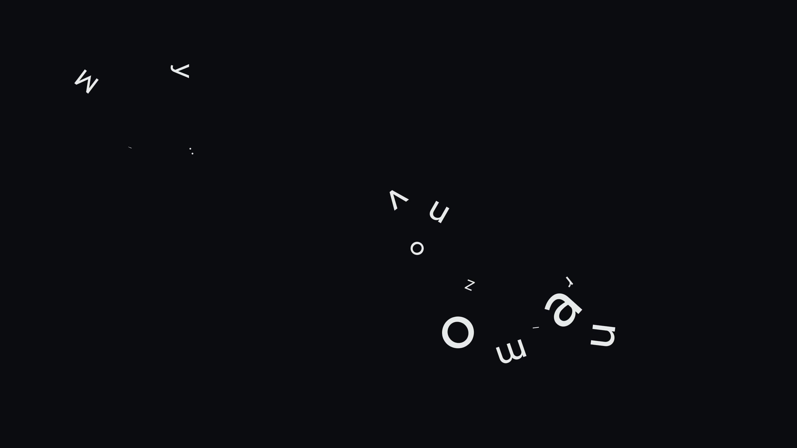
i'm really not one for text art, so forgive me if this critique sucks.
i do like the placement of the "crumbling", but the red I looks a little out-of-place... maybe it's supposed to, but it seemed kind of randomly there for me.
oh wait. i just noticed the TITLE. that I is supposed to be "me, i, you" or whoever you think is saying all of this 
also, there's a bit that says "i'm falling" -- honestly it took me ages to figure out what it was saying. the F is placed so that it looks almost like an E, so i thought it was a made-up "imealling" and was super confused, LOL. i would also use apostrophes to make it easier to figure out.
at the bottom of the pile i see it's getting more and more chaotic and darker as the words are being melded together more -- but i think you should make it even more melded-together and dark -- make it from like small letters at the top to big, bold ones at the bottom or something.
overall i like the idea. only thing i have a big problem with is my own critique i said i'd be brutal and i think i was too nice... i need to get used to this!
👍: 0 ⏩: 1
Yeah, some of the text isn't very clear, but I try to make it that way, with a lot of my text art. Mostly because I prefer people to stop and try to decipher what I want to say, rather than just skim over the work to get the main gist of it.
Thanks for your comments, it's very much appreciated.

👍: 0 ⏩: 0


<= Prev |