HOME | DD
 graphiqual — I

Published: 2009-12-28 08:23:25 +0000 UTC; Views: 8909; Favourites: 201; Downloads: 23
Redirect to original
Description
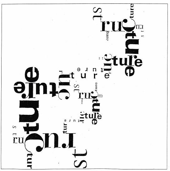
Ever felt like you were just crumbling and falling apart?featured by #ProjectComment : [link] and [link]
featured by ~allieweasley : [link]
featured by *BlueRose00 : [link]
featured by ^ScENeYmE : [link] and [link]
Related content


Comments: 77
")


I really enjoy this piece
It works great with the natural direction of reading and it has a good balance.

👍: 0 ⏩: 1

Yikes.
Great use of the words here, I can feel this as well as see it.
👍: 0 ⏩: 1

Thanks very much!
And thanks for the 

👍: 0 ⏩: 0


YES, I have felt like that several times, unfortunately. A brilliant piece of text art, I love it
👍: 0 ⏩: 1

Thanks a lot.
👍: 0 ⏩: 1


Yes, I have, and this piece illustrates that idea in a new way. I like the simplicity at the top, and how it seems to be building up beneath.
👍: 0 ⏩: 1
Thankyou very much.
👍: 0 ⏩: 0
Thankyou very much, and thanks for the
👍: 0 ⏩: 1

no problem  (Smile)")
👍: 0 ⏩: 0

this is a great typography, really puts together an emotion almost everyone feels
👍: 0 ⏩: 1

Keep it up. This is a wonderful concept and the way the letters are placed do so much for drawing the eyes down.
👍: 0 ⏩: 1


Very well depicted feeling in written and visual terms. The "I" represents the person who is crumbling, but, why did you choose red for it? any particular reason? From my viewpoint it might represent bleeding, which is also a way to fall apart.
Trying to provide constructive comments,
👍: 0 ⏩: 1
Thanks a lot. I didn't actually think very much about the colour of the "I". I just thought red would stand out, but yes it can also represent bleeding.
👍: 0 ⏩: 0


This is really good not sure if it's original or not but i havn't seen anything similar since i've been on here.
Well done.
👍: 0 ⏩: 1

Ooh, this is a really cool composition. Great concept and pulled off very nicely.
👍: 0 ⏩: 1
| Next =>