HOME | DD
 princepoo — Typography 4
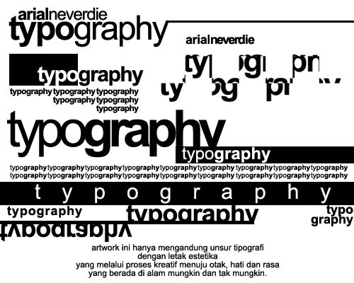

Published: 2003-07-15 00:31:28 +0000 UTC; Views: 18261; Favourites: 156; Downloads: 784
Redirect to original
Description
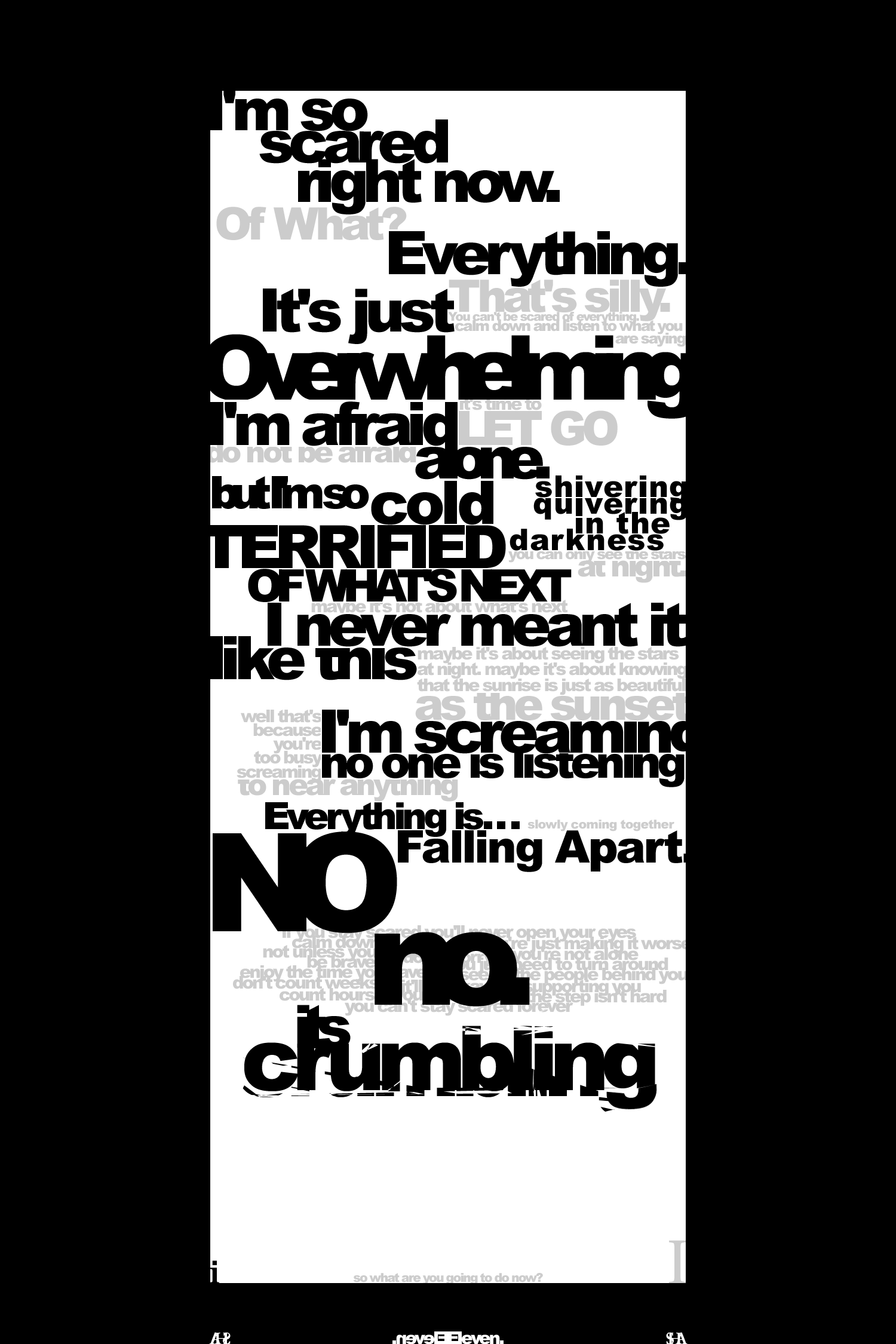
Ever feel like the world is falling apart beneath your feet?Ever feel like everything is changing and you can only watch it all slide away?
I made this the night before Cal Day, an orientation thing at Berkeley. I hadn't decided which college to go to yet. I had an empty Typography 4 frame for about a month before I finally filled it with...
Garamond.
An experiment, yes, but also a representation of the confusion. I put the 'i' on top of everything, though, because there was still hope and future. There still is.
Enjoy.
Related content


Comments: 25


I love it. The message is clear and visually arresting. Thanks!
👍: 0 ⏩: 0


 (Smile)")


I actually really like the main idea of this work, even if the reproduction is a little chaotic.
Did you study typography?
You're quite talented.
👍: 0 ⏩: 0


ah, letters.
in their aesthetic - symbollic whatnot.
well i guess id be liking this a lot if there werent for the title
beneath.
👍: 0 ⏩: 0

yeah i felt like that sometimes....sometimes i feel like this. i lvoe your artwork
👍: 0 ⏩: 0

OMFG this is so awesome! i think the font you used, the "I" looks like a little person, and the way hes just looking at everything crashing down really works with your concept! this is so great.
what program did you use to do this?
👍: 0 ⏩: 1

i used photoshop 6.0, i think.
👍: 0 ⏩: 1
oh kool thanx, i was just asking cause i was curious what people used to do their typography.
👍: 0 ⏩: 1
i should probably use illustrator, as it's much more robust for vector type graphics. using photoshop just gives me massive file sizes, it's really kind of clunky.
👍: 0 ⏩: 0


wow +fav!!
I'd love you to have a go at a typography project im running [link] see journal for details.....
👍: 0 ⏩: 0

I can see you put a lot of work into this. I've done these myself and know how looong they take! i'm not sure about the shaddow either, especially down the left border.
On a whole, you can be proud of this one.
👍: 0 ⏩: 0

Jee! Looks very intresting..
I love it all, but.. man, i can't stand the shadow from the frame :\ I think, that third colour is unnecessary here. It breaks the plane of the fictitious sheet, and makes the composition unstable. Or else I'm wrong... I look at it all onse again. Man, I don't know.. This shadow confuses me
But it's still great!
👍: 0 ⏩: 0

in answer to your question: yes, i have. Most people would've felt that way at some point in their lives. It keeps us human
and now bout this piece...as with all your other typography pieces...i love it...the letters seem to be this bunch of garble that is all but lost to the mind's comprehension but still, at the end of it all, they somehow seem to fall into the right places
👍: 0 ⏩: 0

This is the awesomest style of art... I've never heard of it before.. but its so cool and you do it perfectly.
👍: 0 ⏩: 0


Really great typo work.. I've done this myself and can fully appreciate the work that goes into this.
👍: 0 ⏩: 0

wow... I can almost feel the emotion that you put into this. I really like this one!
Fantastic Job!!
👍: 0 ⏩: 0

Although it's not realy something I normaly like, I think you did real fine on this one.
Brings back some memory's from school, not sure if that's the way I want to go )))))
👍: 0 ⏩: 0

i really like the layout of the typography! nice and even flow...the only thing i might say is that instead of 'typography 4' [is that a class or a program or something?] it should say something personal to reflect the theme of the tumbling text...otherwise, i think it's great!
👍: 0 ⏩: 0