HOME | DD
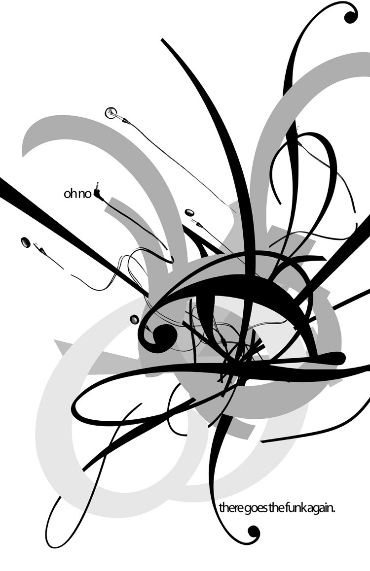
 princepoo — Typography - The Funk.

Published: 2005-02-15 08:34:16 +0000 UTC; Views: 15155; Favourites: 168; Downloads: 916
Redirect to original
Description
ohbabybabysomeone's got their groove back.
[3 fonts. assignment was to personify 'festivity' using text.]
Related content
Comments: 44

Really like this. It's awesome.
Can't stop the funk
👍: 0 ⏩: 0

I love your use of grey-scale. that looks amazing
👍: 0 ⏩: 0

Wow...incredible job. I love the chaos of the center....
👍: 0 ⏩: 0

Awesome - I love the ear buds ^_^
What program did you use?
👍: 0 ⏩: 0

amazing work ! wow! i wish i want to become a designer like u!
👍: 0 ⏩: 0

Heck,
I'm doing a Typography module at the minute, and I'm supposed to be quite 'advanced' in my class, and I'm no where near coming up with ideas that look like this. Where do you start? I'm lacking motivation on all fronts. Hmmpf
Awesome man
👍: 0 ⏩: 0

Is this is based on the ability of headphones to tangle themselves while out of site no matter how neatly you wrap them up?
Irrespective of that, i like the design, it's very dynamic (not sure it says festivity tho.)
👍: 0 ⏩: 0

Put a time and place somewhere and I would totally be at your party!
👍: 0 ⏩: 0

Can't quite put my finger on why, but I really lik this piece!
I really enjoy your work!
You're a RockStar!
👍: 0 ⏩: 0

i like the phrase "oh no, there goes the funk again..." that's great...did you ever think about adding color? it looks good in black and white, but i'd be curious to see this in color as well. (i'm pretty sure i'd prefer it in black and white, but i still think it's be worth playing with).
what i really like is how you have head phones everywhere except by "oh no"...i like how you put a jack by that instead, it's subtle and i like that. great work cutting the squiggles off on the right and left side, that's also a nice touch.
another thing is the line breaks, you make that work well so that was good to add in too, instead of having a bunch of solid lines. great work!
👍: 0 ⏩: 0

Definitely a festive, expressive piece. I love the earphones dancing around, I can almost hear the funk.
👍: 0 ⏩: 0

LOVE it *_^
u have some brilliant graphic design in ur gallery, inspirational.
👍: 0 ⏩: 0

thanks, forgot about that.
👍: 0 ⏩: 1

Your work brings me so much pleasure, just looking at it brings a smile on my face and makes my brain spin.. The musical "red line" works well for this piece and you found the right balance physical images and the playful part.
👍: 0 ⏩: 0

Fantastic vector/typo work! Your shapes feels so solid and expressive...
👍: 0 ⏩: 0

Alright... Finally some more princepoo-typo.
I've been in love with these typos since I met them!
Keep it up....
👍: 0 ⏩: 0

It doesn't look like those plugs are gonna fit in those holes.
👍: 0 ⏩: 0

This is what happens in my mind when I get an idea. It blossoms and whips around in several directions.
👍: 0 ⏩: 0

haha...
i like how this piece challenges the convention of festivities by examining that theme in the style of static and colorless objects...
👍: 0 ⏩: 0

Wow, I really like how the design came out, very interesting to look at! Love it!
👍: 0 ⏩: 0

The middle portion sort of reminded me of an eye. Also, I like the small details, like the little plug in thingy [I swear I know what it's called
Anyway, nice job. It looks good.
👍: 0 ⏩: 0

i like it. were you allowed to use color? or just greyscale? because i think some sharp orange or bold reds would really add to the feel of festivity.
👍: 0 ⏩: 1

yeah, we were working with just black and white last week. this week is color.
👍: 0 ⏩: 1

ha, i really like that...i like how you made it almost like an explosion of some sort
i also like how you actually wrote "oh no, there goes the funk again" but with no spaces in between. the ear phones was a nice touch, and i like the fact that there are no bright colors involved. nicely done.
👍: 0 ⏩: 0

The earphones are trapped in that mess of stuff!? I sure do like it. ;D
👍: 0 ⏩: 0


