HOME | DD
 princepoo — Typography - Words.
Published: 2005-02-25 09:05:30 +0000 UTC; Views: 2730; Favourites: 33; Downloads: 152
Redirect to original
Description
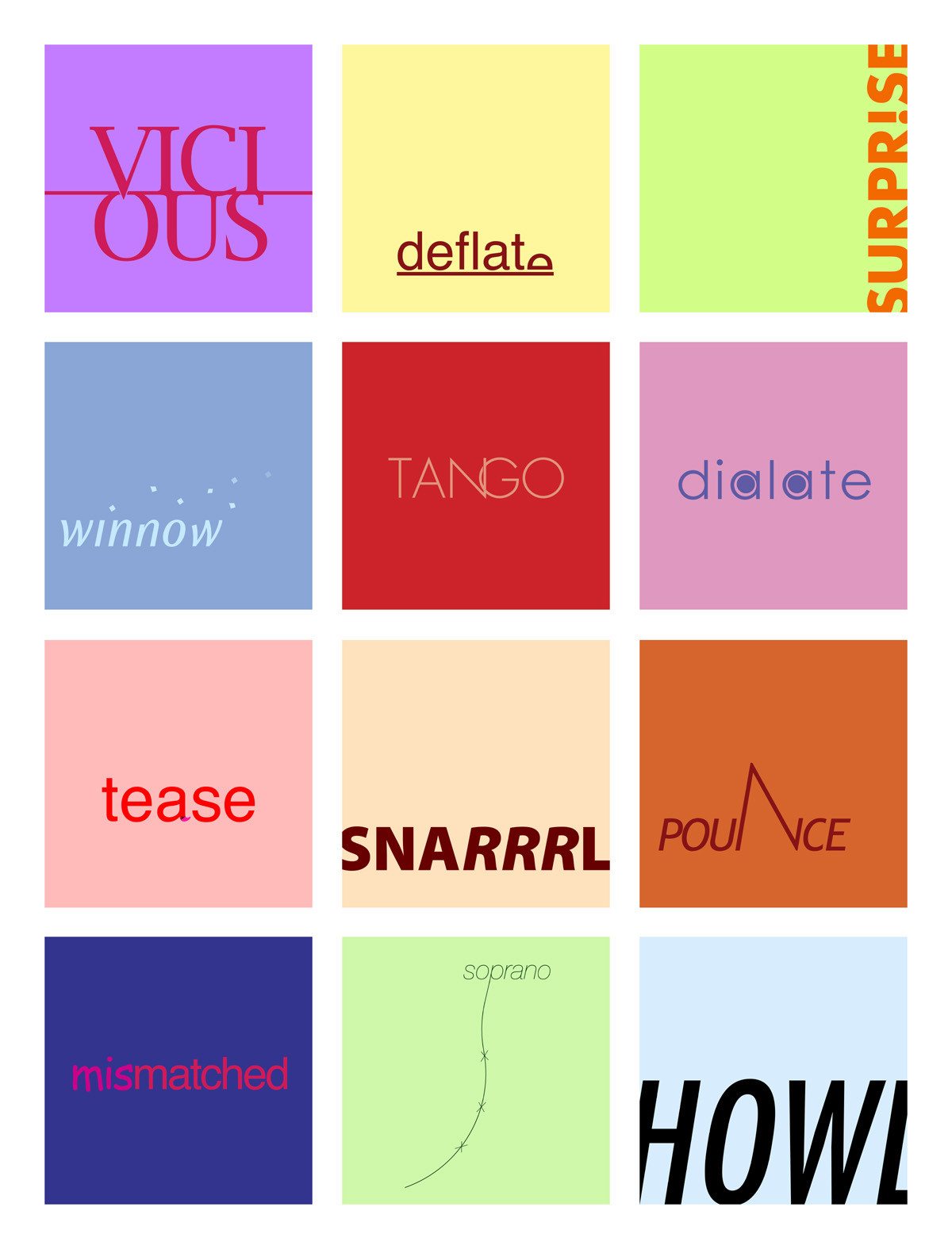
Assignment was to use the word to say the word, like visual onomatopoeia. We were supposed to do 1-5, but i ended up doing about 20. These are 12 of the better ones, i think. I had so much fun with these, wow. I may be doing more.Anyways, tell me which one is your favorite.
[and i know dilate is spelled wrong. my professor spelled it wrong on the list, and there's no way i'm going to sit around and think of a new idea for it.]
Related content


Comments: 31


I just bumped into your gallery going through some of the daily deviation archives. Awesome variety, awesome stuff! And I looooove these. I think deflate and tease are my favorites.
👍: 0 ⏩: 0


Def. Deflate and Tango, you could write it with symbols and someone would be able to match them if you gave them a list of 20 possible choices.
👍: 0 ⏩: 0

i love doing these. yours are so good! i can't decide which one i like best.. it's a toss-up between tease, tango, deflate and surprise. i've never heard the word winnow before, but after looking it up, it's quite clever. I did an "evaporate" very similar to it.
👍: 0 ⏩: 0

i'm going to go against the grain here ...
i really really am tickled by "tease" and i think "winnow" is beautiful.
👍: 0 ⏩: 0

I like "deflate" the best. ")
👍: 0 ⏩: 0

OMFG I can't believe you used Comic Sans in mismatched. Travesty!
👍: 0 ⏩: 1

i had to!
i wanted to make one that just said "ridiculous" or something, and have it be a combination of ravie, jokerman, and comic sans, but i decided against it. someone in our class used comic sans before, and i had to lightly advise them against it; it went something like this.
"yeah, i'd do something other than comic sans"
"oh, yeah? i thought everyone used it"
"yeah, everyone does, but everyone shouldn't"
making a new layer and accidentally typing out something in comic sans afterwards was something akin to a typography heart attack.
👍: 0 ⏩: 1
In some strange way, I'm glad you suffered.
Context for out-of-the-loop readers: [link]
👍: 0 ⏩: 0

wow that is all sorts of fun
👍: 0 ⏩: 0


i see you left tease.
like the pounce, winnow, tango.
👍: 0 ⏩: 0

i like visious, deflate and tango. tease is the funnest cause you need to think about it  (Smile)")
👍: 0 ⏩: 0

I like tango and pounce. You are really good at these.
👍: 0 ⏩: 0

Where are you taking classes, if you don't mind me asking? I am enrolled in an online prog called sessions.edu...
👍: 0 ⏩: 1
i'm a second year architecture major at UC Berkeley; this course is in the visual studies department.
👍: 0 ⏩: 0

Ahahaha
good job man, but what's the rational behind vicious?
other then that, tango is my favorite while deflate and surprise are the wittiest... good use of visual humour, always a crowd pleaser.
👍: 0 ⏩: 0

Cool exercise. Really a nice style and a good flow to it. Very nice job.
👍: 0 ⏩: 0

deflate, tango, and tease were my favorite.
I'm glad you're having fun with this, it looks good.

👍: 0 ⏩: 0


Haha!
Yeah, it does look like tons of fun!
I once had to do a similar excercise:
we were all given the same adjectives to use, like big, tall, cold, scared, etc...
except it was all about which font we used and how we used it.
It was fun.
And I very much like the ones you you show here!
There are some cool designs here!
I particularily like the one that reads deflate.
👍: 0 ⏩: 0


ooh.. not bad.. i don't really understand the concept behind tease n soprano.
my fav is deflate!
not easy doing this.. had to do an assignment something like this too... not easy at all..

👍: 0 ⏩: 0

I already told you that I love deflate, but I think I love pounce more :-D
👍: 0 ⏩: 0


i've read that when people read they dont read each individual letter but rather the word as a whole, so if a few of the letter in a word are jumbled around the reader won't notice as long as the first and last letter are fine. i think maybe you should try to jumble a couple of letters with the mismatch work, just to make it fit the word better. i really like tango. are you able to curve the words or lettering? if so, i think it would look nice if pounce was curved, coming toward the viewer, becasue although the "n" give the word energy it doesn't seem to fit too well.
👍: 0 ⏩: 0
