HOME | DD
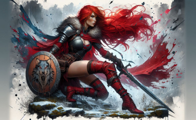
 GravityKnight — Red - The Seventh Knight
by-nc-nd

Published: 2007-12-21 03:31:26 +0000 UTC; Views: 1495; Favourites: 17; Downloads: 0
Redirect to original
Description
Around a month ago I sat down and flipped through my dated portfolio, sighing at the wondrously broken styles I used for both the Valance and Red designs. The Red design looks screwed up because the dark penciled lineart didn't exactly fit well with the slipshod coloring on the overall picture. Valance looked slightly better, not because of the slightly more vibrant shading and lack of proper lineart, but because Valance PWNS Red by default.So I was thinking that I might decide to merge the two vastly different styles to obtain one single ultimate screwup piece of broken artwork. I might even throw in a pathetic excuse for a background for good measure. So now I end up with a revolutionary, defining piece in the career of an artist who does not yet know how to draw.
I used a theme of ivy within vast stone hall, and sort of 'fillered' the remaining blanks with some badly done 'fog of war' to mask my lack of skills. I got this idea while I was mopping the floor (yeah you read that right) and finally decided to paint a relatively coherent background, for once.
This time I took the extra step to actually perform digital inking, so that the lineart doesn't look uneven like in my previous works. I even tweaked the lineart around so that the pic blends smoothly with the background (although for better or worse, I can't really tell). Red's face looks as inexpressive as ever. To be frank, this piece is actually REALLY detailed, but I'll only send the full-res version to a few friends, because when you see the details, you see the flaws, too.
This is more or less an experiment with some dynamic lighting. The results might not actually be such a major improvement, but the fact that I spent more than 16 hours over a span of three to four weeks makes me put down my stylus with relief. For its shoddy appearance, it's actually my largest piece so far, at 87.9mb for the PSD file, would ya believe that.
It's perhaps the first time I've tried a style like this, or even painting a proper background, so if it sucks, it's my fault, yeah.


Drawn on A3, colored in Photoshop, 16+ hours.
Related content
Comments: 12

Amazing! The detail you put into your characters is wonderful. ^^ The only thing I have to say is that your character doesn't seem to match the background very well... he kind of sticks out. Then again, I can't really say much on the subject of backgrounds, considering I fail at them. XD;;;
👍: 0 ⏩: 1

Lol don't worry, I kinda have the same feeling. I'm really hoping to improve in the coming pictures I'll be submitting, especially the background.
👍: 0 ⏩: 0

Okay, you make really good things, but I still think you draw really little hands for your great characters.
Isn't the knob a little strange, too ? How can he line up his sword ?
Don't mistake, I still like this picture.
👍: 0 ⏩: 1

Lol yeah drawing small hands has really become my bad habit...I'll really try to draw larger hands next time 
But I don't get your second comment...what knob?
👍: 0 ⏩: 1

Handle ? Guard ? Sorry, I'm french, I must have used a not-adapted word. The thing you use for take a sword in your hand. The non-sharped end of a sword.
👍: 0 ⏩: 1

Hmm I did realize there was some angle error involved when drawing the sword. I was hoping you wouldn't notice, but thanks for pointing it out anyway
👍: 0 ⏩: 0

Very well done!
Although I thought more can be done with the bg but brilliant colouring.
👍: 0 ⏩: 1

Haha thanks. Sorry for the late reply.
👍: 0 ⏩: 1


